In order to align to the new brand colors, we are including in Watson the capability to switch to the new color palette. This means we will support the legacy accent color (blue) for a while until changes are performed in our products.
Design
Semantics prevail. Form components have semantically changed their appearance from accent to inverted to avoid the plausible connection with success. To understand how to get these changes in Figma and use the new color palette, check this video.
Development
You can follow these steps to introduce the new brand colors to your project:
Updating Watson for the latest version available for the component and tokens will automatically bring the new brand colors out of the box. If you want to continue with the legacy colors, import them from the tokens package:
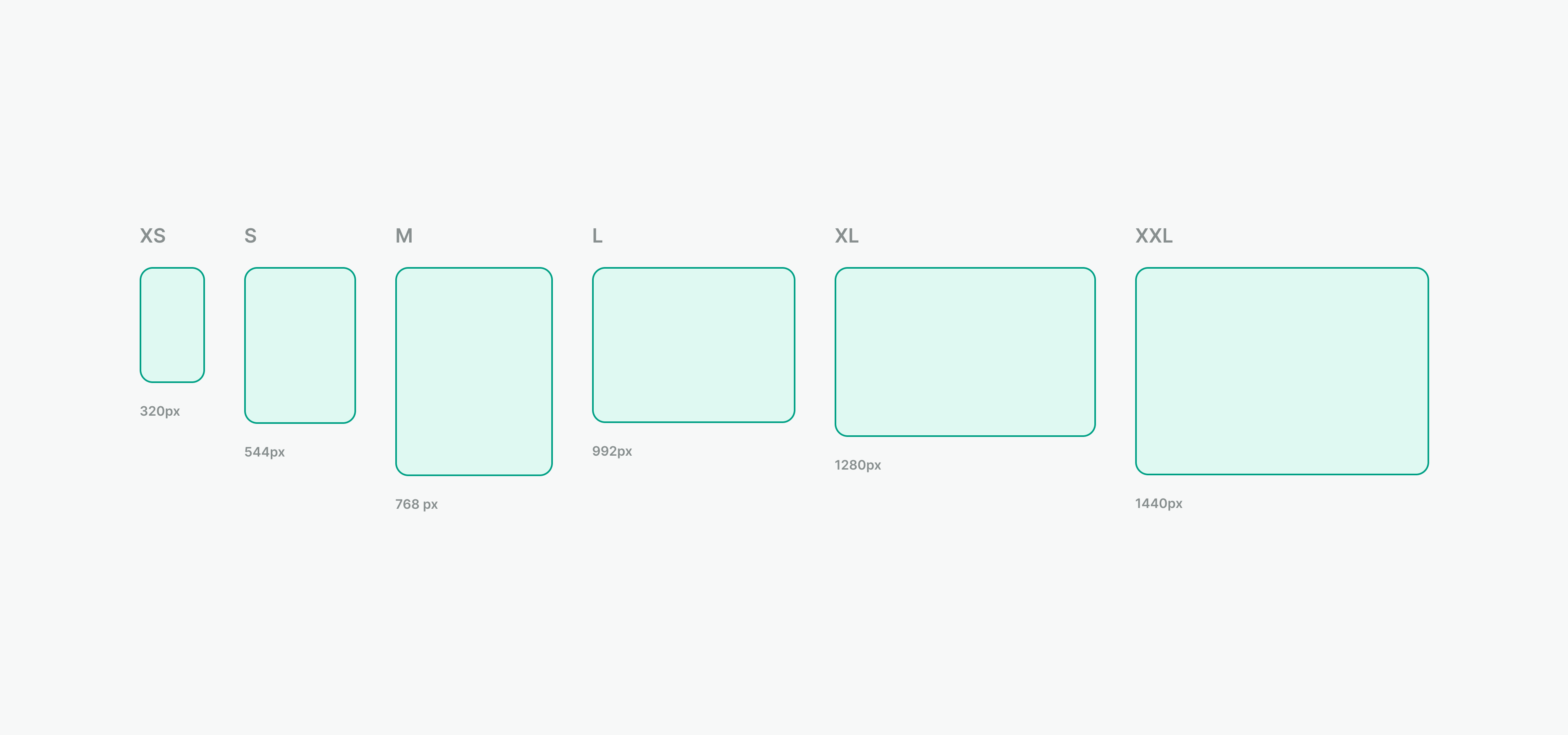
Watson Design System supports responsive design. This update includes:
Breakpoint tokens so we can create useful and responsive user experiences in all devices supported by our
PMSes.
_breakpoints.scss added to the bundle. Now, breakpoints SCSS mixins are available for use in projects that use
Watson components.
Watson components are verified to not break on different screen sizes.
We introduced breaking changes to the WGridItem component which is a part
of WGrid. Please refer to the documentation to
see how to set up the component properly.
We added a new Contribute section to our documentation. It provides
useful information about various ways of contributing to Watson Design System and how to proceed with each of them. We
want our design system to be widely used across the company projects. That's why we value every idea and every person
who want to contribute to our project and help us achieve this goal.
We have added Templates section to the documentation. It contains
examples of how to use Watson components in different
scenarios.
The documentation now includes a new Guidelines
section. Design principles are the first addition to
this section. These principles aim to guide designers and developers when working with the system, serving as a
foundation for better, more informed decisions.
We've added to WTablespinner and skeleton loading states.
Additionally, users now can set the default number of
skeleton rows via the skeletonRowsNumber property if there is no data in the table.
We wrapped tokens into :host selector so that they can be used inside Shadow DOM without additional effort.
We enabled support for custom id property for WInput
and WCheckbox components. It will make it easier to test
apps using those components.
WModal
and WToast will now accept HTML Element as their teleport target.
Breaking change **We removed matchingTriggerWidth and preventCloseOnTriggerClick properties from WPopover.
** Those properties were added to the component as we needed them in WCombobox which was built using Wpopover. Right
now combobox is a standalone component thus we decided to remove them from WPopover. Consequences:
You can't have Popover with identical width as trigger element (matchingTriggerWidth)
You don't have the option to prevent a Popover from closing by clicking on the trigger element (
preventCloseOnTriggerClick).
During the Figma variables effort, we are encountering some issues and inconsistencies with component tokens.
Here you have a list with changed tokens per component.
Work is underway to integrate Figma variables into our system, aiming to streamline design process and improve connection between design and development.
We're initiating Watson Office Hours every Thursday afternoon. This is an open invitation to discuss anything related to Watson – questions, ideas, or concerns. Look out for our weekly reminder in the #tech-proj-watson channel every Monday.
We’re actively working on small but significant improvements in various components, including cards, links, buttons, and form elements, aiming to refine their behaviour and style.