Usage
A file upload allows the user to choose one or more files from their device storage and upload them to a specific location.
Best practices
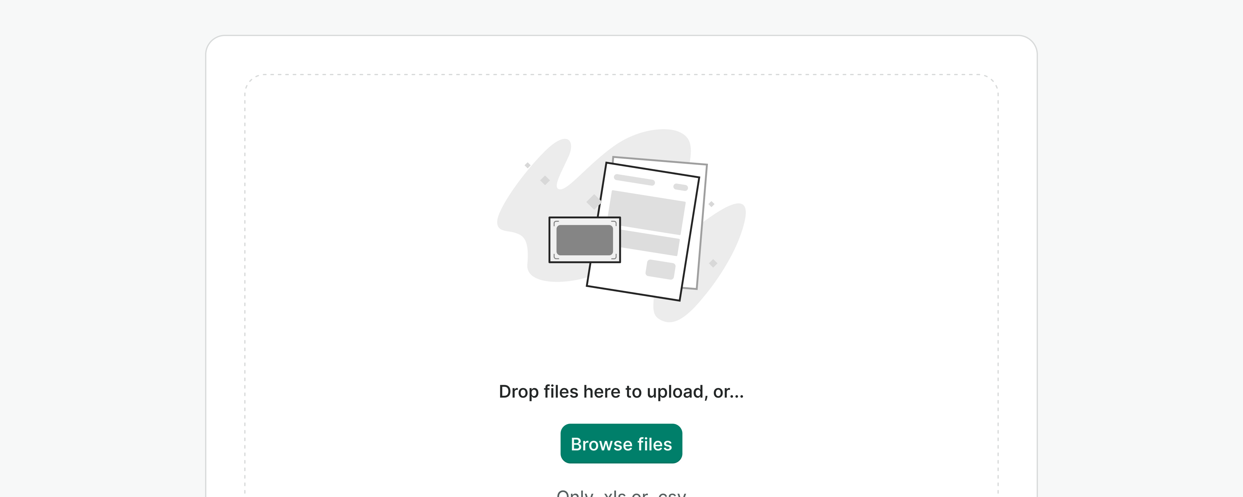
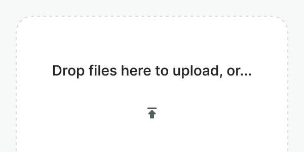
- Use the dropzone variant for empty pages or when the drag-and-drop functionality becomes helpful (e.g. locating multiple files).
- Don't use file uploaders for simple data input. Instead, utilize input fields or other form components unless file formatting is required.
Labels
In both variants, labels help us define the context in which a file upload is required, or how to proceed to succeed.
Labels should always be present, except for those cases where the context and elements that surround the input make it clear what data is needed or how to proceed (e.g. "Upload a file" button as a secondary action in a list). In those cases, the button label will be read by screen readers anyway.
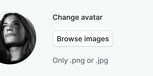
Use labels that are short, descriptive, and support the action of the button.
Make sure not to duplicate information, if the label is not needed, it can be hidden.
Triggers
You can trigger a file uploader using an icon button or a button. Make sure you follow these components' guidelines at all times.
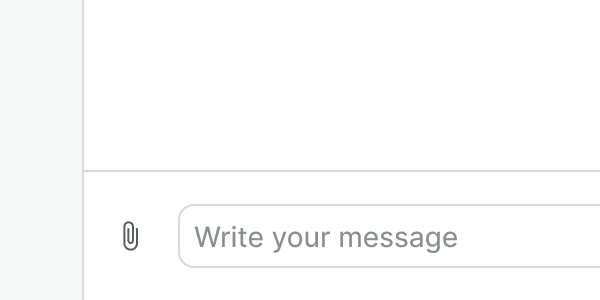
Use the icon button in the default variant when placing a file uploader in small places and if no other information is needed.
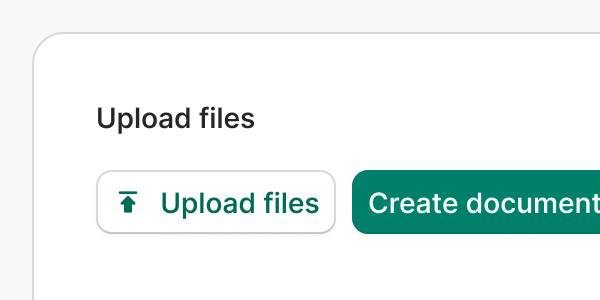
Do not use an icon button when displaying the dropzone variant or when there's enough space for the action to be labeled. Use a button instead.
Hint & errors
Like in any other input component, hints and error messages provide additional directions to support the component function in an accessible manner.
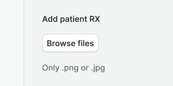
Use hints to provide useful information about the required input, for instance, accepted file types.
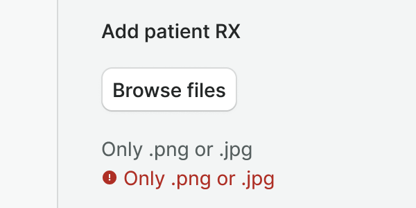
Do not duplicate information. If an error message is repeating the hint, rephrase the error to be more specific (E.g. Your file is not in an accepted format) or hide the hint.
Examples
Live Preview
Props
| Name | Description | Type | Default | Values |
|---|---|---|---|---|
v-model model-value v2, wc value v1 | The value of the input. | array | null | |
variant | Defines the variant of the image uploader. | string | default | default | dropzone |
image-src | Provides a link to the image. | string | ||
label | The label for the image uploader. | string | null | |
trigger | The component that will trigger the file browser. | string | WButton | WButton | WIconButton |
trigger-props | Allows set props for WButton or WIconButton component. | object | ||
hint | Optional text about the expected input. | string | null | |
error | Optional text to be shown under the trigger. | string | null | |
accept | Sets accepted file types. | string | ||
max-size | Sets the maximum file size. Add value in MB. | number | 1 | |
multiple | Allows multiple file selection. | boolean | false | true | false |
translations | Object with all necessary translations. You can find a list of required translations in config.js | object | { fileType, fileSize } |
Events
| Name | Description | Type |
|---|---|---|
v-model update:modelValue v2, wc input v1 | Emits the event after the picked files. | { "names": [ "Array" ] } |
Slots
| Name | Description |
|---|---|
hint | Use it to provide rich content for input hint. Takes precedence over hint property. |