Usage
A calendar allows users to pick a single date or a range of dates from a visual calendar. This component must be used to consistently allow date selection in other contexts. It does not provide the text input functionality of an input type date or a custom text date-picker.
Best practices
If the calendar is triggered by another component, close the calendar upon selection, unless a range is allowed.
Do not use a calendar for entering a birth date or if the date goes ±10 years to the future or past. Use an input component instead.
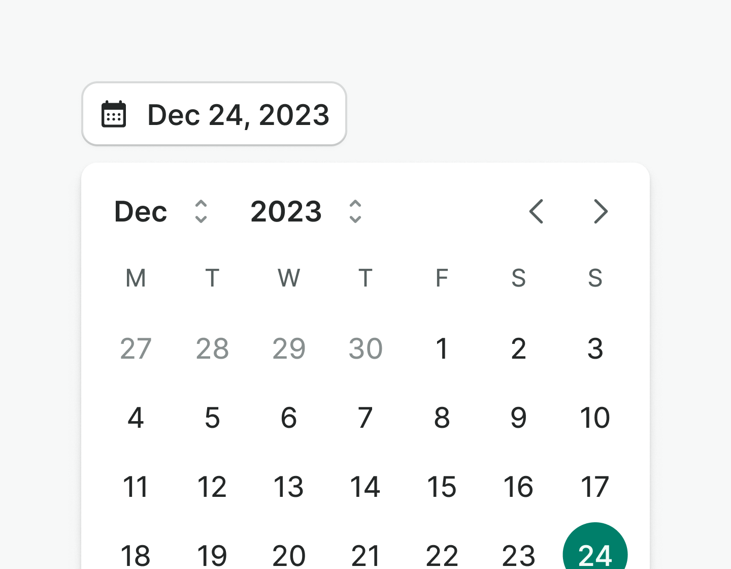
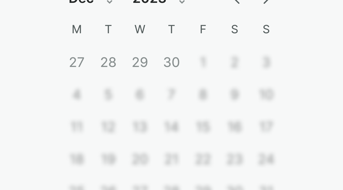
Single-month
Use preferably for single-date selections or when the range is not likely to go across several months.
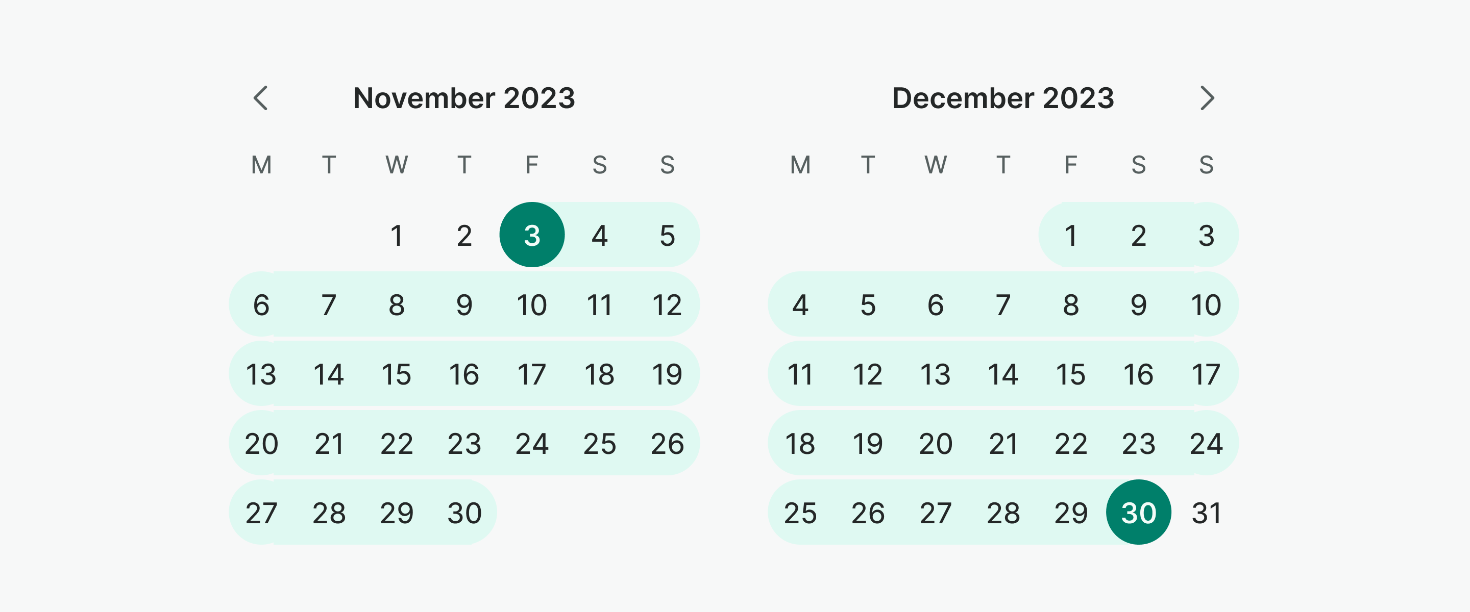
Multi-month
Use when the expected date ranges might go across multiple months. If you only need a single date selection, save space and drive purpose by using the single-month calendar instead.
Days
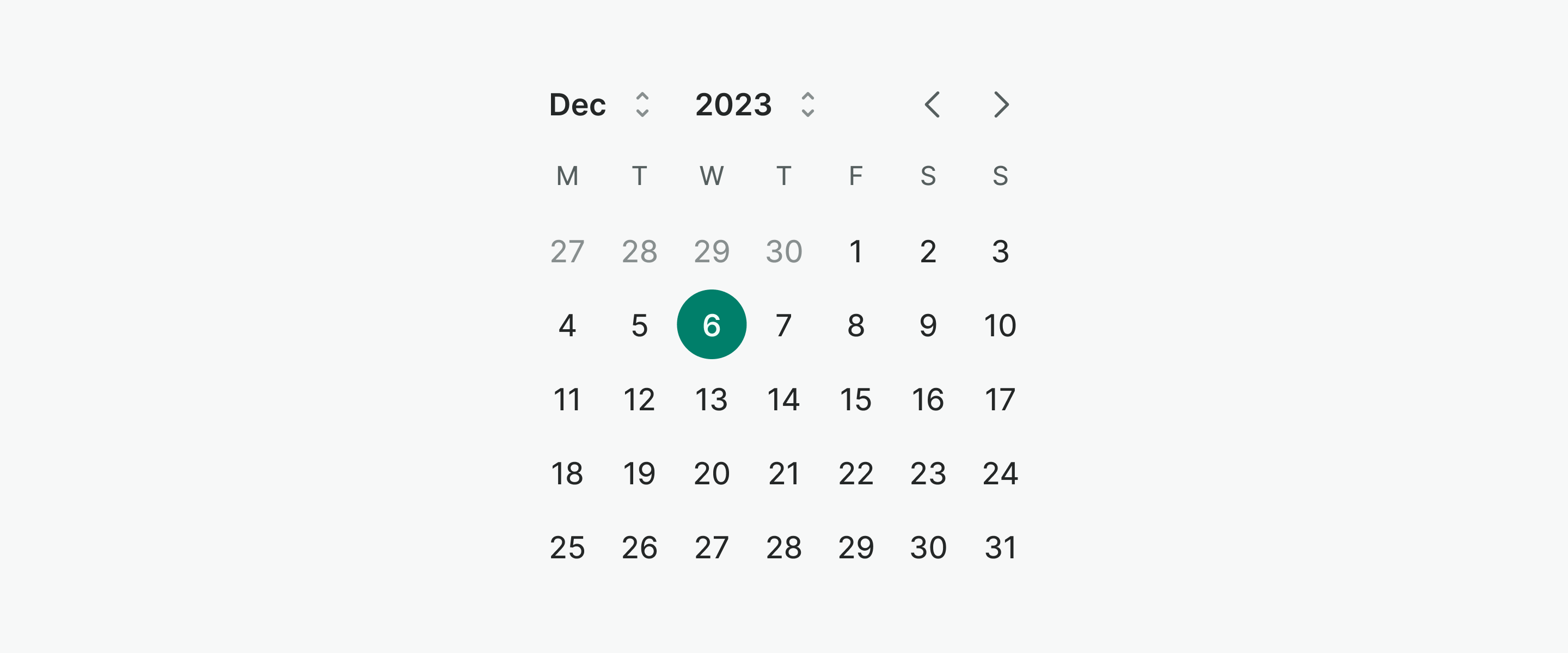
Days in the calendar can be styled to reflect their state and purpose. Use days' states as intended.
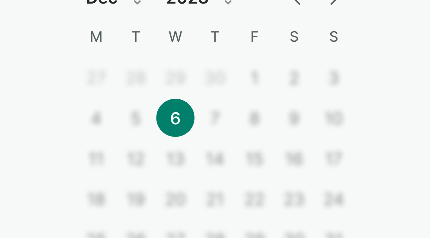
Use selected to mark the selected date in the calendar.
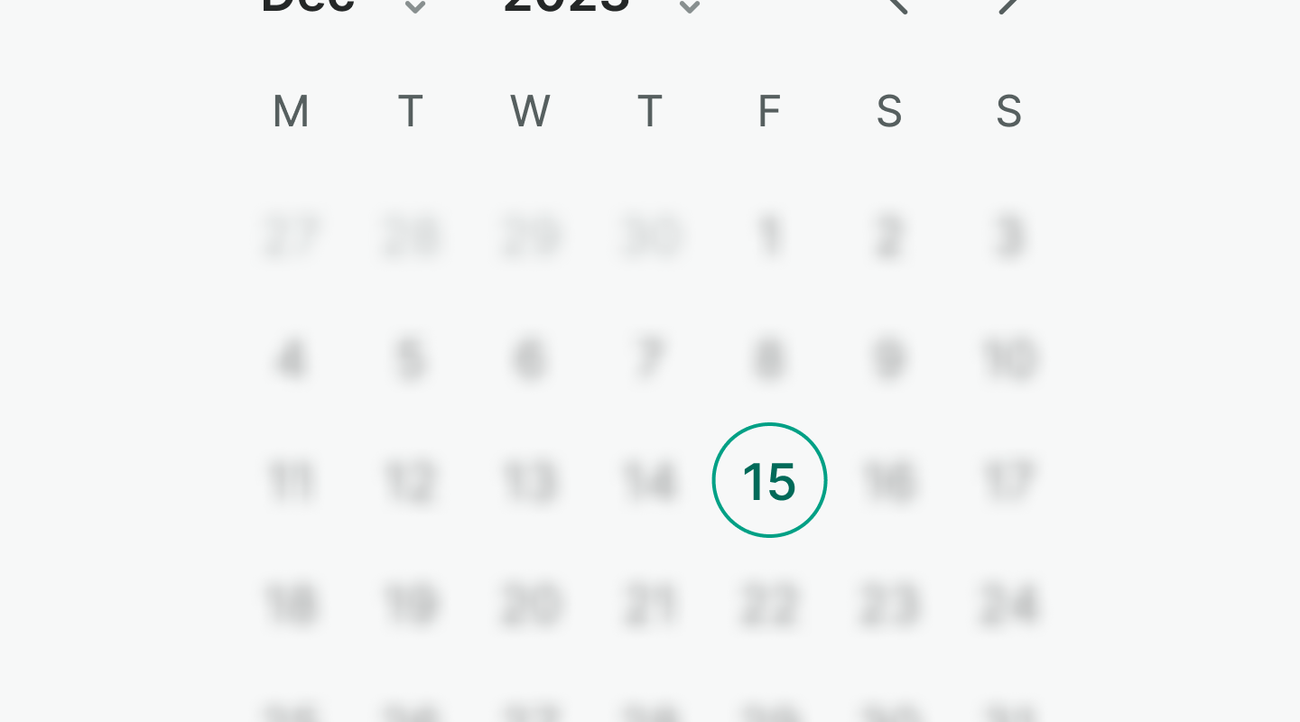
Use today to mark the current date on the calendar.
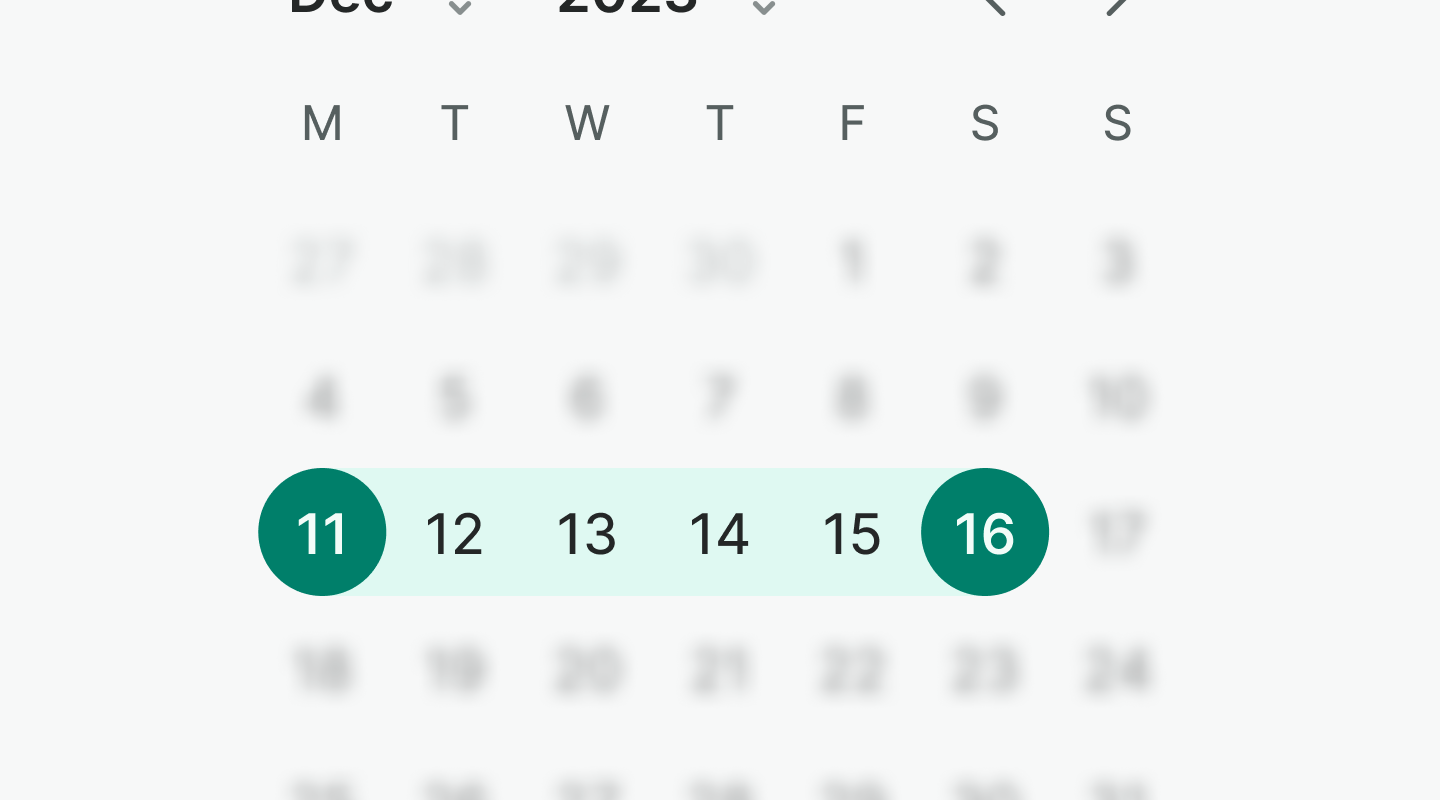
Use highlight to mark all the selected dates in a range or to highlight the week in the agenda.
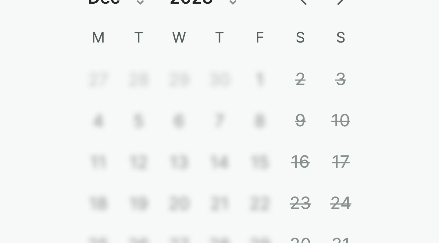
Use blocked to mark dates that are not available. Days are therefore not selectable.
Use muted to mark days that do not belong to the current month but are still selectable.
Examples
Live Preview
Props
| Name | Description | Type | Default | Values |
|---|---|---|---|---|
v-model model-value | The selected date(s) of the calendar. | Array | Array<Date> | |
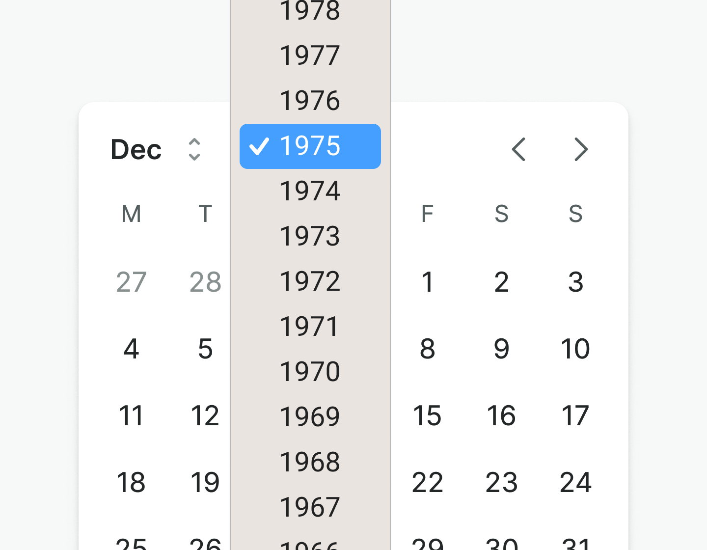
first-day-of-week | Sets the first day of the week for different countries. 0 is Sunday and 1 is Monday. | Number | 0, 1, 2, 3, 4, 5, 6 | |
multi-month | Controls whether the calendar is multi month or not. | Boolean | false | |
range | Controls whether the calendar is range. | Boolean | false | |
dates-disabled | Controls which dates are blocked from being selected. | Object | {} | { before: Date, after: Date, dates: Array<Date>, ranges: Array<{ from: Date, to: Date }> } |
dates-highlighted | Controls which dates are highlighted. | Object | {} | { before: Date, after: Date, dates: Array<Date>, ranges: Array<{ from: Date, to: Date }> } |
highlight-current-week | Highlights the current week based on the selected date. | Boolean | false | |
locale | The locale to use for the calendar. | String | 'default' | default, de-DE, en-GB, en-US, es-CO, es-MX, es-ES, es-US, it-IT, pl-PL, pt-BR, pt-PT, tr-TR |
full-width | Controls if the button extends to fill the width of the container. | Boolean | false | |
translations | Object with all necessary translations. | object | {
month: 'Month',
year: 'Year',
previousMonth: 'Previous month',
nextMonth: 'Next month',
} | { month, year, previousMonth, nextMonth } |
Events
| Name | Description | Type |
|---|---|---|
v-model update:modelValue | Emits the selected date(s). If the calendar is single month, it will emit an array with one date. If the calendar is multi * month, it will emit an array with two dates. | { "names": [ "Array<Date>" ] } |
select | Emits the selected date. | { "names": [ "Date" ] } |