Usage
The filter component lets users narrow down visible data by selecting specific values or ranges.
Use for:
- Filtering data in data tables or large lists
Don’t use for:
- Sorting data
- Selecting values in forms
- Dropdown action menus.
Anatomy
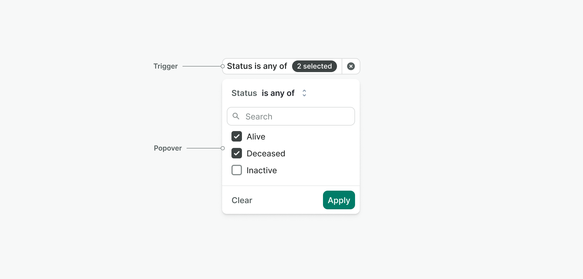
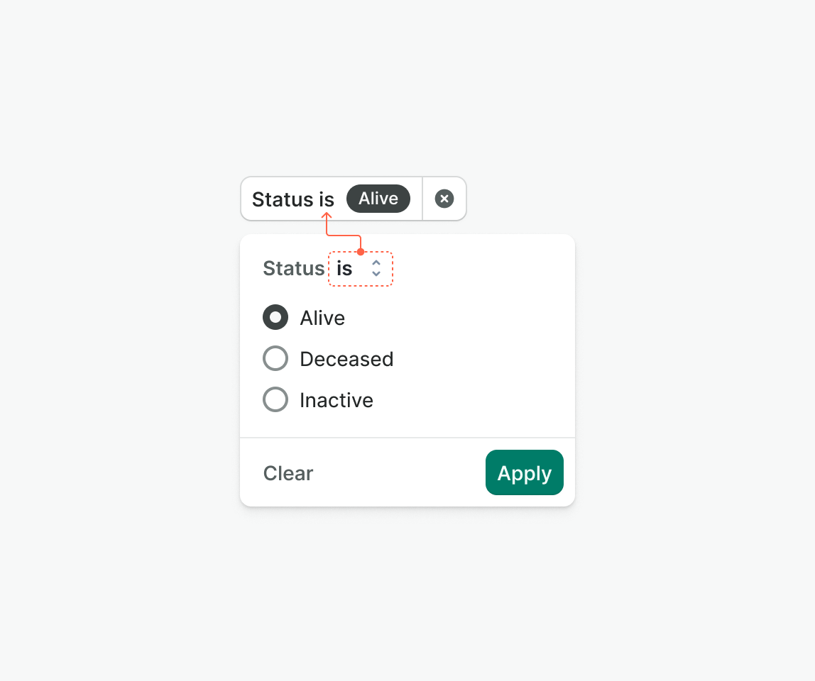
Filter trigger
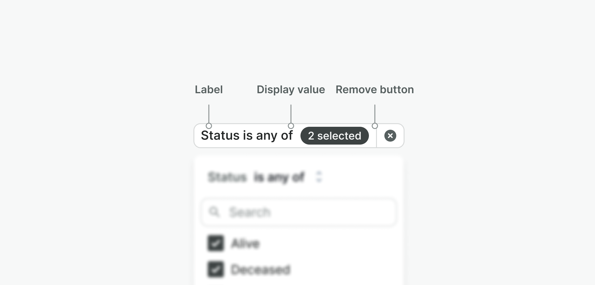
The button users click to open the filter options. It includes:
- Label – Text that describes what the filter is for (e.g. “Status”).
- Display value – Shows the currently selected filter value(s) (e.g. “Active”).
- Remove button – Clears the filter and hides it from view.
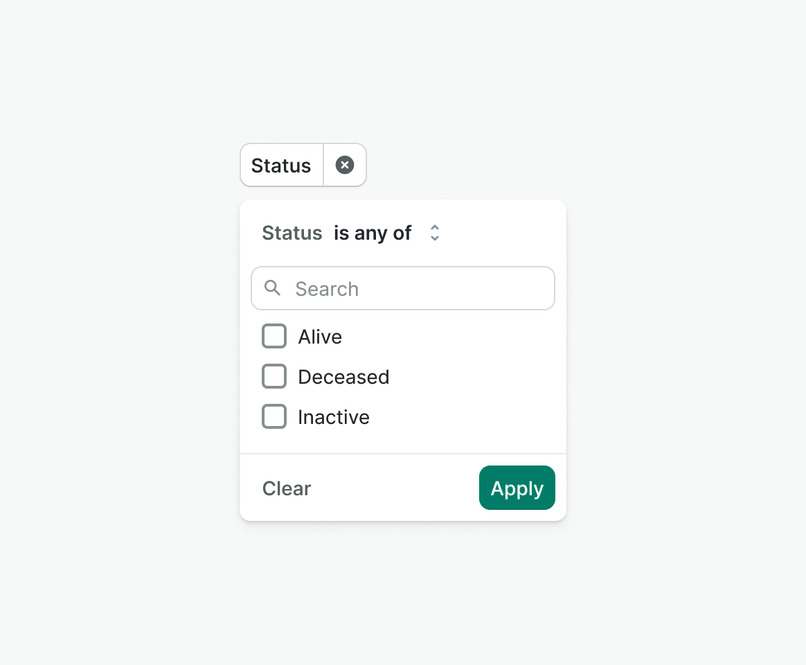
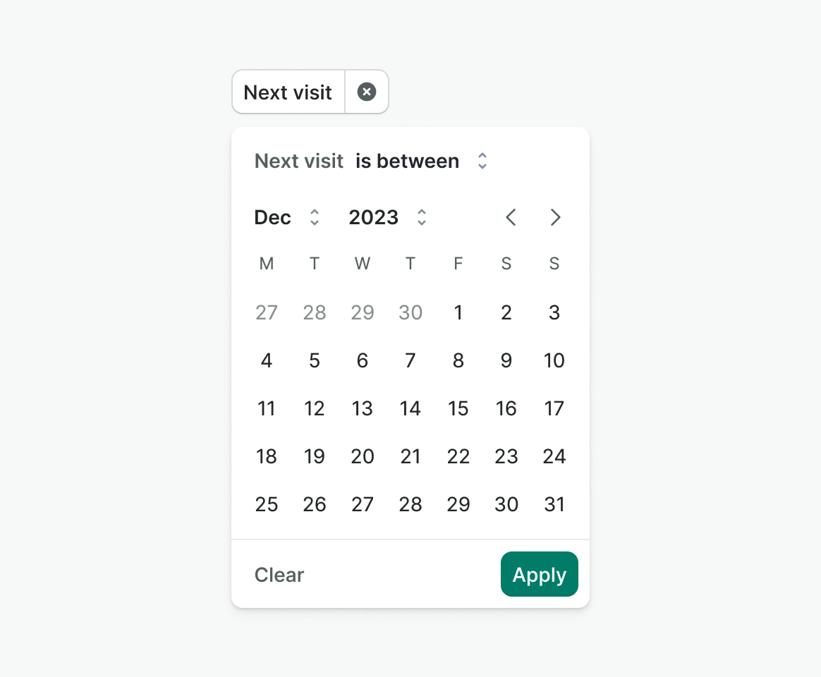
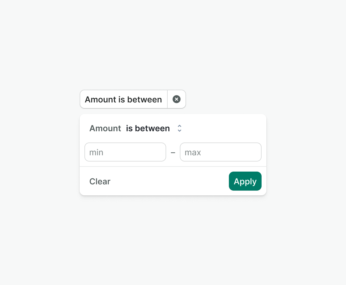
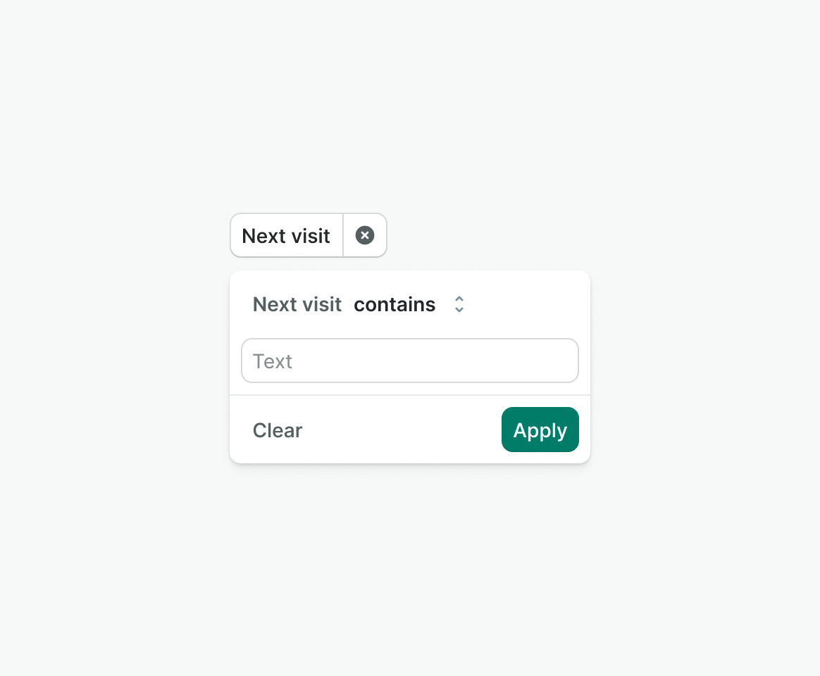
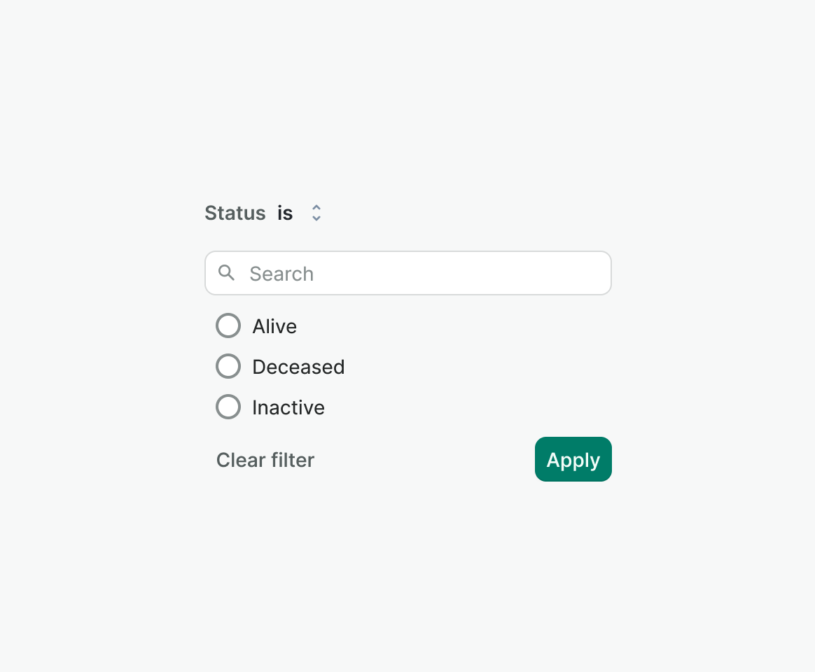
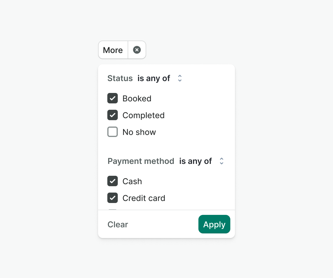
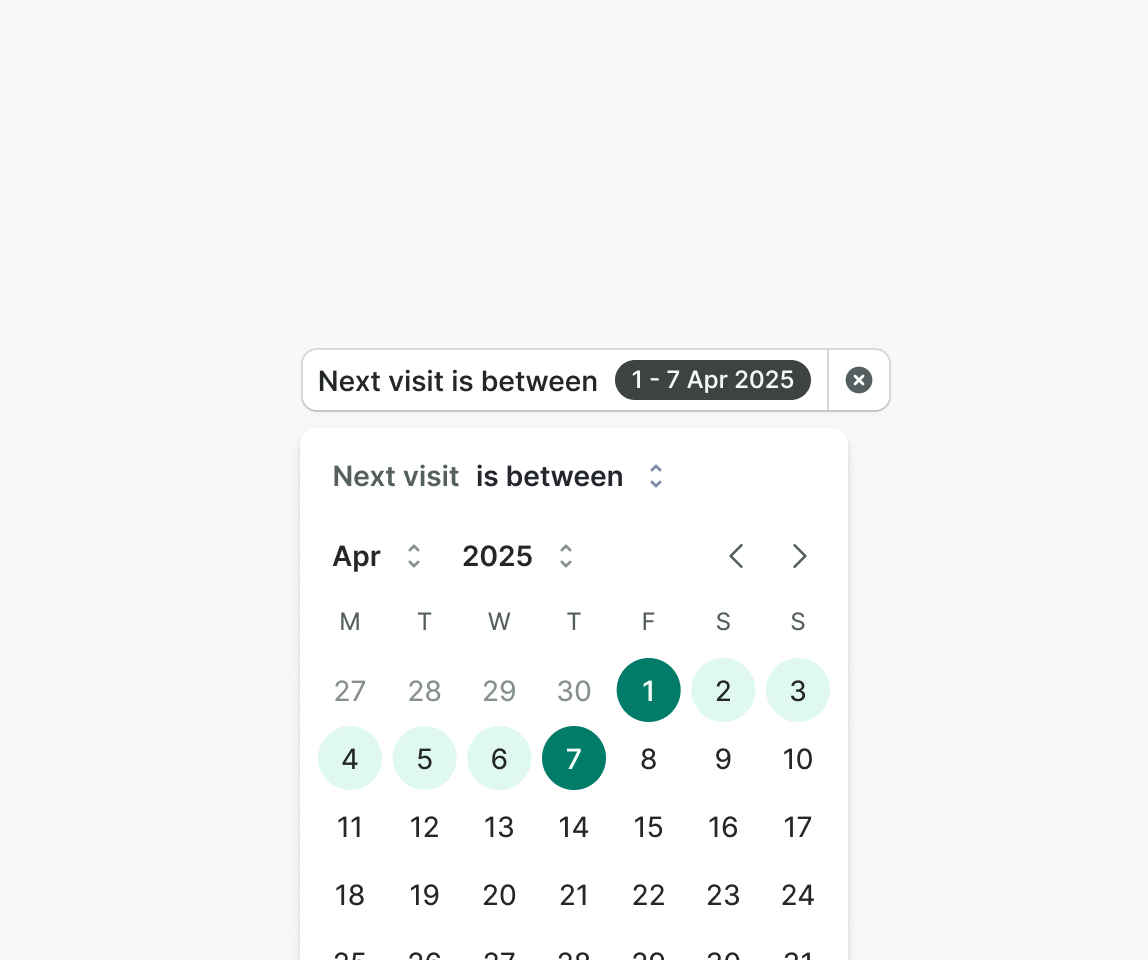
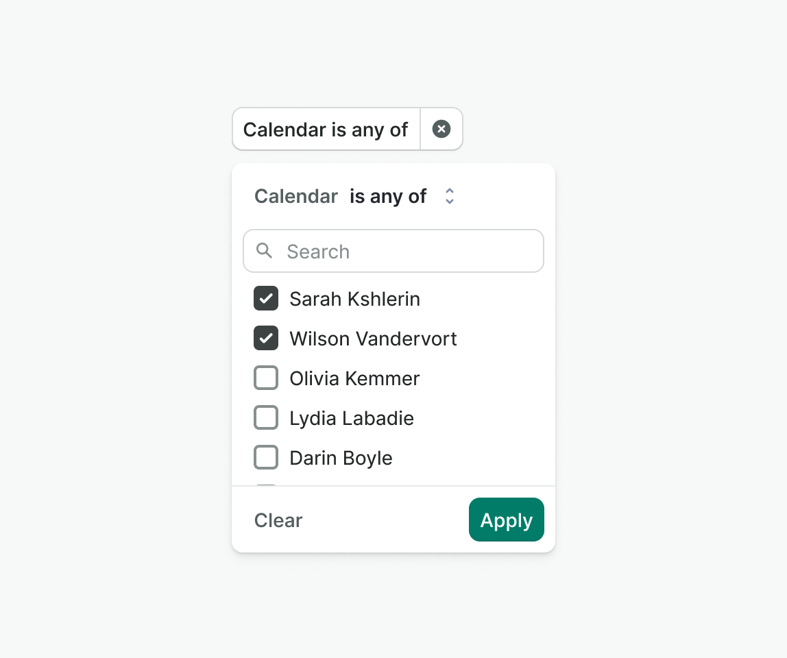
Filter popover
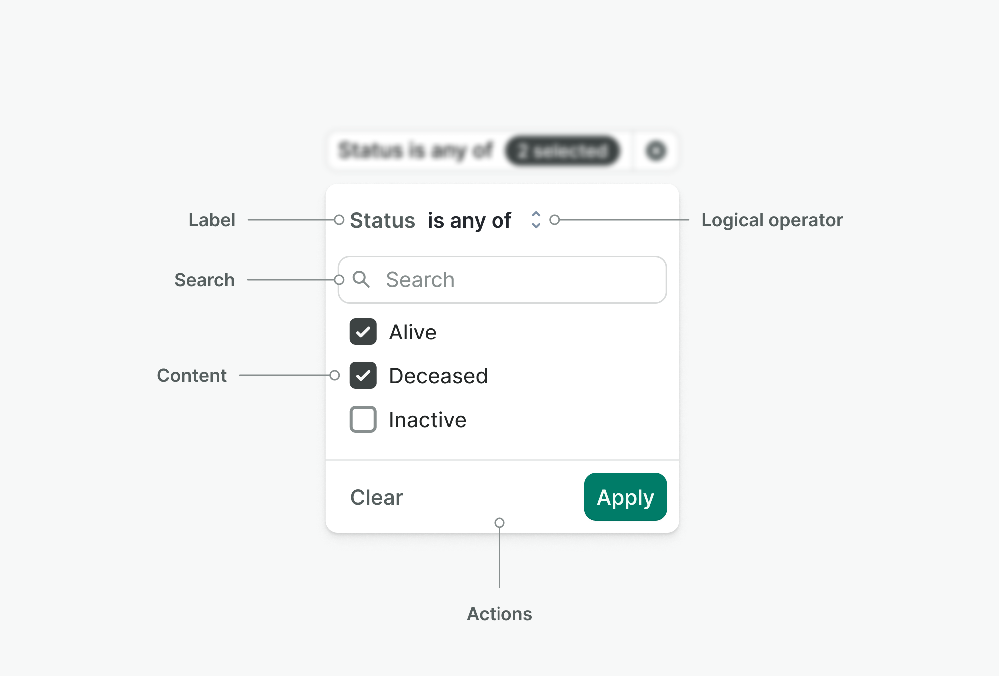
- Label – Always shows just the name of the filter (e.g. “Status”) to indicate context.
- Logical operator – Select or text element that defines how the filter will behave (e.g. “is,” “is not,” “contains”)—this clarifies how data will be included or excluded.
- Search – Optional input for filtering long lists of values inside the popover.
- Content – The actual filter UI based on type.
- Actions – Actions to apply or clear the filter value.
Types
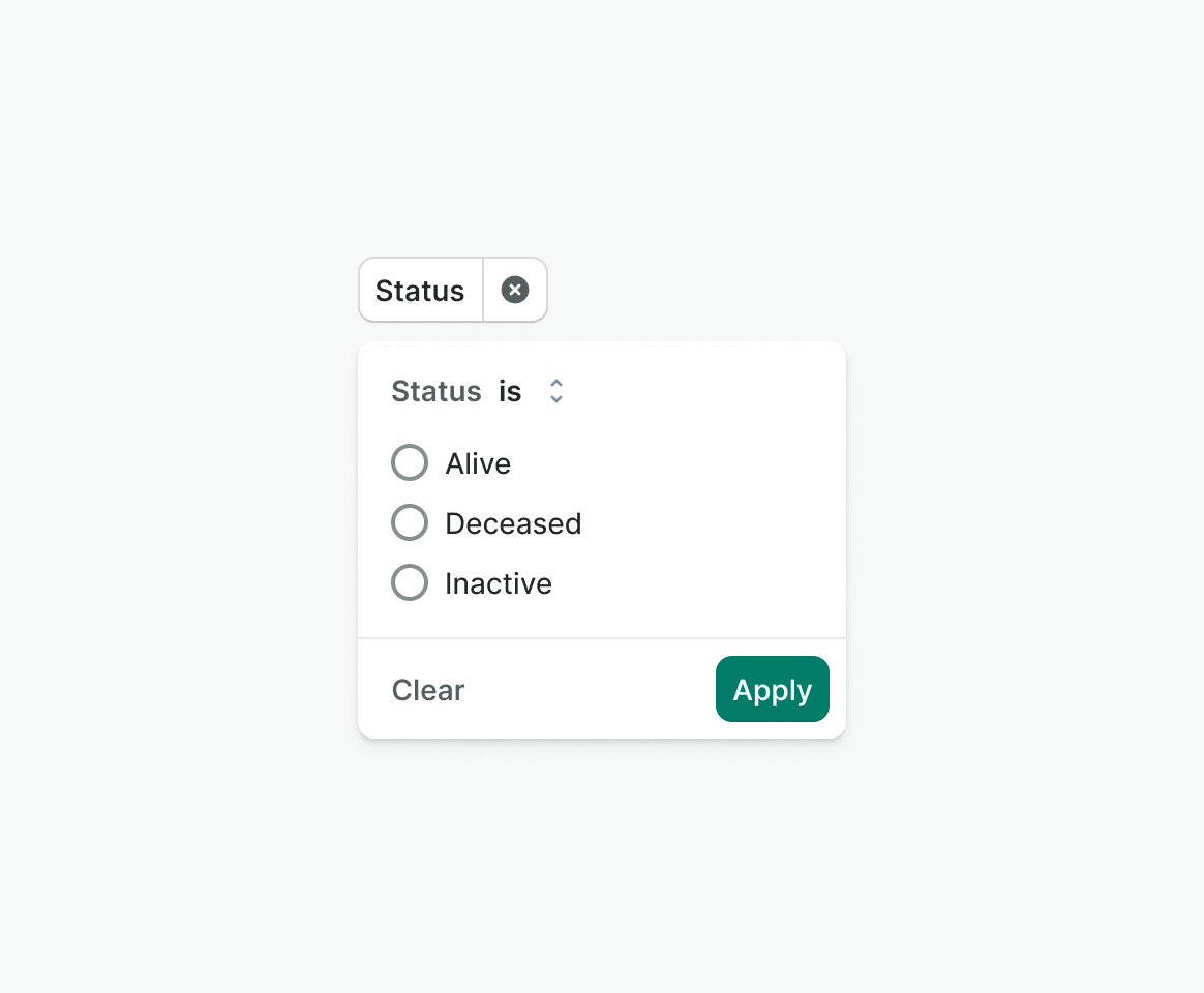
Single
Allows users to choose one value from a predefined list to use as a filter.
Multi
Allows users to select multiple values from a predefined list to filter data.
Date
Allows users to pick a date range as filter input.
Range
Lets users define a numeric range to filter by
Text
Accepts text input to be used in filtering.
Behavior
Placement
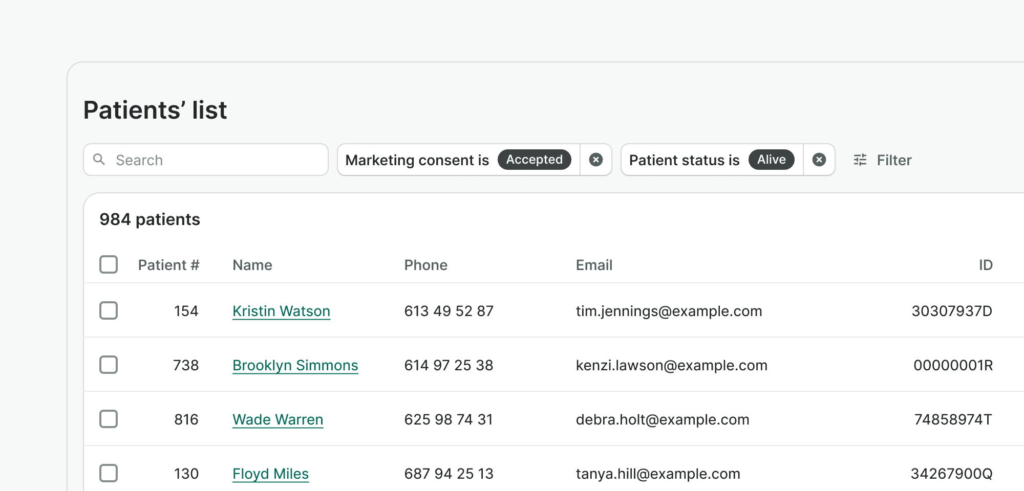
Filters should be positioned above the content they control, stacked horizontally with small gap between them. If filters overflow the available width, they should wrap to a second line to maintain responsiveness in order to avoid introducing scroll.
Applying filters
Explicit
Instant
Clearing a filter
Clicking ‘clear ‘ instantly removes the selected value, resets the filter’s internal state, and reflects the empty value immediately—no ‘Apply’ required.
Removing a filter
Removes the filter from the UI and clears all related data, including its internal value and any state associated with it.
Using logical operators
Users select a logical operator to define how the filter compares values. It updates the same way as the filter content—either instantly or on apply, based on the component’s apply mode. A default operator should always be provided. If only one operator is available, it’s displayed as plain text instead of a select menu.
Variants
Default
Default variant includes a trigger button and a popover. Clicking the trigger opens the popover, which contains the filter label, logical operator, content area, and actions. Use this variant when filters don't need to be persistently visible on the page.
Inline
Inline variant shows filter content directly on a page. Consider using this inline filters are crucial to operate current page (e.g, calendar) or when filters are presented all at once in a separate modality e.g, on mobile devices.
Best practices

Examples
Live Preview
Props
| Name | Description | Type | Default | Values |
|---|---|---|---|---|
label Required | Label for the filter. | string | ||
type Required | Type of the filter. | string | single | single, multi, text, date-range, number-range |
options | Options for the filter. | array | ||
logical-operator-options | Options for the logical operator. | array | ||
searchable | Controls whether the filter is searchable or not. | boolean | false | false, true |
apply-mode | Controls the apply mode of the filter. | string | explicit | explicit, immediate |
target | Type string or an actual DOM node where you want render component | string|object | body | |
use-teleport | When it is set to true, filter menu will teleport the content part into the target. | boolean | false | false, true |
open | Controls whether the filter is open or not. | boolean | false | false, true |
position | Controls the position of the filter menu in relation to the trigger. `bottom-left` will align it to the bottom left of the trigger. `bottom-right` will align it to the bottom right of the trigger. `top-left`and 'top-right' will align it to the top left and right respectively. | string | bottom-left | bottom-left, bottom-right, top-left, top-right |
id | Custom ID for the filter component. | String | ||
v-model model-value | Selected value of the filter. | object | ||
translations | Object with all necessary translations. | object | FILTER_TRANSLATIONS | { filterIconSearch: 'Search', filterIconRemove: 'Remove filter', filterInputPlaceholder: 'Search option', filterButtonApply: 'Apply', filterButtonClear: 'Clear', filterButtonClose: 'Close' } |
readonly | Determines whether the filter is readonly or not. | boolean | false, true | |
formatter | Controls the trigger value of the filter. | Function | ||
hide-remove-button | Controls whether to hide the remove button. | boolean | false | false, true |
hide-clear-button | Controls whether to hide the clear button. | boolean | false | false, true |
Slots
| Name | Description |
|---|---|
default | Default content slot |
Events
| Name | Description | Type |
|---|---|---|
update:modelValue | Emits when the filter value is updated (temporary, before apply) | { "names": [ "object" ] } |
open | Emits the event after the click | { "names": [ "Event" ] } |
close | Emits the event after the click | { "names": [ "Event" ] } |
remove | Emits when the filter is removed | { "names": [ "Event" ] } |
clear | Emits when the filter is cleared | { "names": [ "Event" ] } |
apply | Emits when the filter is applied | { "names": [ "object" ] } |
change | Emits when the filter value changes (for v-model compatibility) | { "names": [ "object" ] } |