Usage
Badges are used to inform of the status of an element or an action that has been taken.
Badges with icon
- Type of icon can be customized for Neutral and Accent types
- Semantic types can only include an icon that represents the semantic meaning.
Best practices
Do
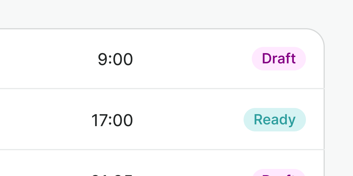
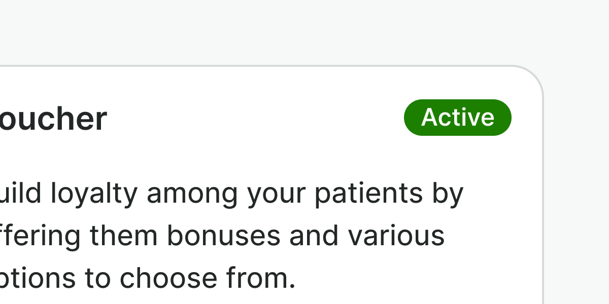
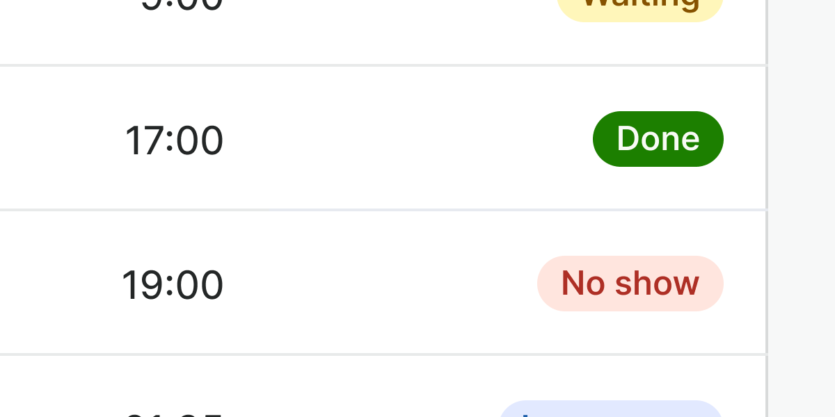
Use badges to show the status of an interface element. Ensure the label clearly implies the sentiment, so color is not the only status indicator.
Don't
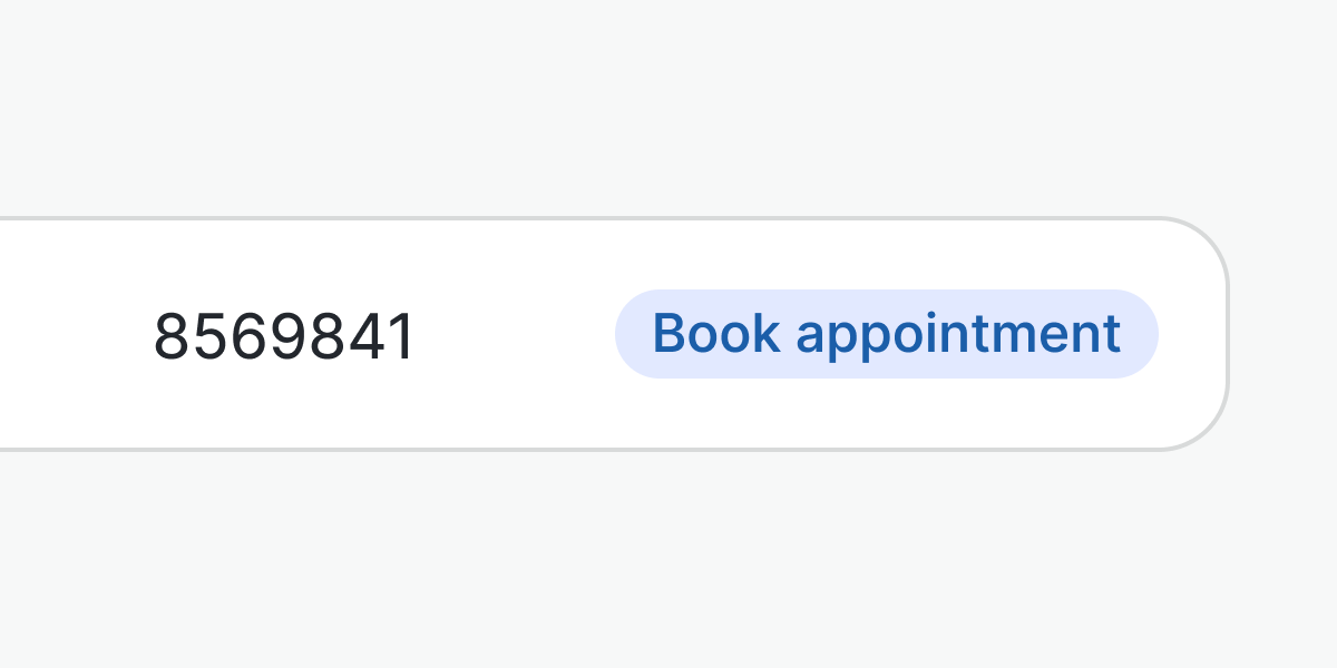
Do not use badges to portray actions, use buttons instead.
Do
Place the badge close to the element that is related to it.
Don't
Do not use alternative color codes to the types provided.
Do
Use the inverted version of the badge to highlight it or draw attention to crucial statuses in the interface.
Don't
Do not mix inverted and non-inverted badges when used to portray statuses in the same context.
Don't
Do not be wordy. Use a simpler and scannable term instead. For example: “New”.
Examples
Live Preview
Props
| Name | Description | Type | Default | Values |
|---|---|---|---|---|
type | Types represent a semantic context that badge can be used for. | string | neutral | neutral | neutral-inverted | info | info-inverted | success | success-inverted | warning | warning-inverted | danger | danger-inverted |
icon | Icon name for neutral, accent and info (and their inverted types) type only. Default icon for other types. | string, boolean |
Slots
| Name | Description |
|---|---|
default | Default content slot |