Usage
Combobox is an autocomplete input that allows users to filter and select one or more values from a list of options.
Best practices
Use labels to describe what the data in the combobox is all about.
Do not omit the label, or use a placeholder as a label. The label should be always visible to the user.
Use combobox for single selection in forms where the list of options is long and filtering options benefits the user.
Avoid using it for short and simple lists of options that do not require filtering. Use the Select instead.
Use combobox for multi-selection in forms.
Don't use combobox for actions and filtering purposes e.g. table filters. Use the Popover instead.
Anatomy
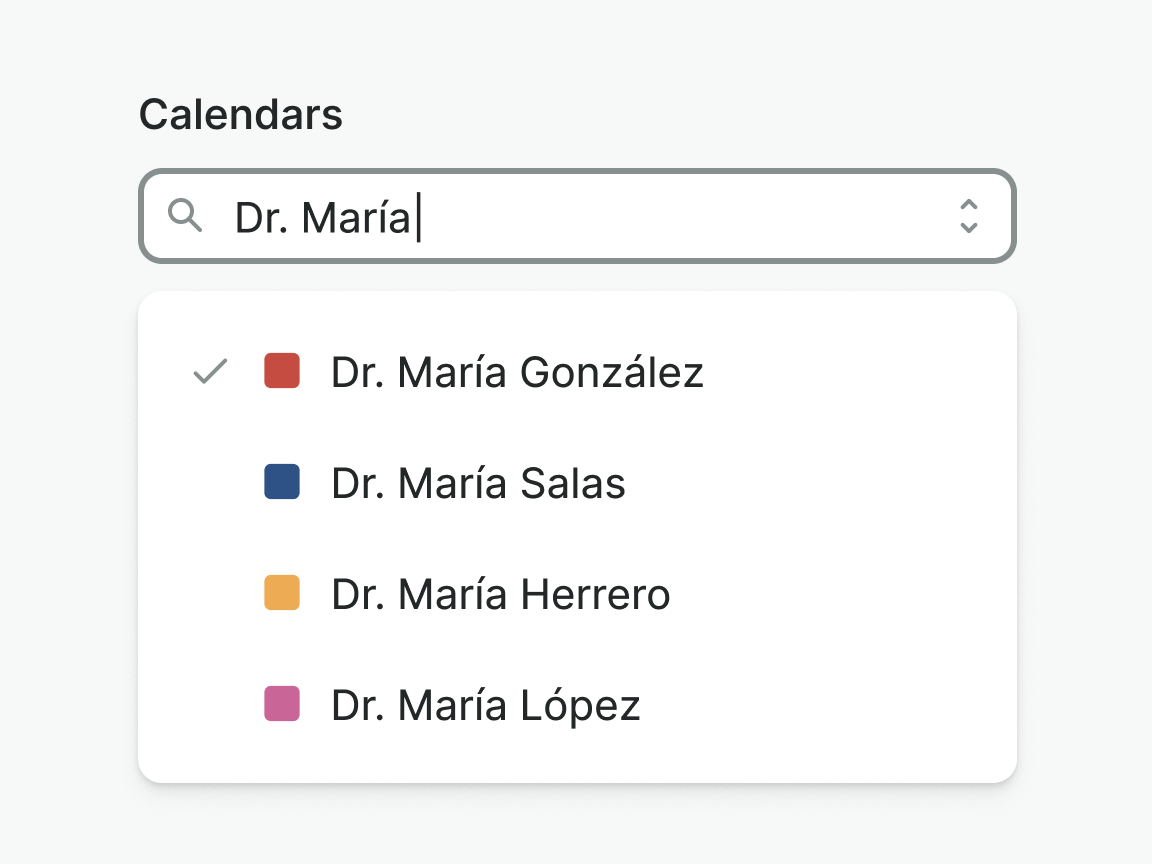
Single-select
Leading and trailing icons are placed at the start or end of the dropdown item and, as the icons that are placed in buttons, they should be used consciously.
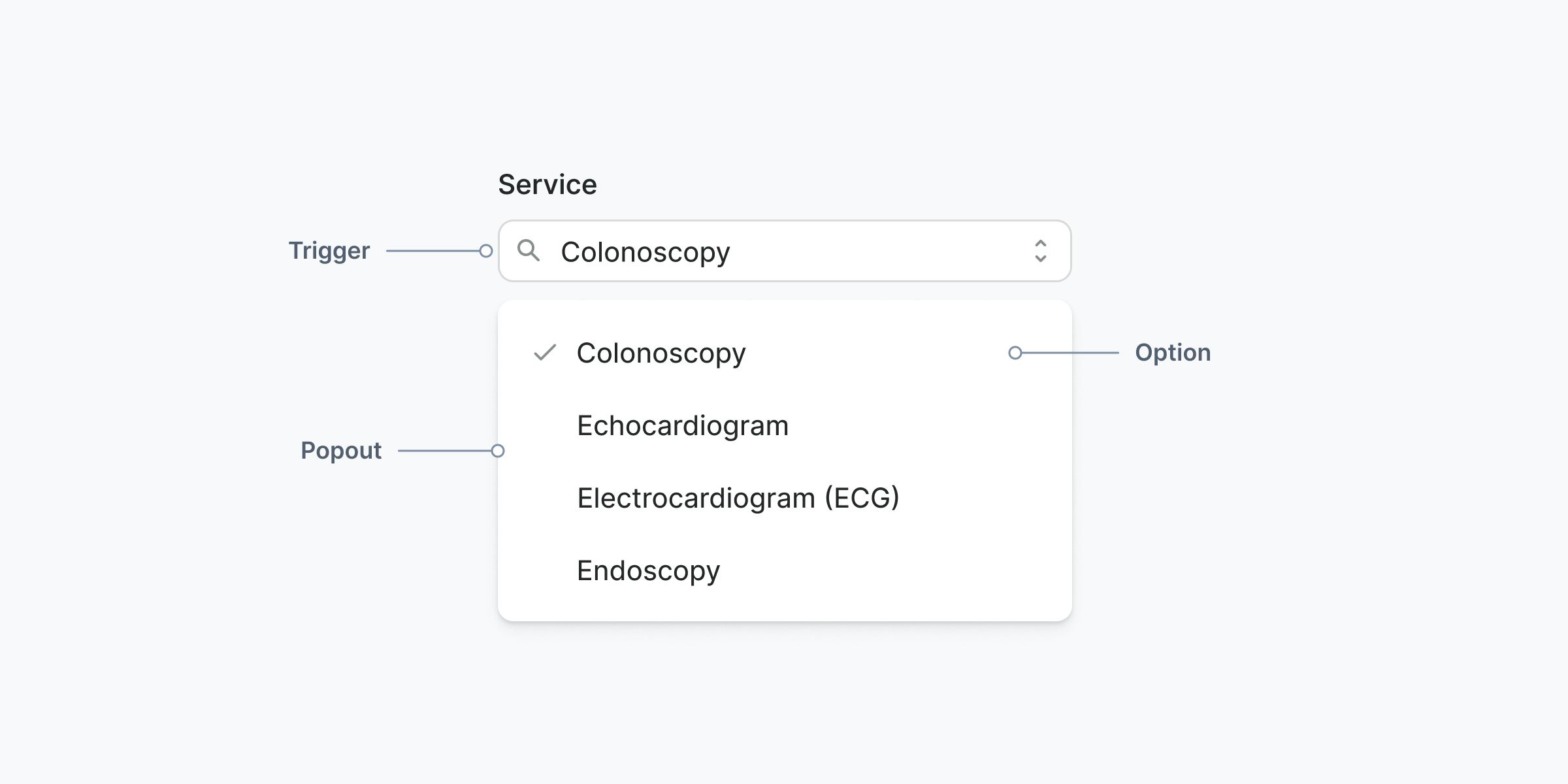
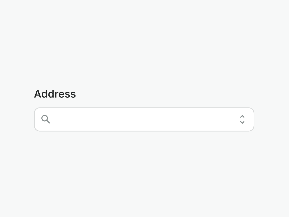
Trigger
Text input that opens the combobox popout when clicked, displaying the available options.
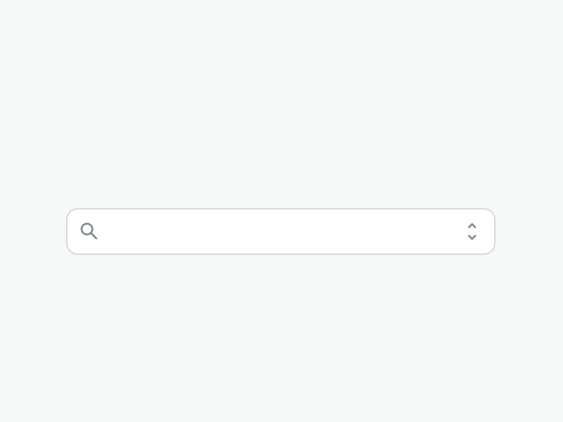
Popout
Container that holds available options.
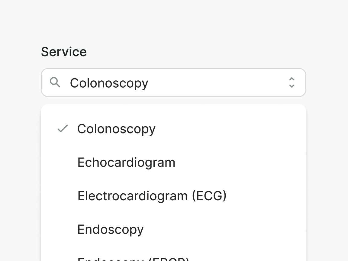
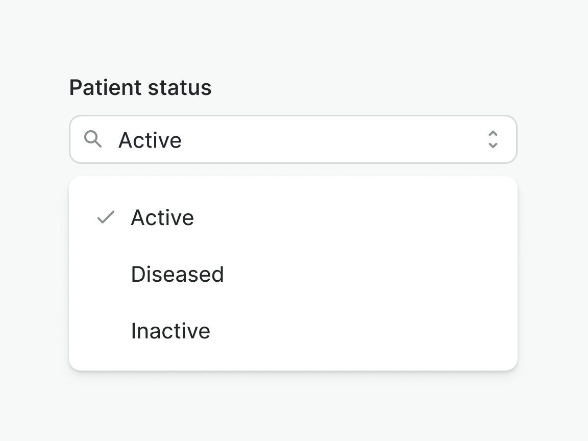
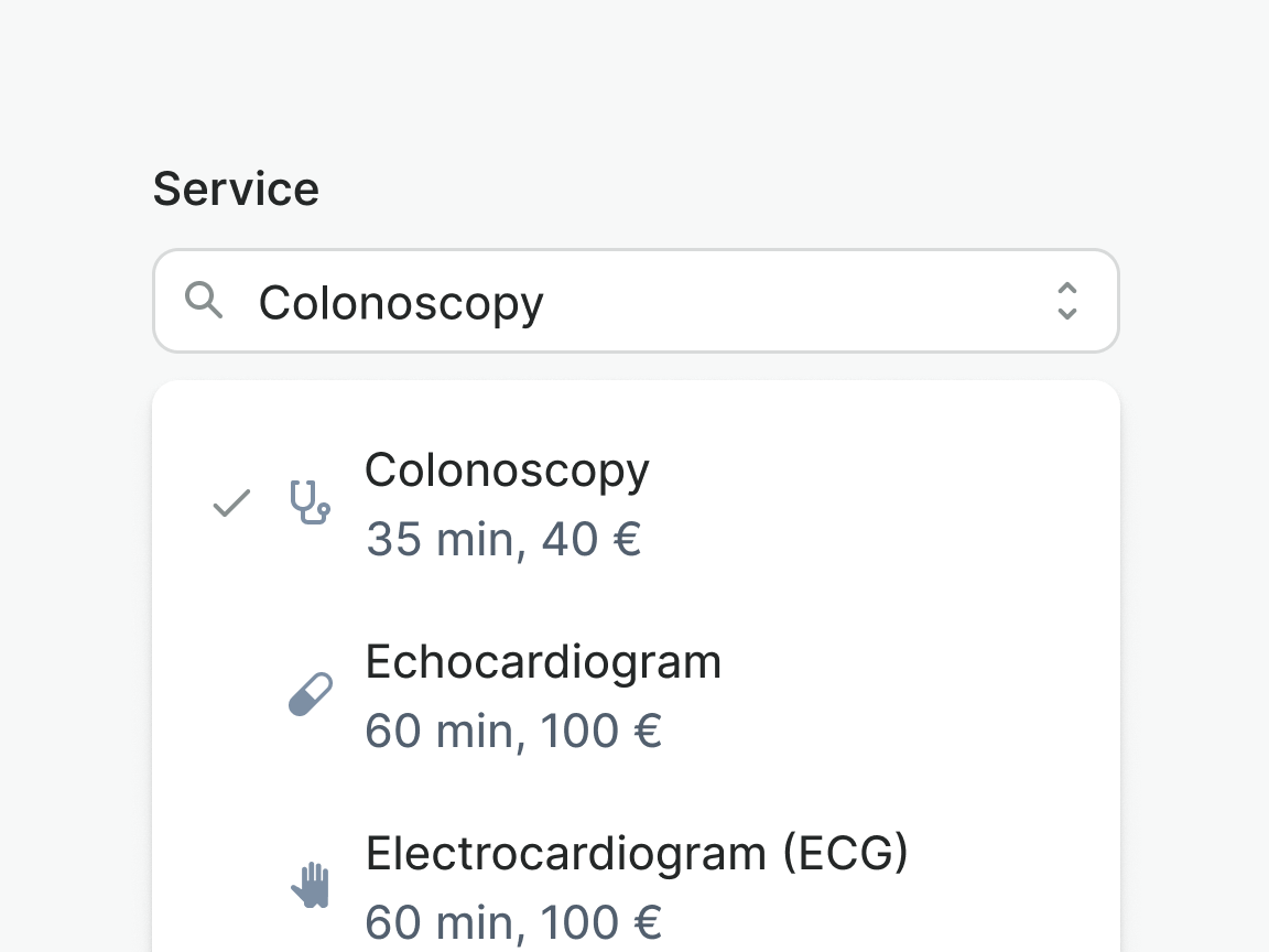
Option
Item that can be selected by the user. Selection is indicated by check icon placed on the left. Option can be extended with complementary content.
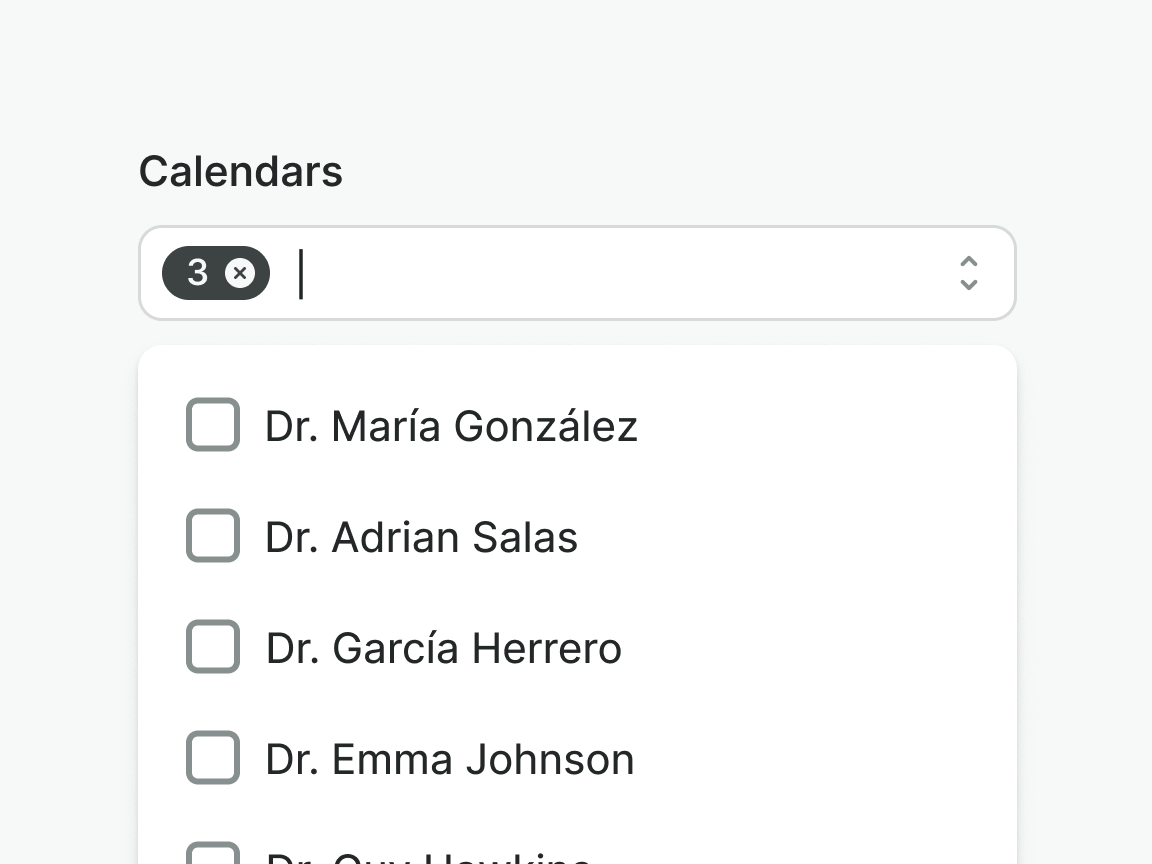
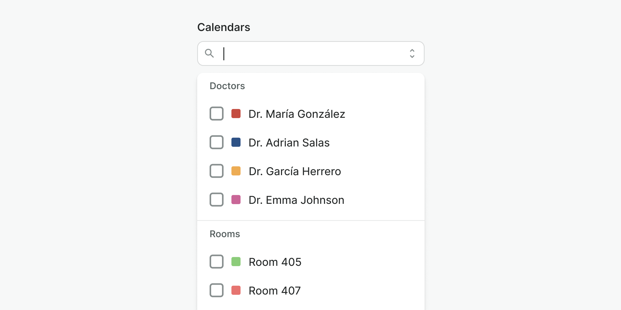
Multi-select
Leading and trailing icons are placed at the start or end of the dropdown item and, as the icons that are placed in buttons, they should be used consciously.
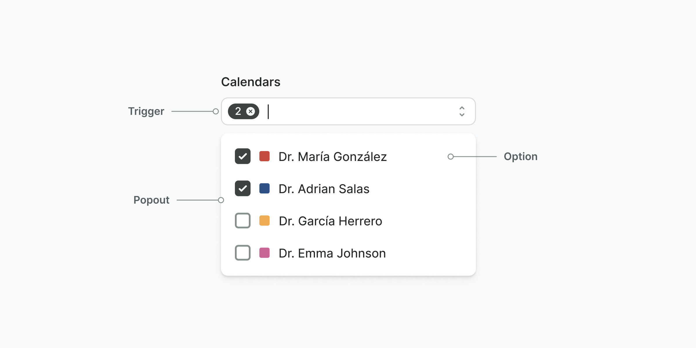
Trigger
Text input that opens the combobox popout when clicked, displaying the available options. The trigger includes a badge that shows the total number of selected options.
Popout
Container that holds available options.
Option
Item that can be selected by the user. Unlike a single-selection combobox, options in this case include a checkbox instead of an icon. This helps users clearly understand that they can select multiple items.
Grouping
Combobox support section dividers and headers for grouping options and adding clarity.
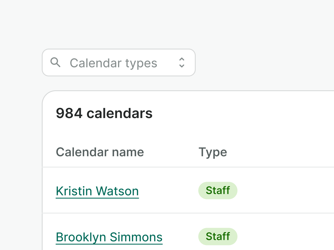
Options
Options can include a prefix icon and description, in addition to the label. These provide users with extra information to help them choose the right option.
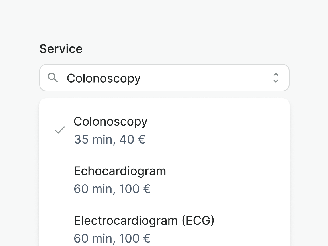
Use supplementary content if it helps users make a decision.
Do not use supplementary content for decorative purposes.
Use icons consistently for all options to ensure proper layout and easy scanning.
Examples
Live Preview
Props
| Name | Description | Type | Default | Values |
|---|---|---|---|---|
trigger-type | Determines whether the combobox is triggering on click or input typing. | string | click | click, input |
multiselect | Determines whether the combobox is multiselect or not. | boolean | false, true | |
loading | Determines whether the combobox is loading or not. | Boolean | false, true | |
error | Optional error message to be shown under the combobox field. | string,boolean | ||
hint | Optional text about the expected combobox. | string | ||
label | The label for the combobox field. | string | ||
placeholder | Placeholder text to display within the combobox field. | string | ||
required | Determines whether the combobox is required or not. | boolean | false, true | |
target | Type string or an actual DOM node where you want render component | string|object | body | |
use-teleport | When it is set to true, combobox menu will teleport the content part into the target. | boolean | false | false, true |
open | Controls whether the dropdown is open or not. | boolean | false | false, true |
position | Controls the position of the dropdown menu in relation to the trigger. `bottom-left` will align it to the bottom left of the trigger. `bottom-right` will align it to the bottom right of the trigger. `top-left`and 'top-right' will align it to the top left and right respectively. | string | bottom-left | bottom-left, bottom-right, top-left, top-right |
items | Controls the number of dropdown items and dropdown groups to display. | array | [{ heading: string, items: array [ { title: string, trailingIcon: string, leadingIcon: string, href: string, to: string, value: string | number } ], hideDivider: boolean }] | |
v-model model-value | Selection of the combobox. Accepts an array of item objects. For single selection, pass in an array of one object. | array | [{ title: string, value: string }] | |
translations | Object with all necessary translations. | object | { triggerIconSearch: 'Search', triggerRemoveSelectedItems: 'Remove selected items', triggerIconToggle: 'Toggle', itemIconCheck: 'Item selected', messageResultsNotFound: 'No results found' } | { triggerIconSearch: string, triggerRemoveSelectedItems: string, triggerIconToggle: string, itemIconCheck: string, messageResultsNotFound: string} |
readonly | Determines whether the combobox is readonly or not. | boolean | false, true | |
filter-fn | Custom function to filter combobox items. | Function | getComboboxItemsFiltered |
Events
| Name | Description | Type |
|---|---|---|
input | { "names": [ "undefined" ] } | |
item-click | This event is emitted when the combobox item is clicked. | { "names": [ "Event, Object<string, string>" ] } |
v-model update:modelValue | This event is emitted when the combobox selection is changed. | { "names": [ "Array" ] } |
Slots
| Name | Description |
|---|---|
hint | Use it to provide rich content for input hint. Takes precedence over hint property. |