Onboarding
Onboarding refers to the process of guiding users through the initial setup and familiarisation with a new feature or significant change in our products.
When to onboard
- When we want to drive the adoption of a new feature with high business value, and we need to explain how it works.
- When we make substantial changes to the interface, and it is worth diverting users from their current workflow.
Things that usually fit this description are big and make a noticeable difference. For example, it could be adding new pages to settings or introducing a brand-new technology or capability.
Bring awarness
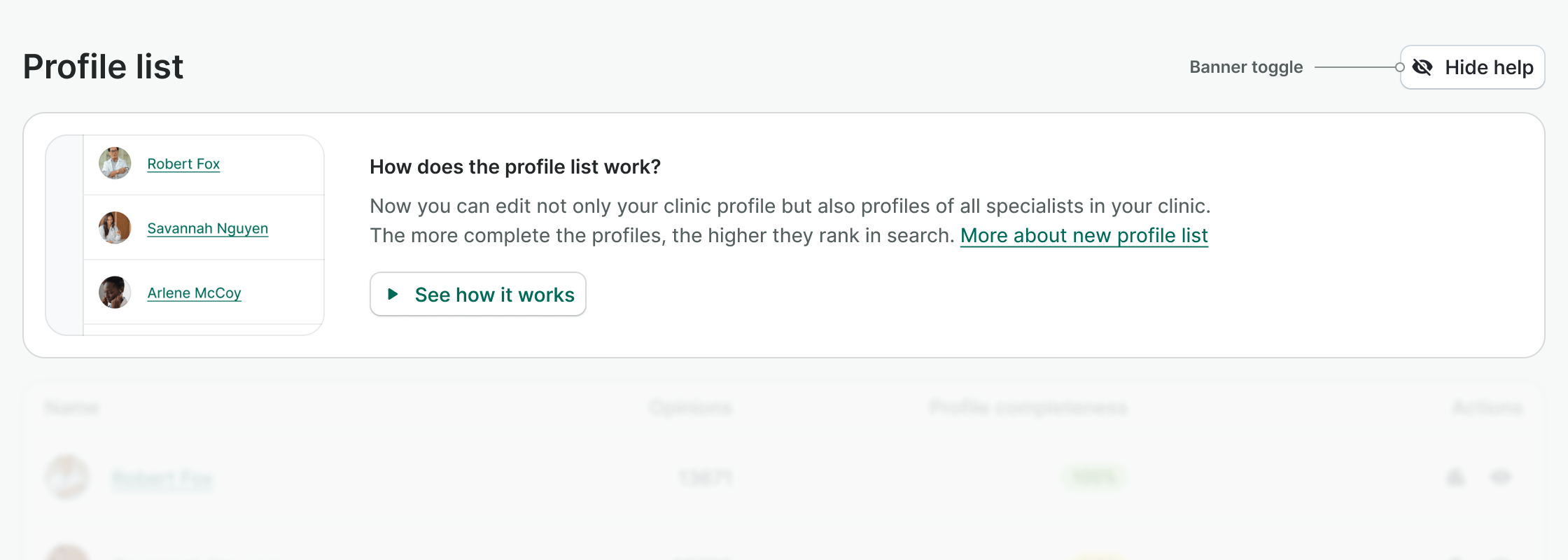
We use a banner that can be hidden or shown as desired to highlight these changes or new features we've mentioned before.


Content
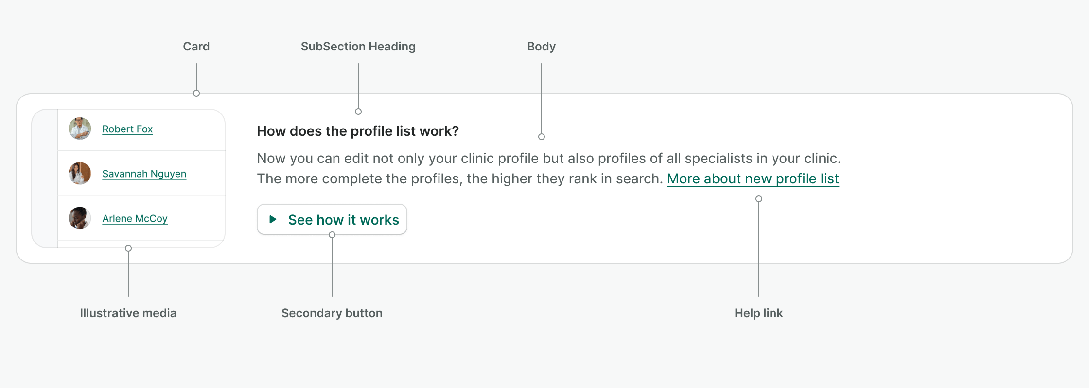
- Illustrative media: showing the most important function of the feature or the trigger in the interface. Hide it on mobile to make better use of the available space.
- SubSection Heading: keep it short. Use How does X work?.
- Body: try to answer what you can do with the new feature, how it solves an existing problem or meets an existing need, or highlight any upselling opportunities. Stick to SMS length, around 160 characters.
- Help link: this is an optional inline link that can extend the information about the feature. Use More about X.
- Secondary button: use See how it works button to start the onboarding.
Provide guidance
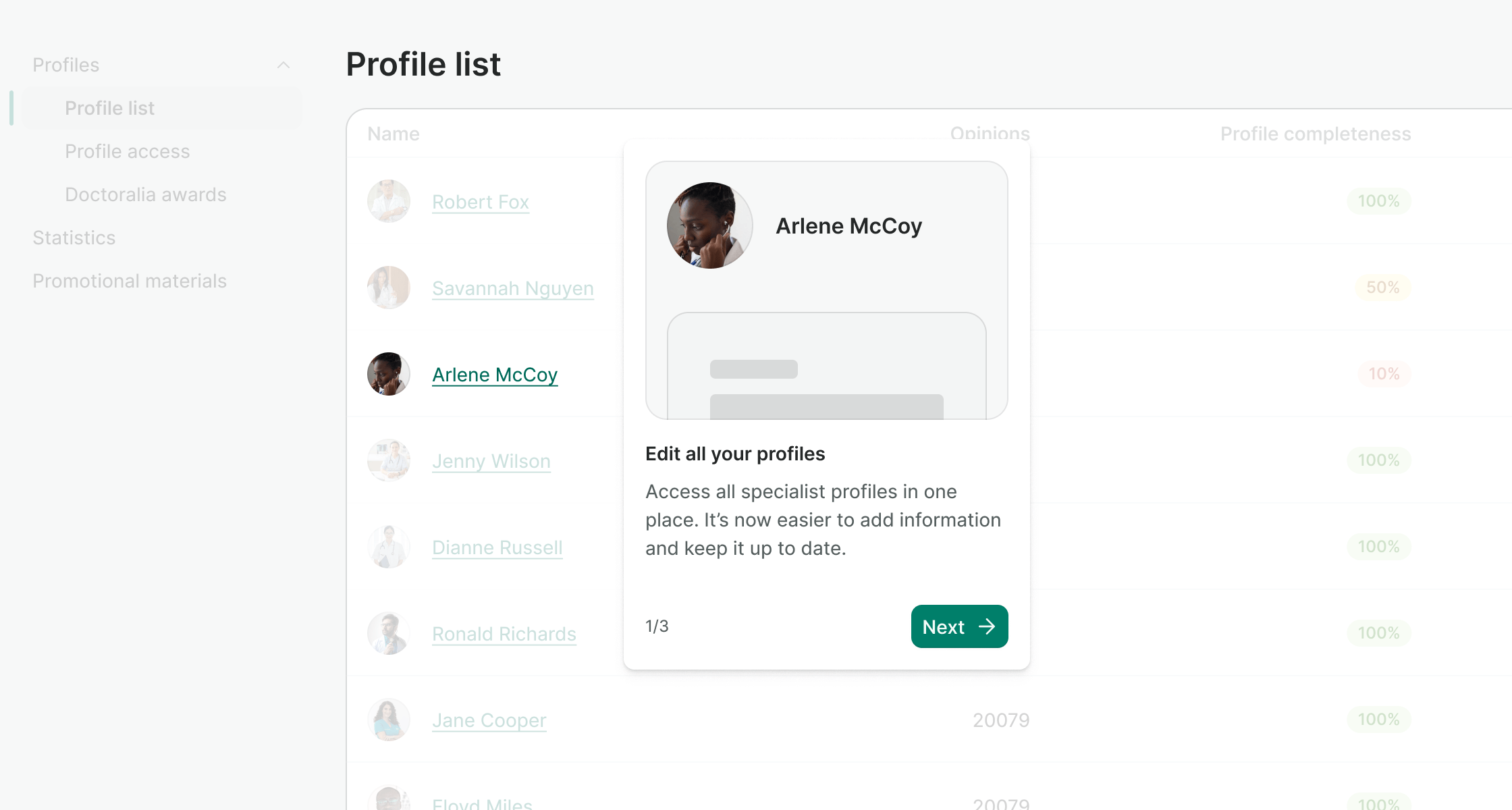
Once the user clicks on the banner button to see how it works, we trigger contextual popovers with interactive guides that explain where to find the new features or how the interface has changed.


Content
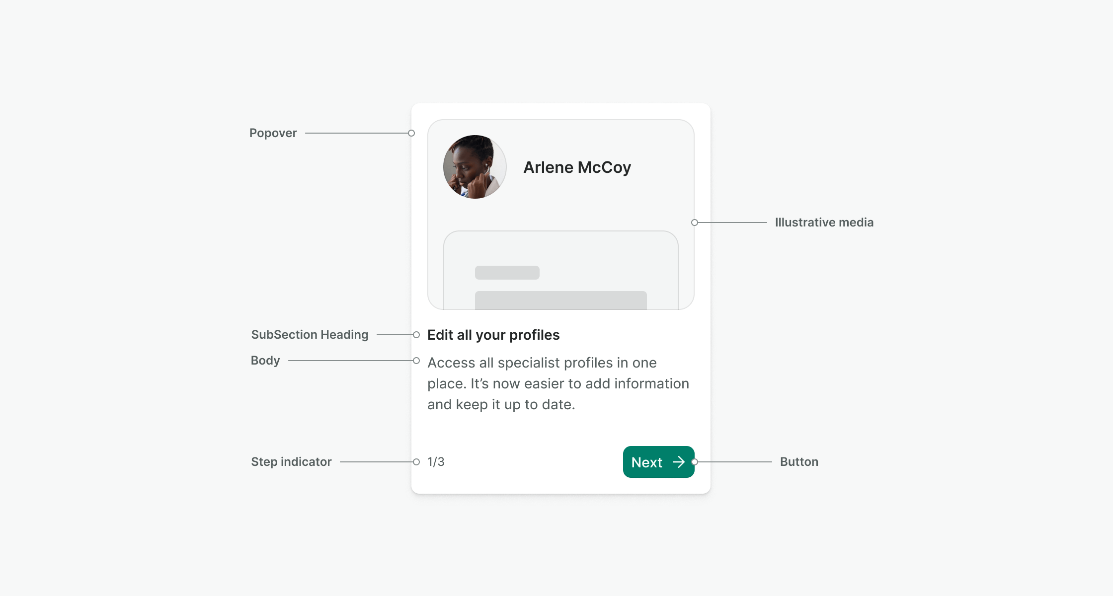
- Illustrative media: shows the consequence of interacting with the highlighted interface component. (e.g. clicking on a name link drives you to the profile page, so you should portray that).
- SubSection Heading: it must be direct, starting with a verb, a CTA (e.g. Get, Select, See).
- Body: explain the feature and its benefits. Stick to SMS length, around 160 characters.
- Step indicator: use a fraction number (e.g. 1/3, 2/3, 3/3).
- Button: use Next for all steps and a CTA for the last one (e.g. Try it in action).
Videos or images
Since introducing some new features or interface changes can always be challenging and the available space is pretty scarce, make sure your videos or images are:
- Simple and clear: use clean and minimalistic images focusing on the feature being explained.
- Consistent in style: by using the interface as a reference and to create a cohesive and professional look throughout the whole onboarding process.
- Action-oriented: Choose images that directly represent the action the user needs to take, like tapping a button or completing a form, to guide them through the steps intuitively.