Depth refers to the layers, hierarchy, and spatial relationships within a digital interface. Setting up proper depth helps us create a more intuitive experience by mimicking the physical world. In Watson, we use z-index, surfaces, and shadows to generate this depth.
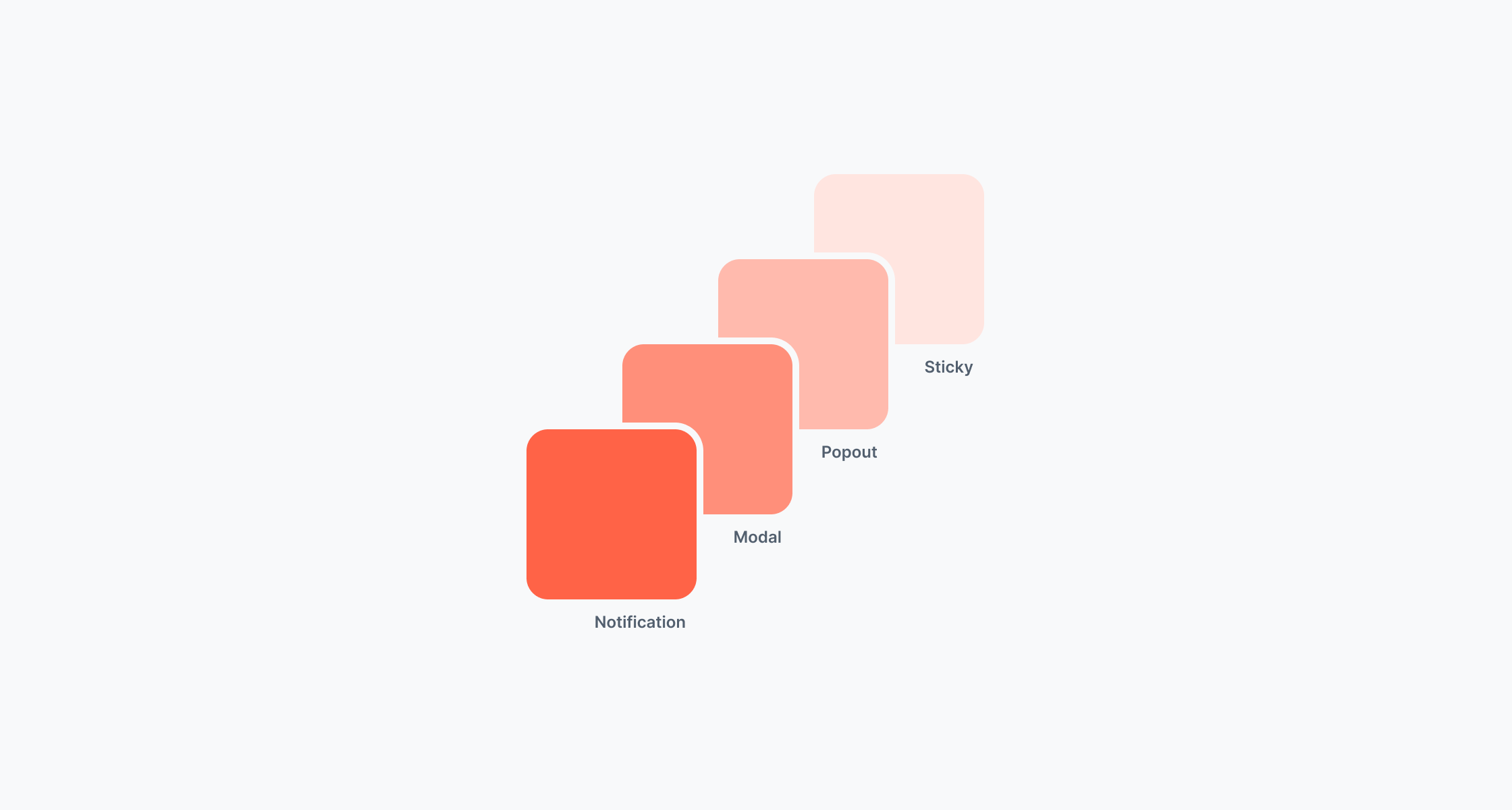
The z-index controls the vertical stacking order of elements on the z-axis. It determines which elements appear in front of or behind others when they overlap. With Watson, we provide a comprehensive z-index token scale that helps you position elements intuitively.
Sticky (300)
It is meant for elements that should stick to the page's viewport.
Popout (600)
Use it for elements that pop out on the screen and cover other elements i.e. dropdown menu, popover, tooltip.
Modal (900)
Use it for elements that open a new modality for the user and completely cover the initial window i.e. modal dialog.
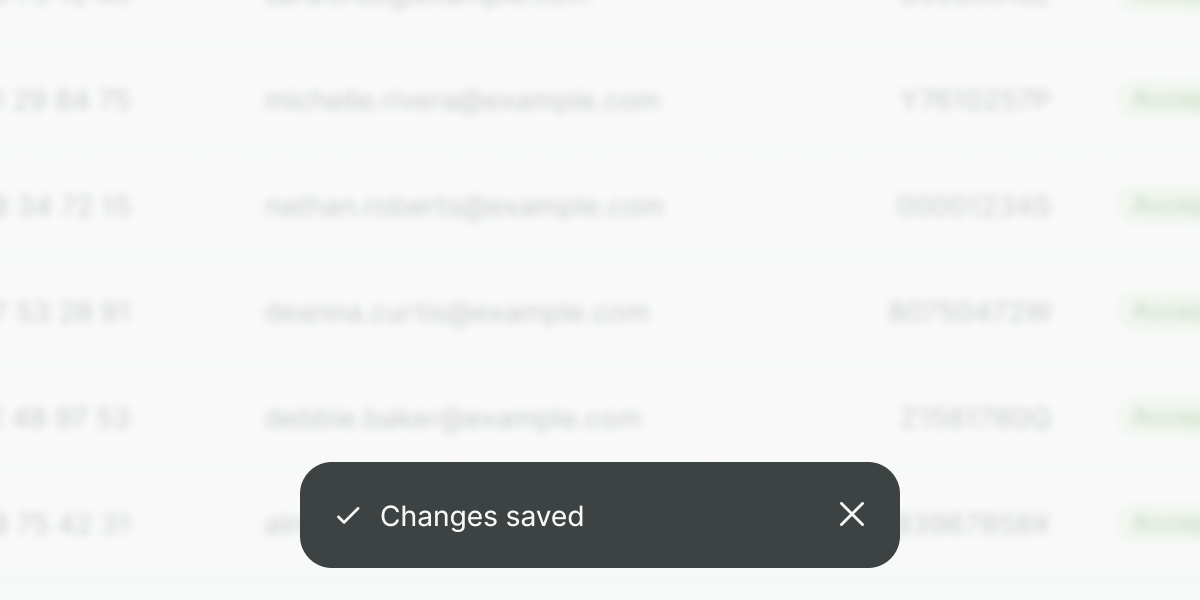
Notification (1000)
It is meant for system notifications that should provide feedback to users i.e. toast messages.
Make your components fit the current scale to avoid confusion or overlaps with other components.
Don't
Do not override our values without a strong reason. Avoid setting up random values as this could cause unpredictable stacking issues that may destroy hierarchy.
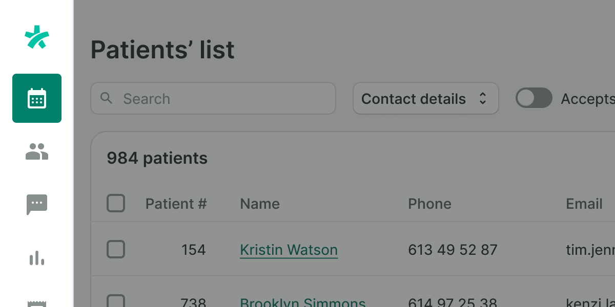
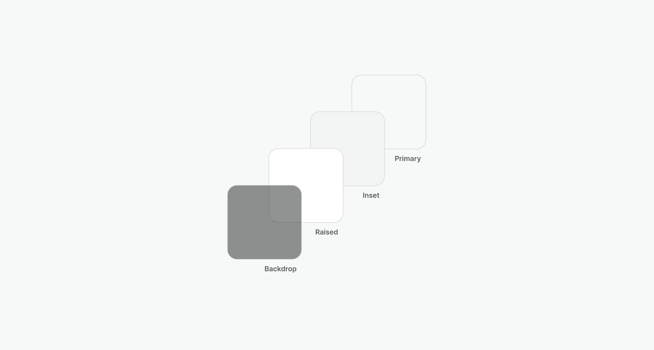
Use a backdrop for modal windows to distinguish them from the layer underneath.
Don't
Do not use a backdrop when there’s no need for a separate modality, that means there’s no need for blocking the rest of the interface.
Do
Keep raised as the most used surface, to level up components like tables, lists, or even text-only content.
Don't
Avoid nesting surfaces of the same type. Use other visual resources like a different surface type, a divider, or ultimately, splitting the information.
Do
Use inset when displaying forms or any type of editable data, so the user can better focus on completing the task. There are exceptions to this rule, for instance, the wizard, as it is the only surface in place.
Don't
Do not use unique effects like inner shadows to differentiate surfaces. Use dividers, and different cards, or prioritize other visual resources first.
Do
Use primary to de-emphasize content inside a card, modal, or as the screen or component background directly.
Don't
Do not use any other background color to highlight or emphasize content. This creates a noisy interface and distracts from the main content.
We also use shadows together with the previously mentioned concepts to empower depth and clearly show the hierarchy of elements. These shadows give the illusion that the element is raised above the rest, showing that it is interactive and important. Without the item being placed on the proper surface and without the proper z-index, shadows by itself do not ensure good layering.
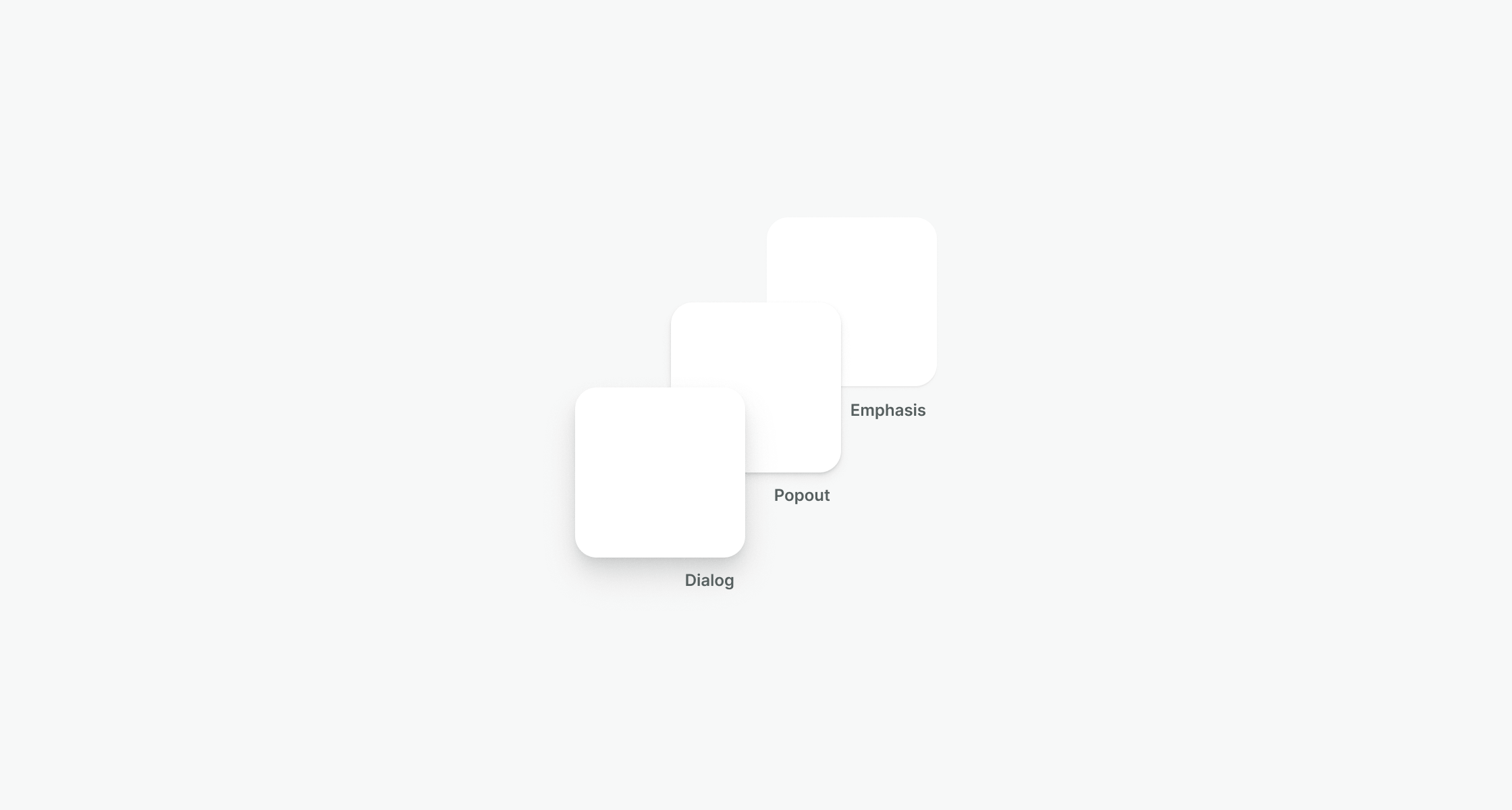
Use the emphasis shadow for static elements on the page that need a bit more intensity.
Don't
Do not overuse shadows adding unnecessary effects to an element. Use shadows to convey interactivity and importance instead.
Do
Use the popout shadow for elements such as tooltips, popovers, toasts, and dropdowns.
Don't
Avoid using shadows to differentiate sections within the same surface level. Try to combine surfaces or other visual techniques like dividers or borders to create that separation.
Do
Use the dialog shadow for big elements that affect the whole view and need focus such as modal dialogs.
Don't
Do not rely exclusively on shadows. Use a combination of z-index, surfaces, and shadows to ensure your design is accessible.