Usage
The select component allows users to choose one item from a menu of options. It is generally used in forms to submit data.
Best practices
Use select to let a user choose a single item from an options menu.

In a form, do not use select if you have fewer than 2-3 options. Consider using the radio component instead if you have enough space.
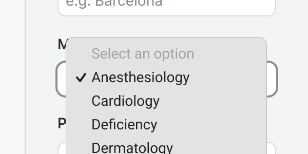
Sort the menu of options based on the frequency of use. In a form, alternative sorts such as alphabetical may be more fitting.
Labels
Labels indicate what type of data the field needs. Having labels present gives us two major advantages:
- They are programmatically associated with the field, which means assistive technologies will read them when the user focuses on them.
- When the user click/tap on the label, the browser passes the focus to the field, which makes it easier for touch screens, and users with motor disabilities.
Important note
Labels should always be present, unless for those cases where the context and elements that surround the select make it
clear what the purpose is (e.g. sorting or filtering). In those cases, make sure an ariaLabel is used.

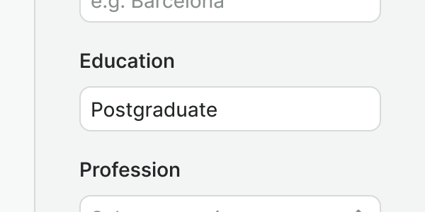
Use labels to describe what the data in the select field is all about.

Do not place a label within the select component, labels must always be above the select field.
Placeholders
Use placeholders in select fields to let the user know the action that they need to perform (generally: "Select an option"). They can never be a substitute for the label or hint because they do not meet a strong contrast ratio.

Use a placeholder whenever there's no logical default option to pre-select.
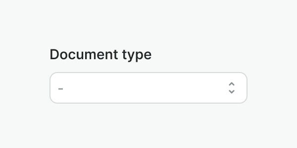
Do not leave the select field empty. Have a default option pre-selected whenever possible, or a placeholder instead.
Hint & errors
Hints and error messages provide additional directions to support the label meaning in an accessible manner.

Use hints to provide useful information about the required select field.
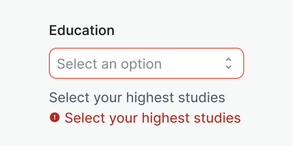
Do not duplicate information, if an error message is repeating the hint, hide the hint.
Examples
Live Preview
Props
| Name | Description | Type | Default | Values |
|---|---|---|---|---|
v-model model-value v2, wc value v1 | string|number | null | ||
options | List of options displayed | array | ||
hint | Text displayed under the label with additional information | string | ||
label | Label of the input element | string | ||
required | Determines whether the input is required or not. | boolean | ||
placeholder | Placeholder text to display within the select field. | string | ||
name | Default name for the select. | string | ||
disabled | Disable the select component. | boolean | ||
error | Optional error message to be shown under the select field | string|boolean | ||
aria-label | Identifies select fields when a visual label is not present | string |
Events
| Name | Description | Type |
|---|---|---|
v-model update:modelValue v2, wc change v1 | Emits the input value selected | { "names": [ "String" ] } |
on-blur | Emits the event when it is blurred | { "names": [ "Event" ] } |
on-focus | Emits the event when it is focused | { "names": [ "Event" ] } |
on-change | Emits the value selected | { "names": [ "String" ] } |
Slots
| Name | Description |
|---|---|
hint | Use it to provide rich content for input hint. Takes precedence over hint property. |