Usage
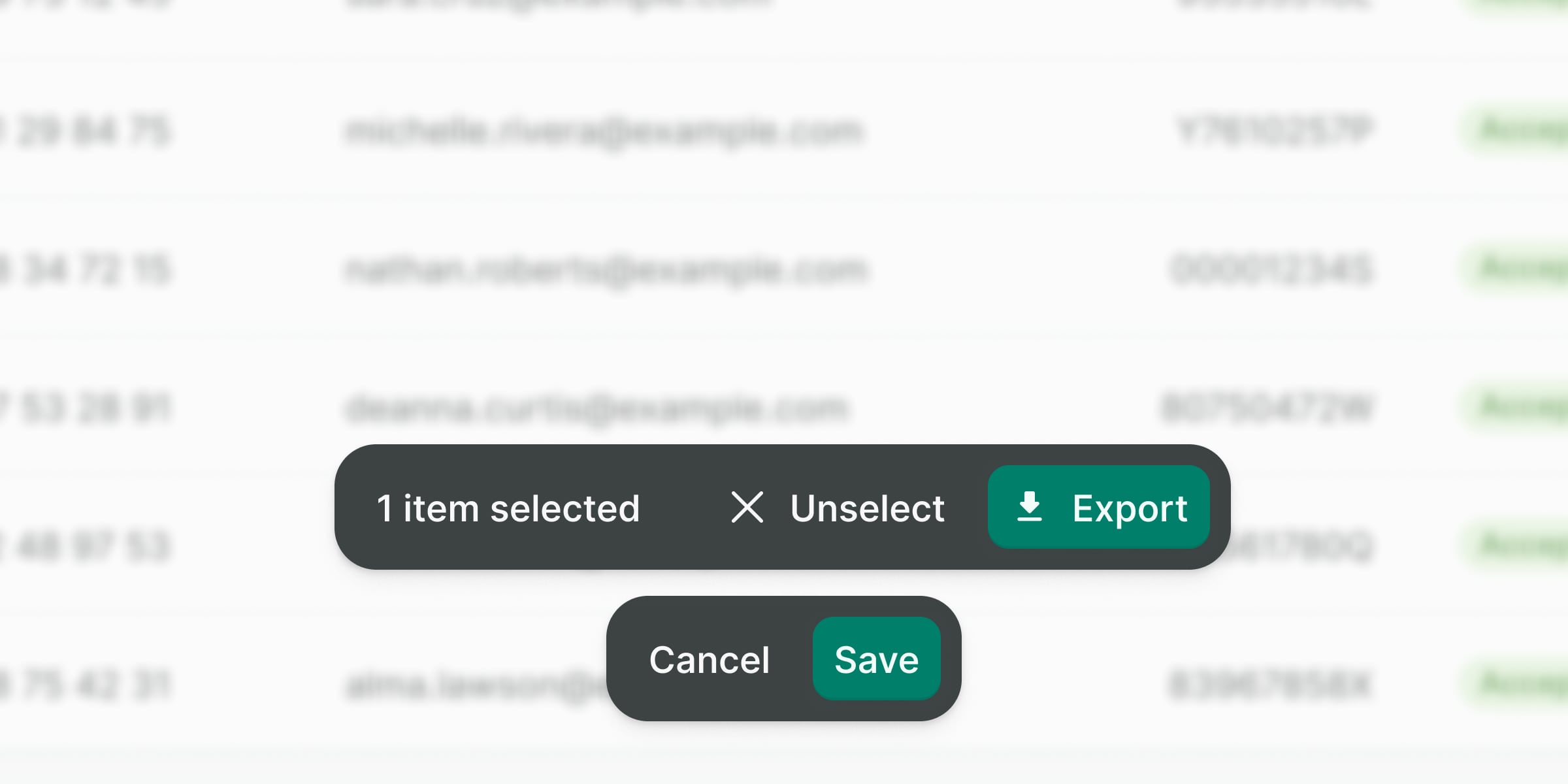
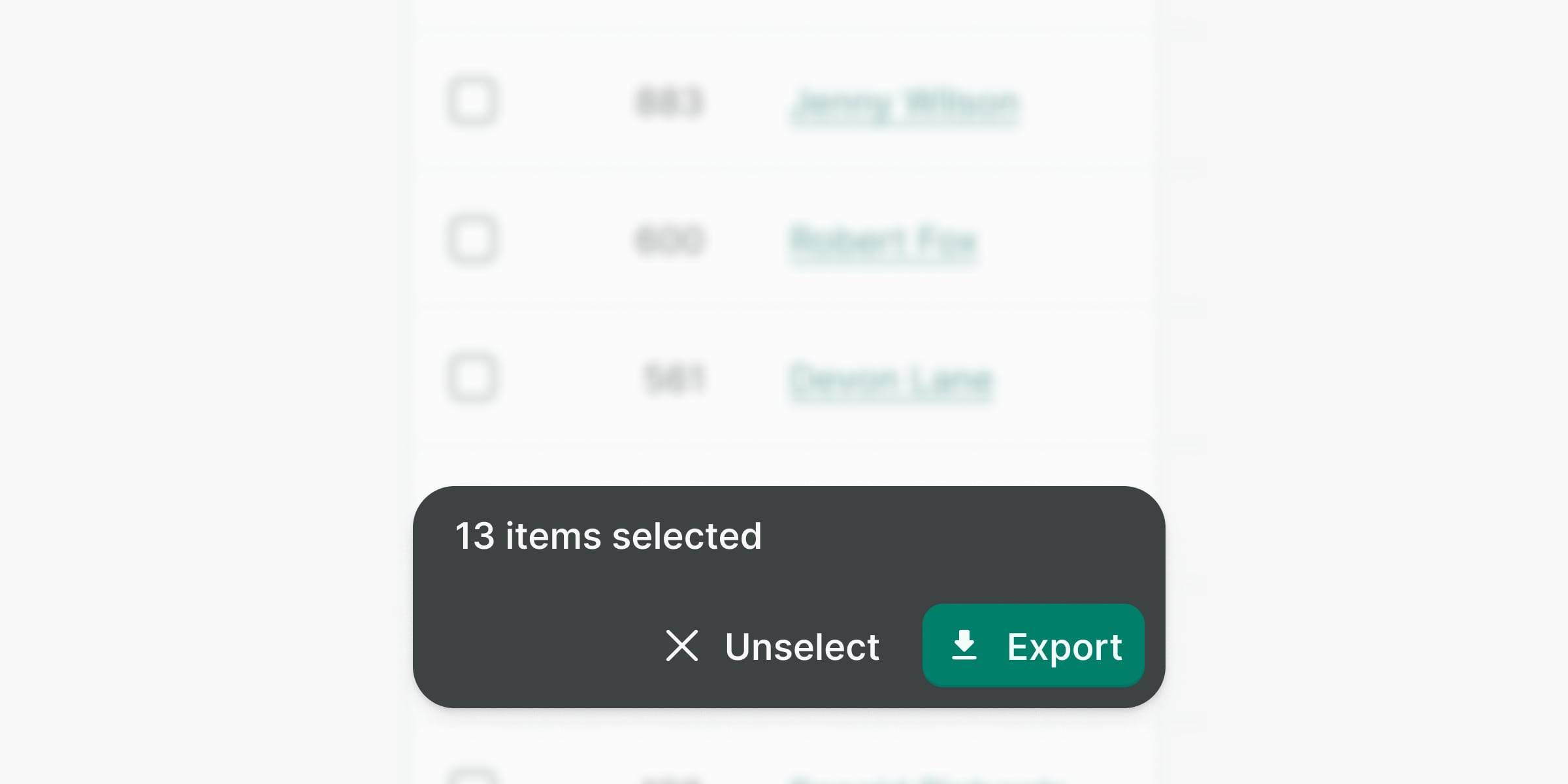
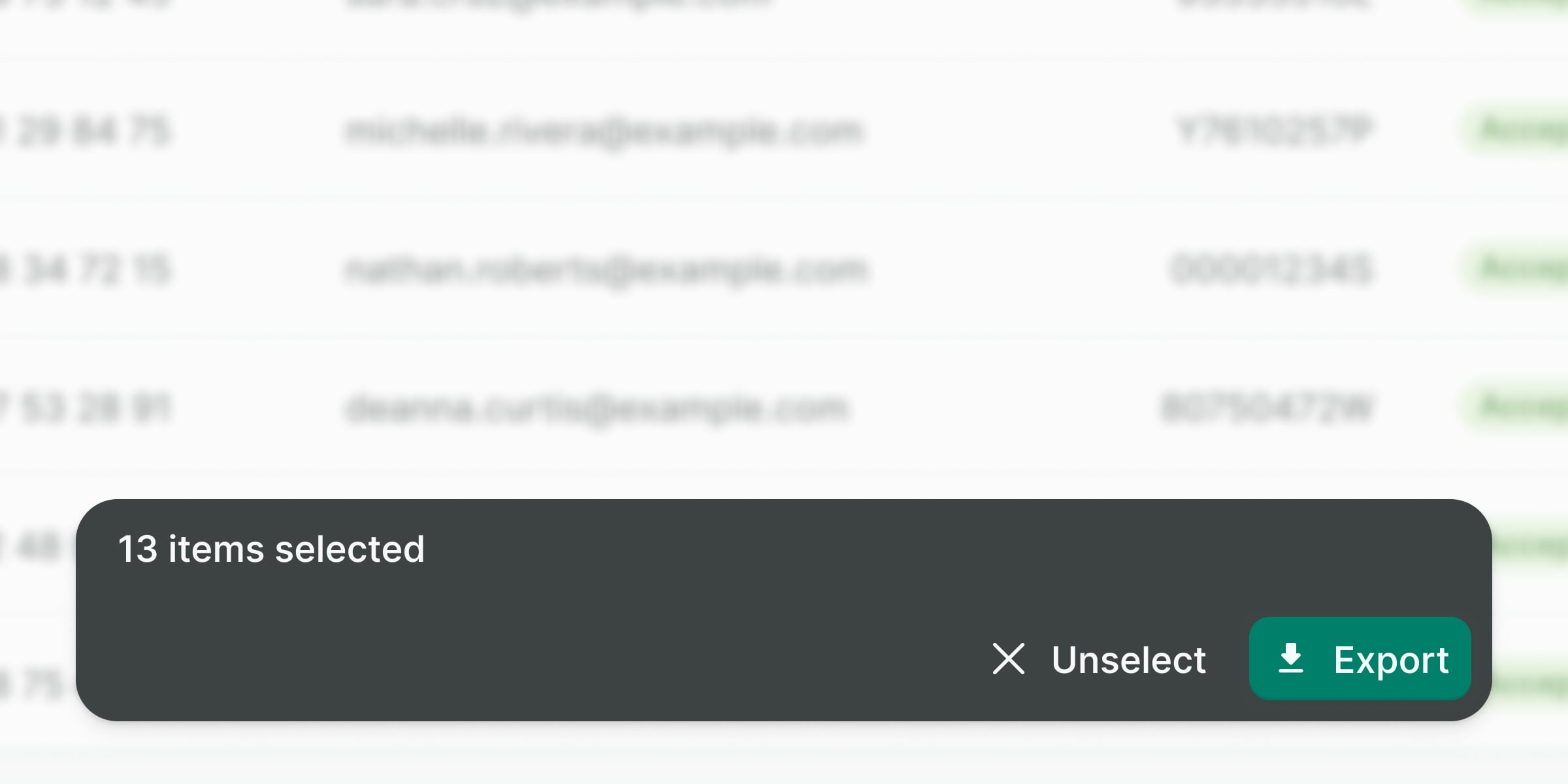
The action bar facilitates performing actions on one or multiple items simultaneously.
Best practices
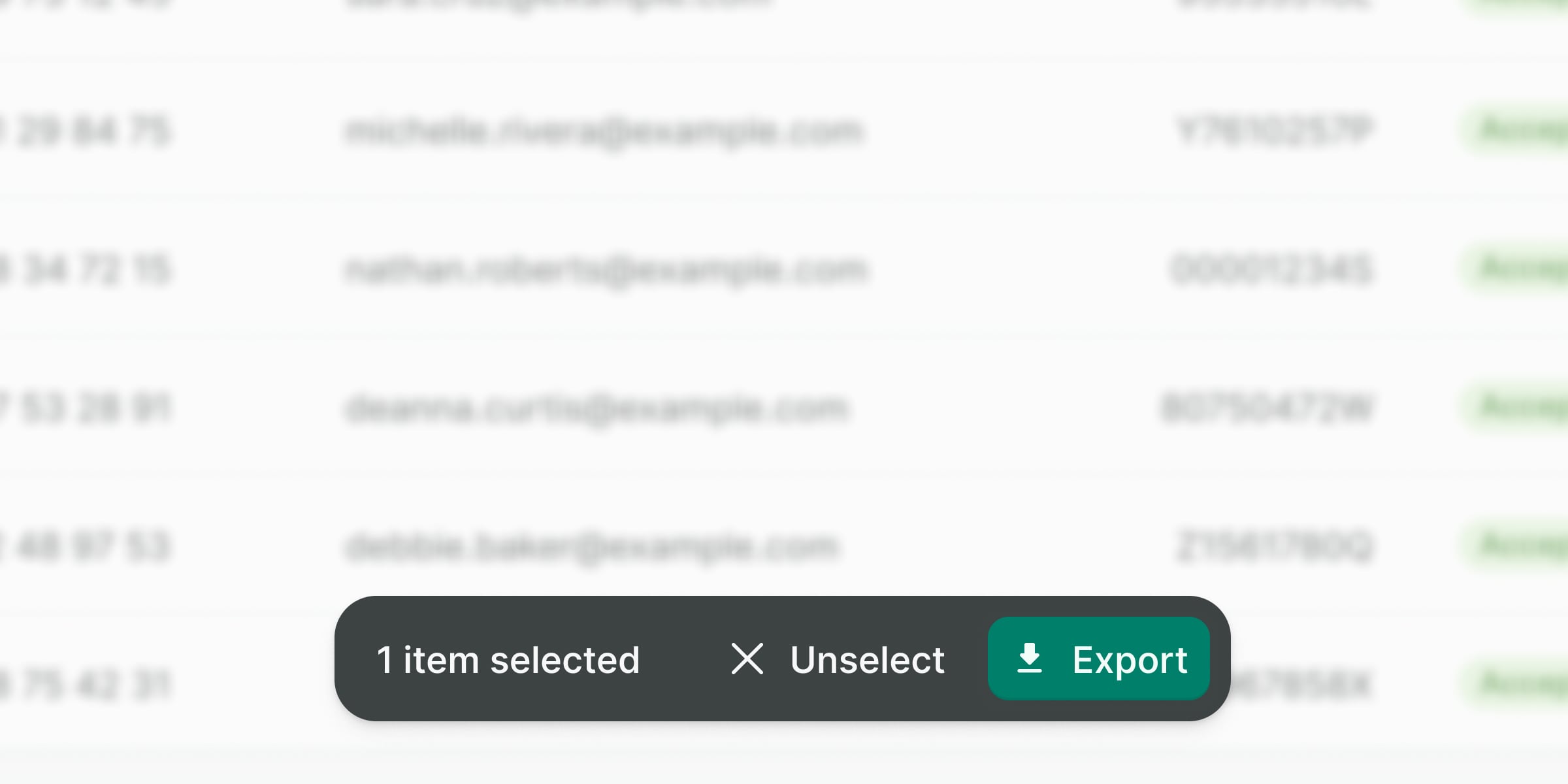
Use it to provide a layer of actions at the bottom of the page or inside a component, such as table actions or long forms views.
Do not show more than one action bar at a time.
Be conscious of mobile regarding content and the amount of actions available. Prioritize or place less important actions in a dropdown menu.
Do not stretch the action bar on bigger viewports nor use the mobile version, instead, display it always in a single line.
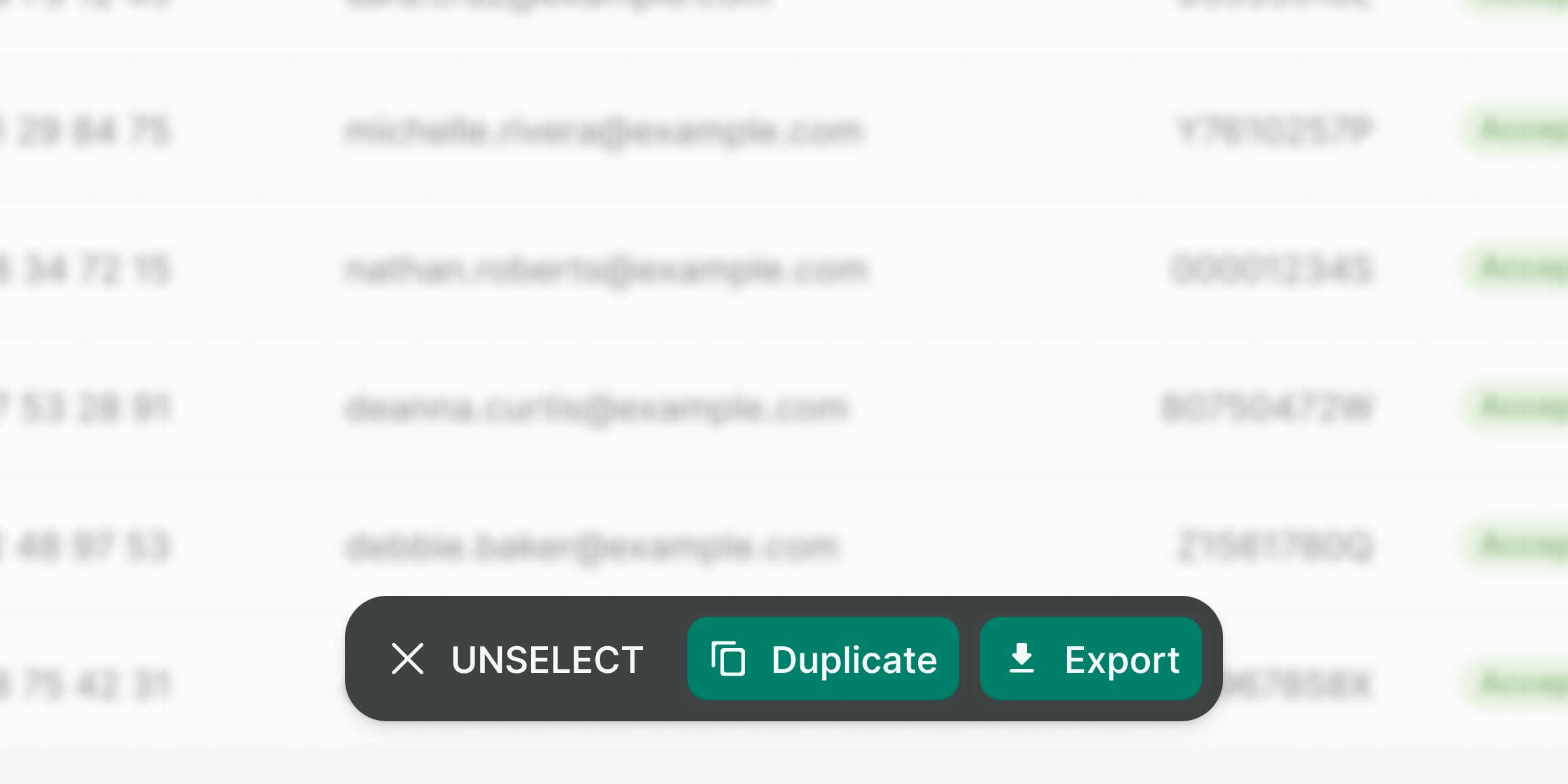
Make sure you follow the button’s best practices.
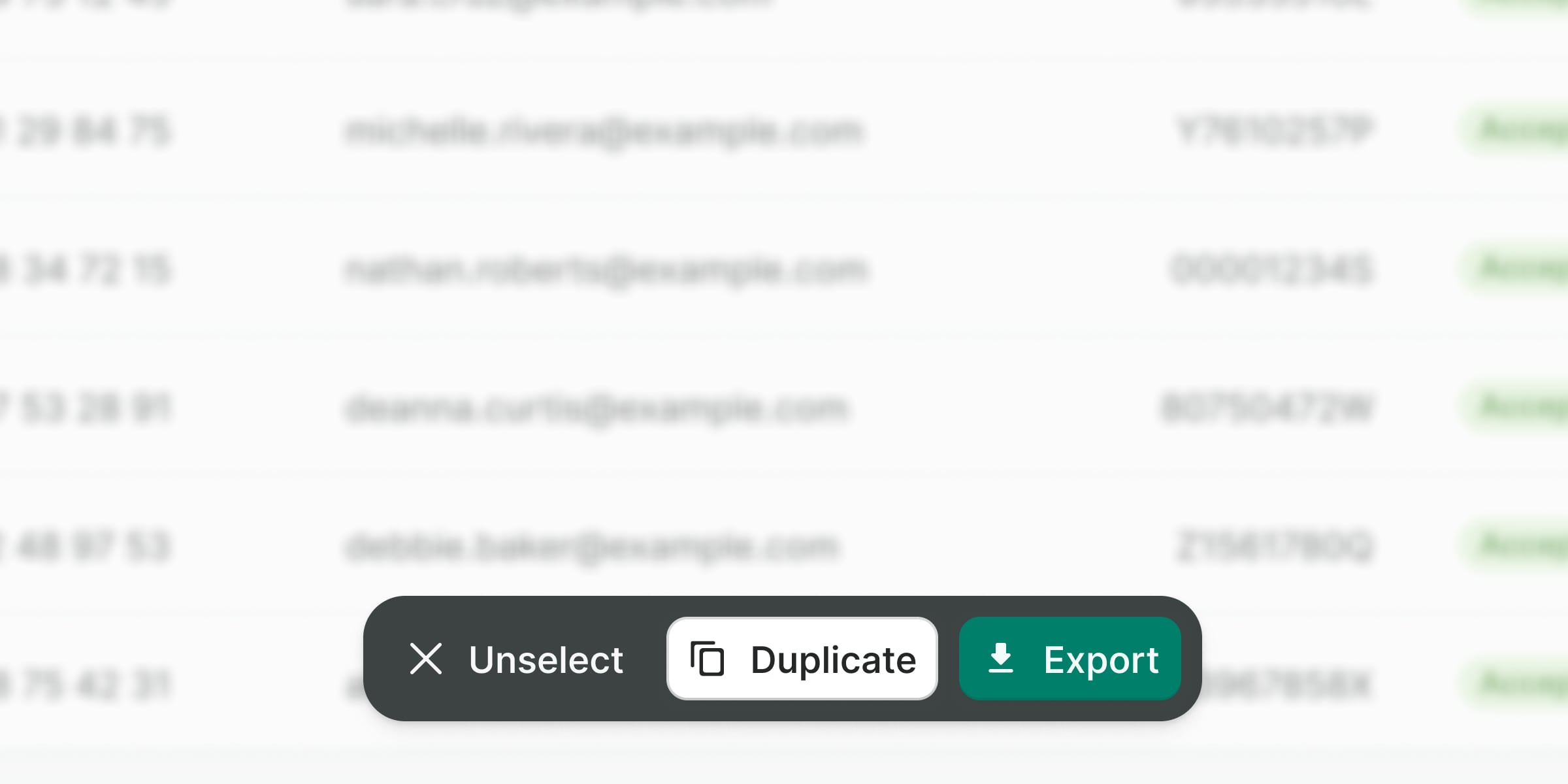
Do not use any other button than plain, and additionally, primary or danger. Action hierarchy should always have two levels.
Accessibility
General considerations
Some of the considerations to make the action bar accessible require adding ARIA properties to the regions being affected:
- Set
aria-livetoassertiveso updates to the region have the highest priority and should be presented to the user immediately. - Set
aria-atomictotrueif you want the entire changed region as a whole to be presented. - Use
aria-busyto indicate that an element is being modified and that assistive technologies may want to wait until the changes are complete before informing the user about the update.
Examples
Live Preview
Props
| Name | Description | Type | Default | Values |
|---|---|---|---|---|
disable-teleport | Disables the teleport functionality. If teleport is disabled the target property has no effect and the action bar will always be rendered in place. | Boolean | false | |
open | Controls the visibility of the action bar. | Boolean | false | |
position | Specifies the position of the action bar. | String | 'fixed' | 'fixed', 'sticky' |
target | Specifies the target element where the action bar should be rendered. Can be a string selector or an actual DOM node. | union | body | |
title | To display the reason why the action bar is shown or the number of items being affected | String |
Slots
| Name | Description |
|---|---|
default |