Empty data tables
Display an empty state when a table has no rows to show, helping users understand why the table is blank and what they can do next.
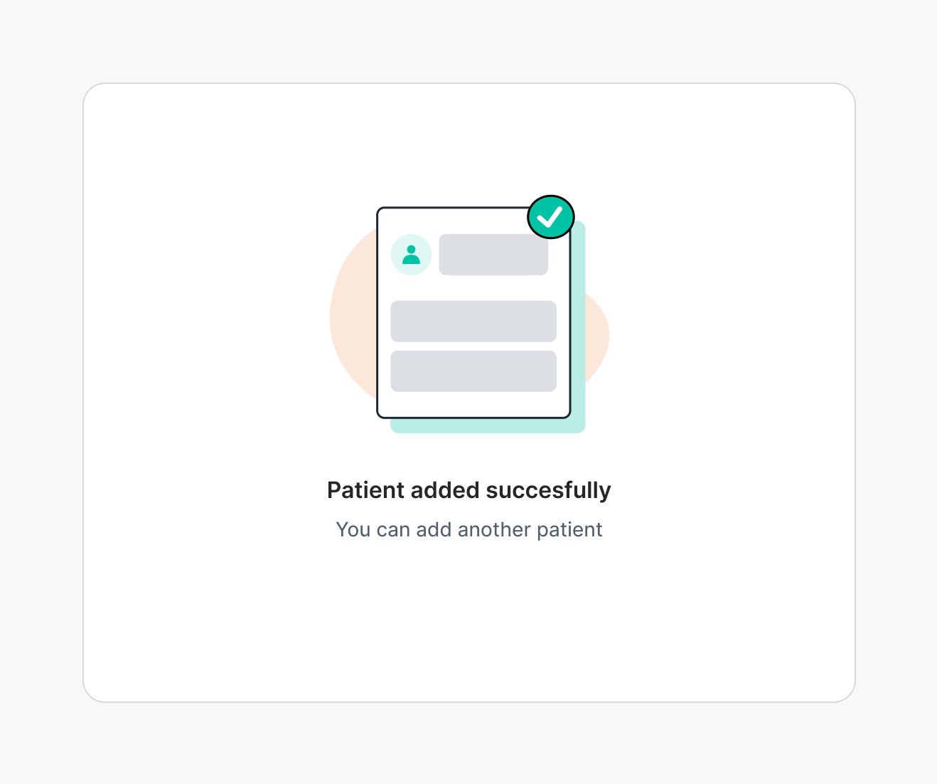
Empty states are used to fill blank spaces when no content is present, or when the feature is temporarily empty. They are meant to propose a path forward.
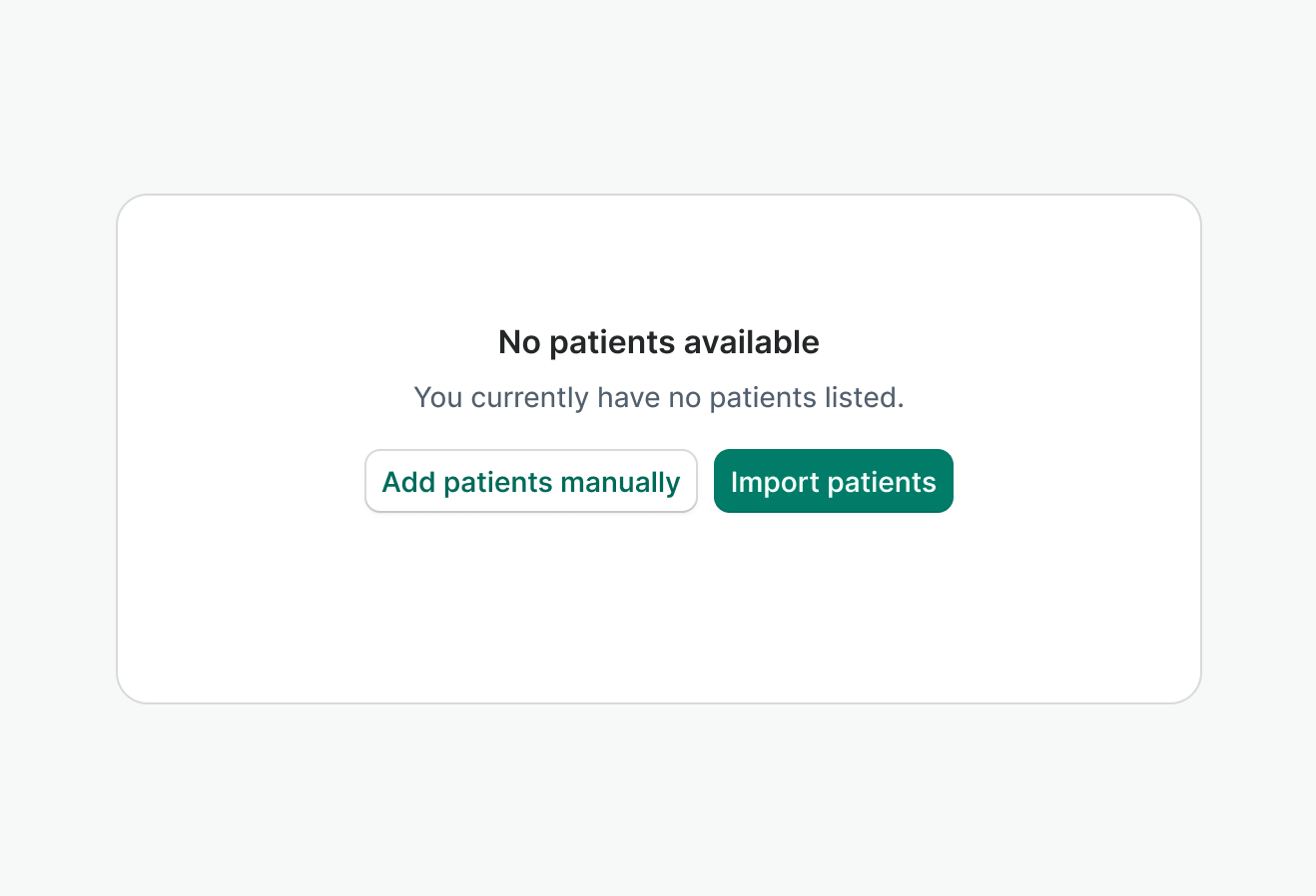
Display an empty state when a table has no rows to show, helping users understand why the table is blank and what they can do next.
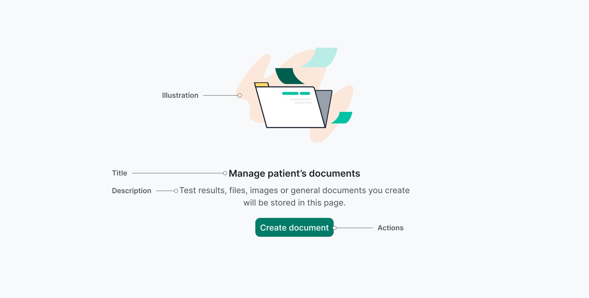
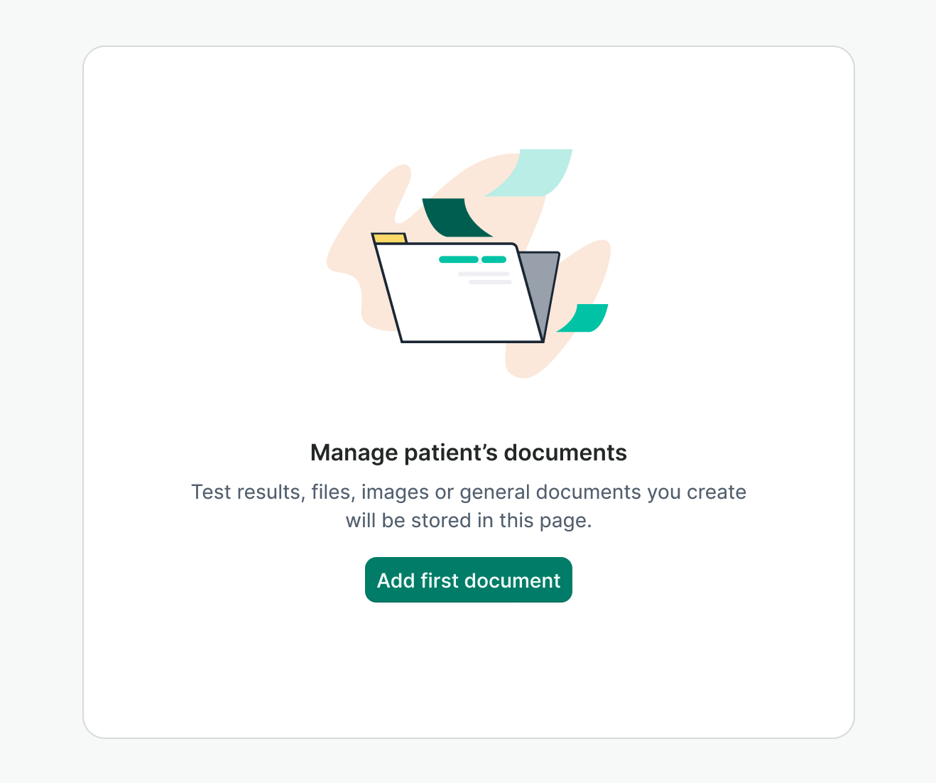
Use an empty state to introduce features that require user input or data before anything is displayed, guiding users on how to get started.
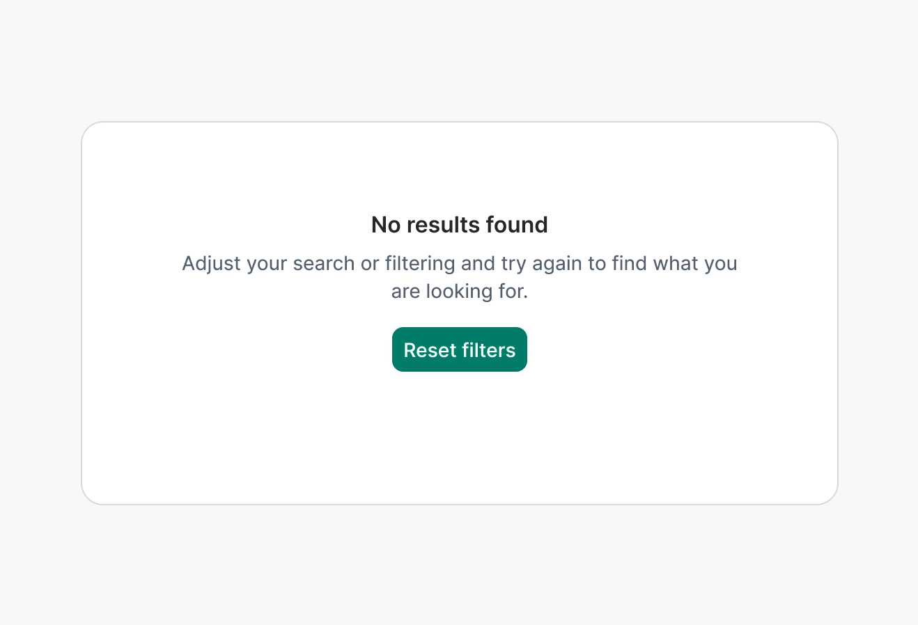
Show an empty state when searches or filters return no results, explaining the situation and suggesting possible next steps.
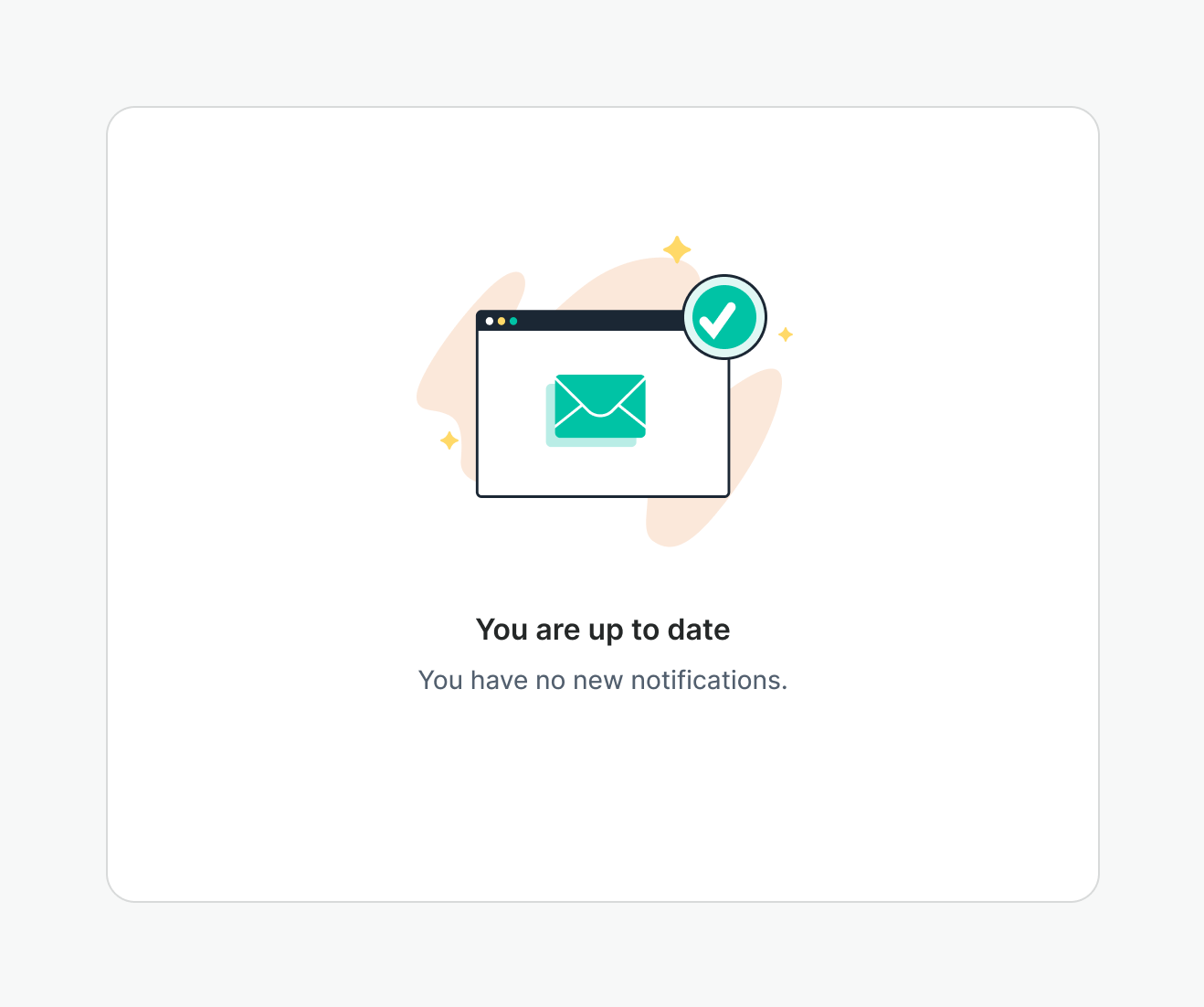
Present an empty state after an action (such as clearing all notifications) to reassure the user that everything is up to date and there is nothing left to review.
Don’t use empty states for feedback that should be presented as a temporary toast.
Empty state’s maximum width is 400px. If container is smaller than 400px, Empty State will fill out the available width.
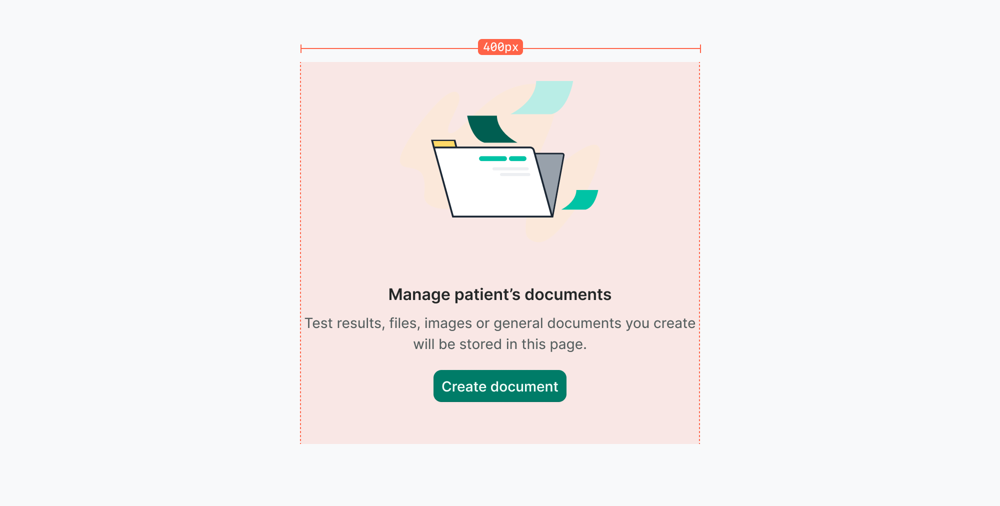
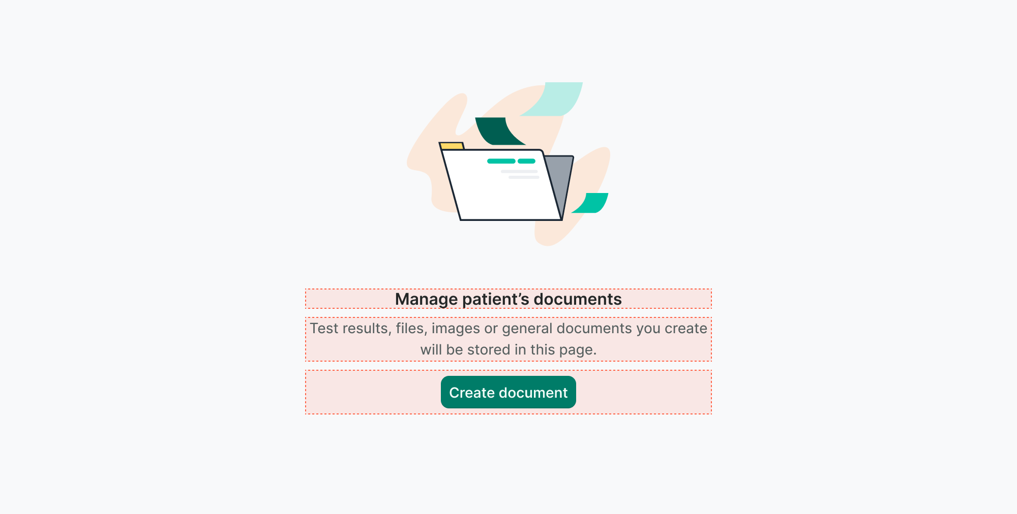
Content inside the empty state is center-aligned, and the entire empty state should be vertically and horizontally centered within its container.
For further information, see the Content Styleguide.