Usage
Popover is an overlay that opens on demand after clicking on the trigger. Popover allows to expose extra information or functionality to the user. It should always open next to the trigger.
Best practices
Do
Use the popover to expose a small amount of additional functionality or information to the user.
Don't
Do not use the popover if content can be shown directly or if the information is vital for using the screen.
Don't
Don't use popovers for simple labeling i.e. providing a label for the icon button. Use a tooltip instead.
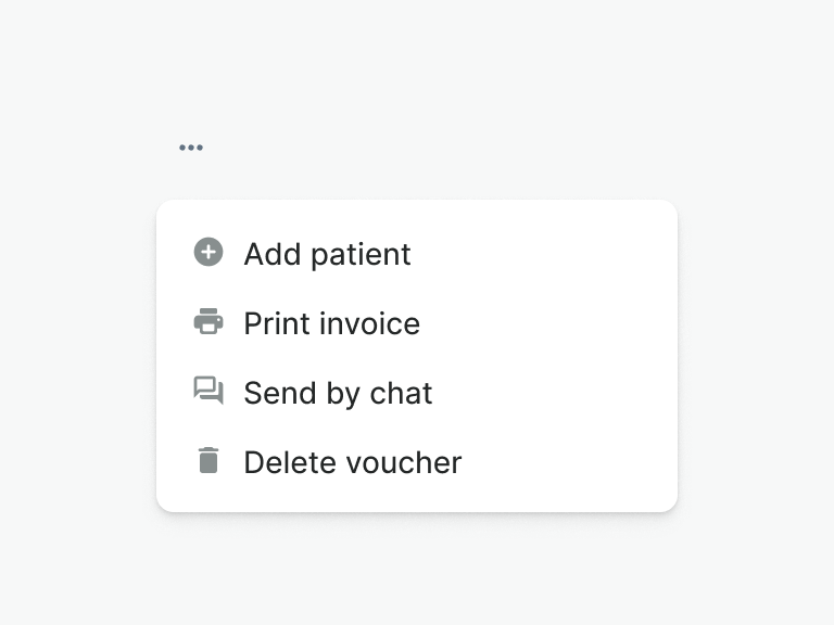
Don't
Don't use popovers to show a list of actions. Use the dropdown menu instead.
Anatomy
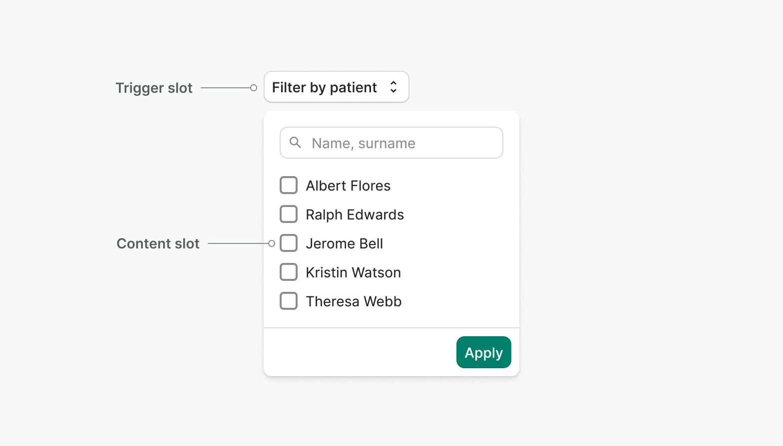
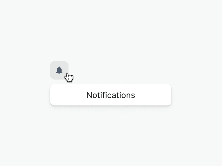
Trigger slot
This area is designated for the trigger. When clicked, a popover will open. Hovering is not a supported trigger event.
Do
Use buttons or elements that users expect to be clickable as triggers.
Don't
Do not use links or non-interactive elements (icons, text, images) as triggers.
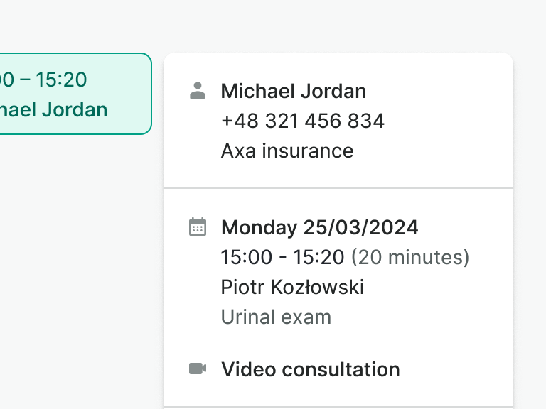
Content slot
This area is designated for the content of the popover.
Do
- Focus on one context or functionality only.
- Use edge-to-edge dividers to separate sections inside.
Don't
- Don't nest popovers inside each other.
- Do not resize the popover arbitrarily. Adjust its dimensions to the content inside.
Positioning
The popover should always be placed next to the trigger and aligned to one of its edges.

Examples
Live Preview
Props
| Name | Description | Type | Default | Values |
|---|---|---|---|---|
v-model model-value v2, wc open v1 | Controls whether the popover is open or not. | boolean | false | false, true |
position | Controls the position of the popover menu in relation to the trigger. `bottom-left` will align it to the bottom left of the trigger. `bottom-right` will align it to the bottom right of the trigger. `top-left`and 'top-right' will align it to the top left and right respectively. | string | bottom-left | bottom-left, bottom, bottom-right, top-left, top, top-right, left-top, left, left-bottom, right-top, right, right-bottom |
target | Type string or an actual DOM node where you want render component | string|object | body | |
use-teleport | When it is set to true, dropdown menu will teleport the content part into the body. | boolean | false | false, true |
anchor | Set an optional anchor element to align against, replacing the triggering element. | string|object | null |
Slots
| Name | Description |
|---|---|
default | The slot where the trigger for the popover is placed |
content | Default content for popover |
Events
| Name | Description | Type |
|---|---|---|
open | This event is emitted when the popover is open. | { "names": [ "Boolean" ] } |
close | This event is emitted when the popover is closed. | { "names": [ "Boolean" ] } |
v-model update:modelValue v2, wc toggle v1 | Emitted on popover open or close | { "names": [ "Boolean" ] } |