Usage
A step indicator shows the user their progress along the process of completing a task. User actions are required for the progress to be updated.
This component does not supply built-in validation, validation must happen inlined at the content level.
Best practices
Use it for multi-step processes and be mindful of the number of steps shown. If the task needs more than 8 steps, consider simplifying the process or breaking it up into multiple tasks to stay concise.
Visual progress
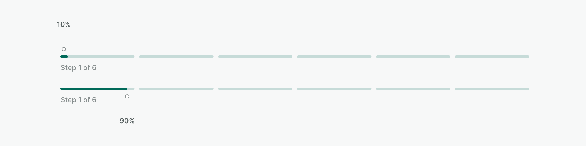
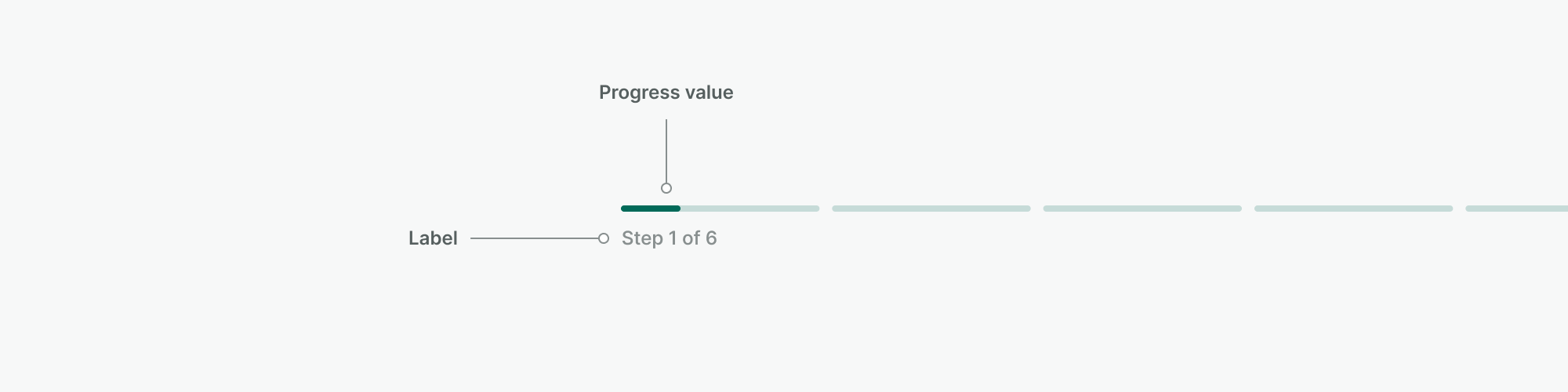
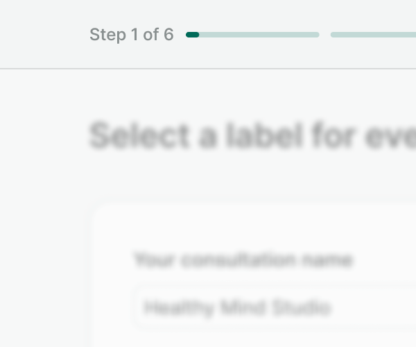
The progress property sets the minimum progress of the current step at 10% to show visually the user's position. At
this stage, no content has to be filled to reach that percentage.
Equally, the progress shown in each of the steps should max at 90%, reaching 100% only when the next button is clicked.
The rest of the progress should be dynamically changed based on how much of the step has been filled by the user.
To check how the step indicator behaves, take a look at the live code examples.
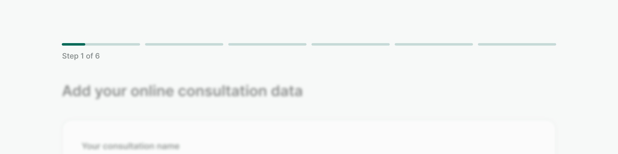
Labeling the step indicator
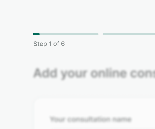
The component provides a mandatory label that states the step of the process (e.g. Step 1 of 6), this information is
merged with the value of the progress bar correspondent to the step and bonded as the aria-label for the component,
allowing us to provide more precise information about the completion of each individual step to assistive technologies.
Alignment
The step indicator component provides two options for the label to be aligned: block and inline. Use the inline version whenever the space is scarce, or if the content of each step changes the layout dramatically. Otherwise, favor a placement in context using a block alignment.
Examples
Live Preview
Props
| Name | Description | Type | Default | Values |
|---|---|---|---|---|
current | Sets the step as the current step. | number | 1 | |
label Required | The label for the step indicator. | string | Loading | |
progress | Defines the amount of progress in the current step. | number | null | |
steps Required | Defines the number of steps. | number | ||
align | Change the alignment of the step indicator label. | string | block | block, inline |