Usage
This component is used to display supplementary actions in the interface, either to trigger actions or drive navigation is allowed. They cannot be used as the main call to action.
Best practices
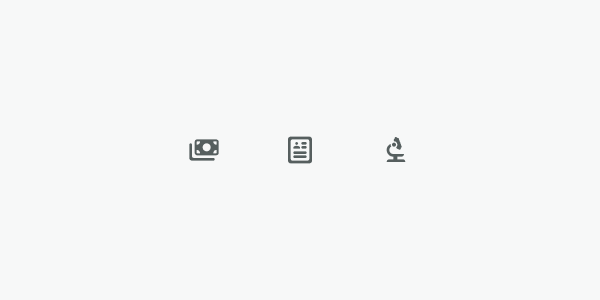
Do
Use secondary as the default icon color for this component.
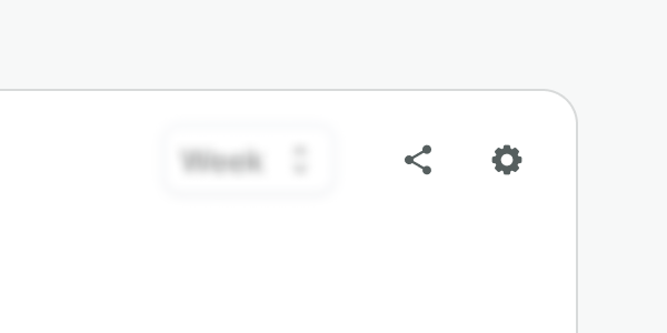
Don't
Do not use an icon that does not drive a clear and direct action.
Do
Use it where text labels don’t fit. Remember always to add an aria-label.
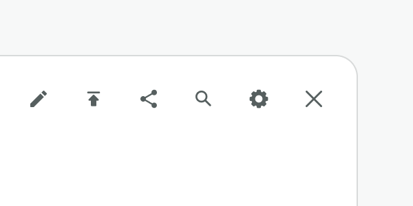
Don't
Do not display more than 5 buttons in a row. Be conscious of the number of options and the space available. To avoid that cognitive load, use a dropdown instead.
Examples
Live Preview
Props
| Name | Description | Type | Default | Values |
|---|---|---|---|---|
aria-controls | Identifies the element (or elements) whose contents or presence are controlled by this component. | string | ||
aria-label | Defines a string value that labels an element. | string | ||
icon-name Required | Icon name in the kebab-case format | string | icon name (i.e. "alarm-clock") | |
icon-color | Sets the icon color | string | secondary | primary, secondary, muted, accent, success, warning, danger |