Usage
The icon component allows you to display an icon from the Iconography library. They are used to provide additional meaning or give a hint about the usability of the component they are used in.
Best practices

Do
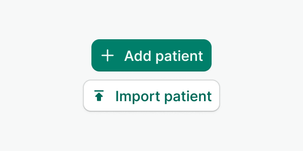
Pair icons with content to reinforce their meaning.

Don't
Don't use icons for decorative purposes alone.

Do
Use it where text labels don't fit. Remember always to add an aria-label.
Custom colors
The icon component supports custom HEX values to cover cases that are specific to the product and are not supported by the Watson color palette i.e. custom colors for services and agendas. If you have trouble identifying your case, reach out to the design system team for help.
Examples
Live Preview
Resources
- To know more about icons, check our iconography here
- Check our foreground color palette here
- To know more about aria-label, check the w3 documentation
Props
| Name | Description | Type | Default | Values |
|---|---|---|---|---|
name Required | Icon name in the kebab-case format | string | ||
color | Sets the icon color | string | muted | primary, secondary, muted, inverted, accent, success, warning, danger, accent-inverted, success-inverted, info, info-inverted, danger-inverted, any hexadecimal color (#176d00) |
size | Defines the size of the icon | string | medium | small, medium, large, xlarge |
aria-hidden | Indicates whether the element is exposed to an accessibility API. This can be used for hiding decorative icons that already display a visible and accessible label. | boolean|string | true, false | |
aria-label | Defines a string value that labels an element. | string |