Usage
The navigation list provides local navigation for the current context and indicates the current view. It is typically placed in the sidebar of the page and changes what is shown in the main area.
Best practices
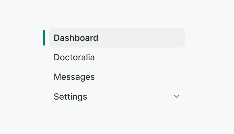
Do
Use short and scannable labels for navigation items.

Don't
Avoid using long labels. Long text gets truncated.
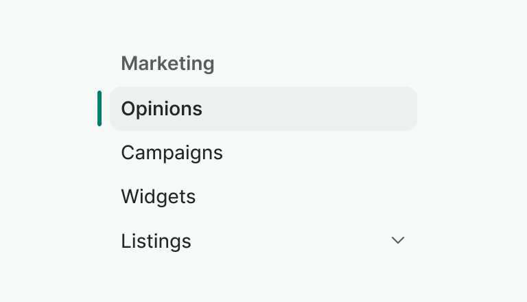
Do
Use the heading to clarify the navigation's list category.

Don't
Don't omit the headings if the navigation list is not self-explanatory.
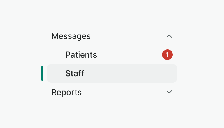
Do
Use the counter property to add auxiliary information about the navigation item e.g. number of new messages.

Don't
Use counters sparingly as you can overwhelm users and reduce the effectiveness of the feedback. Instead, balance the need for each section and display the strictly necessary.
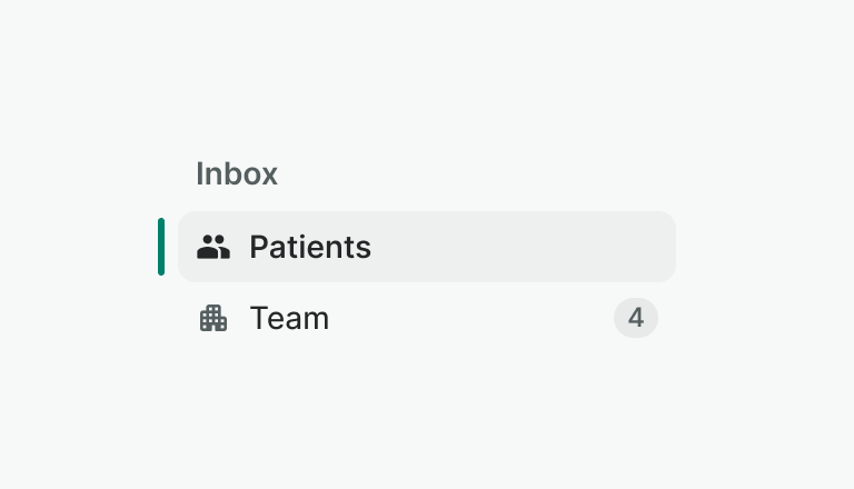
Do
Use leading visual e.g. icon to help user understand what navigation item represents
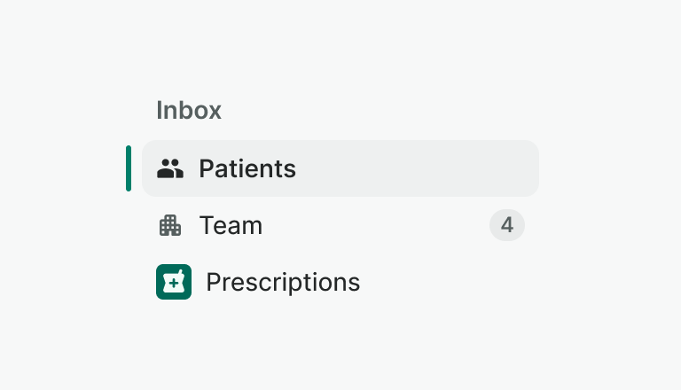
Don't
- Don't mix different leading visuals inside one navigation list.
- Don't skip them for certain items. Use them consistently across all items in a navigation list if you choose to include them.
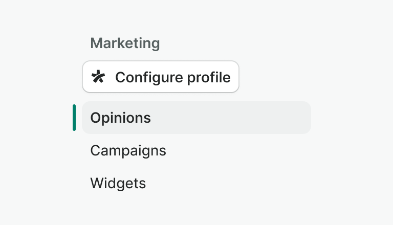
Don't
- Don't include any elements other than navigation items in the navigation list.
- Don't add any interactive elements to the navigation item itself.
Nesting
You can use nested navigation to group items that fall under the same feature or category. The navigation list supports 1 level of nesting only.
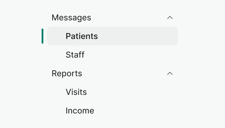
Do
Group navigation items based on related categories.
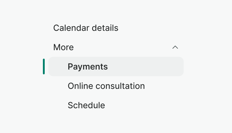
Don't
Don't group items that are not related to each other or to save space.
Examples
Live Preview
Props
| Name | Description | Type | Default | Values |
|---|---|---|---|---|
heading | Defines a heading title for the navigation list | string | ||
items | An array of objects that represents the list of Navigation Items for the Navigation List component. | array | [] | [ { title: String, isActive: Boolean, counter: Number, counterType: String, to: String, href: String, leadingVisual: Object } ] |
Warning!
WNavListItem's
to
property is not supported in web-component
version of this component
Slots
| Name | Description |
|---|---|
default | Default content slot for nav-list |
Events
| Name | Description | Type |
|---|---|---|
change | This event is emitted when nav item change. | { "names": [ "String" ] } |