Usage
Checkboxes allow user to select many options from a limited number of choices. Use checkboxes in forms, for filtering purposes, or to let user accept certain conditions. Checkboxes have 3 states: selected, unselected, and mixed.
Best practices
Do
Use checkboxes when it's possible to select more than one option.

Don't
Don't use the checkbox for mutually exclusive single-select choices. Use the radio button instead.
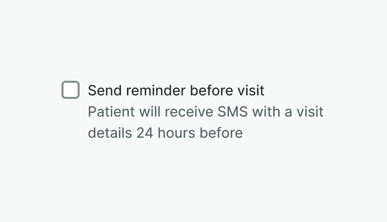
Do
Use hint to provide additional information about checkbox.
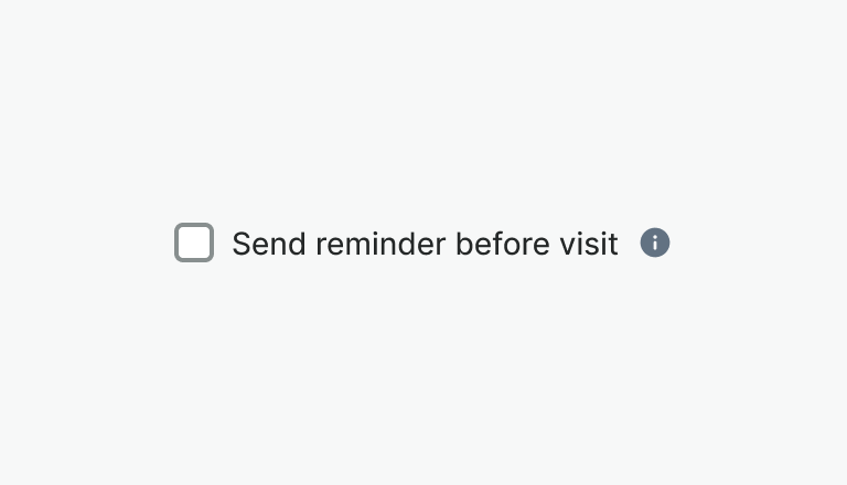
Don't
Don't hide additional information behind the tooltips or icons.
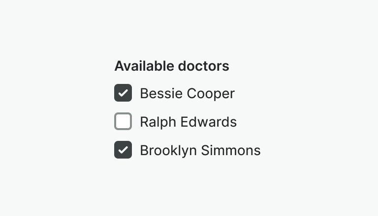
Do
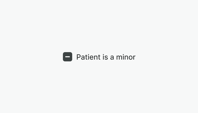
Use mixed state to represent value of a group of checkboxes, and for bulk selection of items.
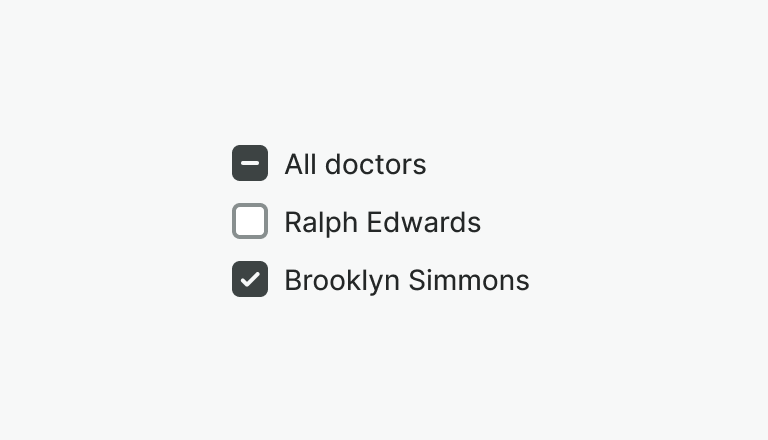
Don't
Don't use mixed state on a single checkbox.
Examples
Live Preview
Props
| Name | Description | Type | Default | Values |
|---|---|---|---|---|
hint | Text displayed under the label with additional information | string | ||
label | Label of the input element | string | ||
required | Determines whether the input is required or not. | boolean | ||
aria-label | Defines a string value that labels an element. | string | ||
error | Displays an error description and changes the style of the input | string|boolean | ||
indeterminate | The checkbox is still either checked or unchecked as a state. | boolean | false | |
v-model model-value v2, wc checked v1 | Controls whether the input is checked or not. If array is provided the input is checked if the array contains the value property. | boolean|array | false | |
value | Value of the input. Please note that value is required only if you pass array as v-model | boolean|number|string | ||
disabled | Controls whether the checkbox is disabled or not. | boolean | false |
Events
| Name | Description | Type |
|---|---|---|
v-model update:modelValue v2, wc change v1 | If Array is passed into v-model this event emits an array of values from all selected checkboxes. If Boolean is passed into v-model this event emits if checkbox is checked or not regardless of its value. | { "names": [ "Boolean, Array" ] } |
Slots
| Name | Description |
|---|---|
label | Use it to provide rich content for checkbox label. Takes precedence over label property. |
hint | Use it to provide rich content for checkbox hint. Takes precedence over property. |