Usage
Modal dialog overlays on top of the main content of a page. It is used to focus the user's attention on a specific task and require interaction before they can continue browsing the site. Modal dialogs are disruptive and should be used sparingly and with caution.
Best practices
Open modal dialogs on user’s request i.e., clicking a button
Don’t disrupt user’s workflow with modal dialogs that appear without user action i.e., for marketing purposes.
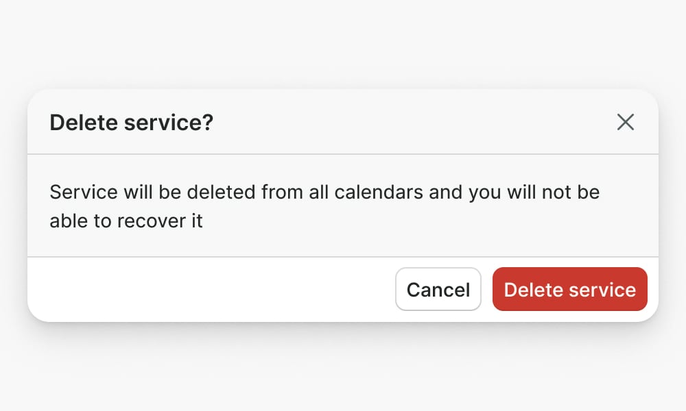
Use a modal dialog to confirm decisions before proceeding
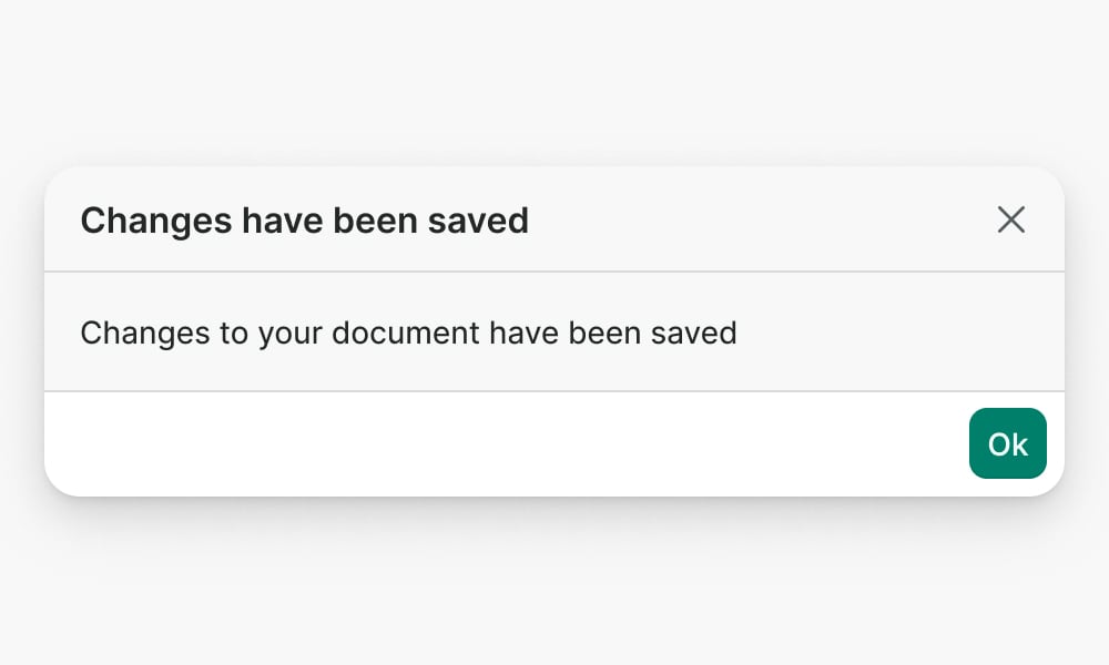
Don't use a modal dialog if confirmation is not necessary, or to give feedback to the user. Use Toast or Banner instead.
Don’t nest modals. If the situation requires a sequence of decisions, consider a different design pattern. Confirmation modals upon closing are an exception.
Anatomy
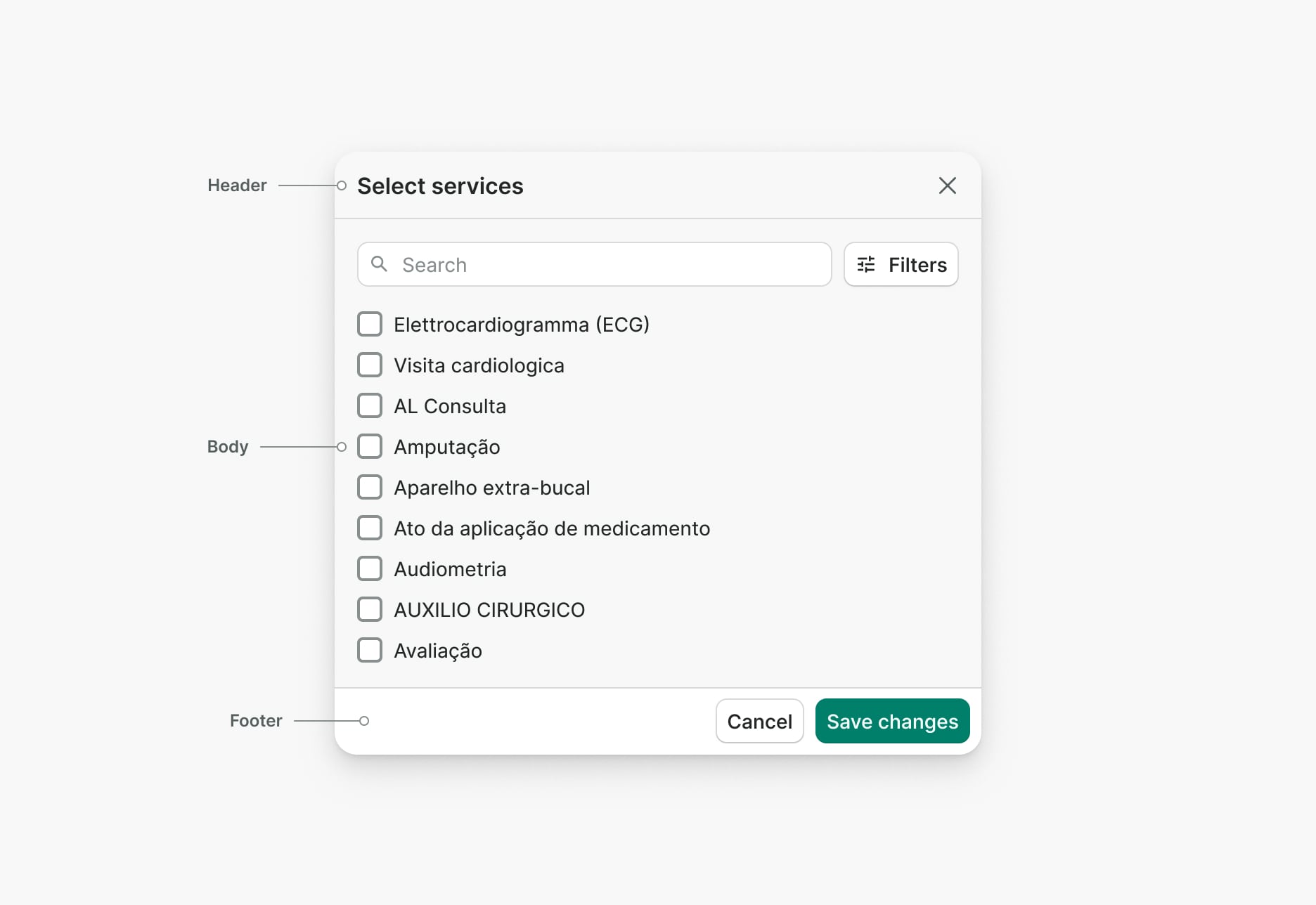
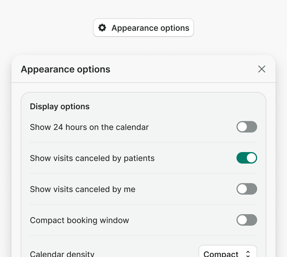
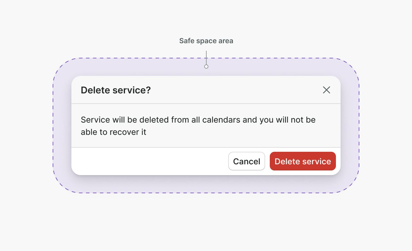
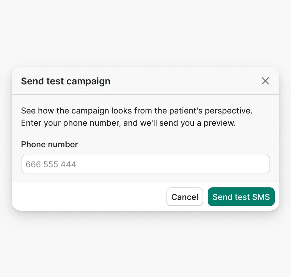
Header
Header provides a title that describes the context of the modal dialog and a close button in the top right corner.
Use a brief and clear title that explains the context of a modal dialog.
Don’t use modal dialogs without a title.
Body
The body is used to display and provide the main functionality of the modal.
Avoid including navigation inside a modal dialog. A dialog should be used within a single context.
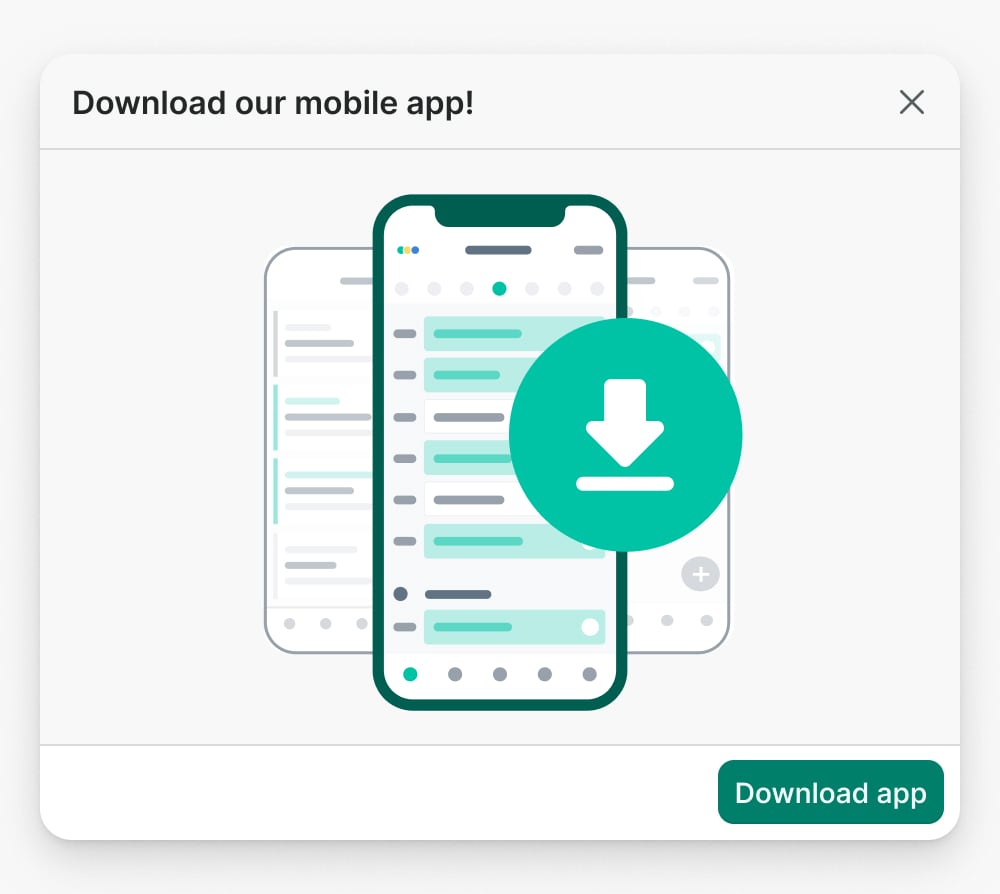
Footer
The footer provides a space for the main actions of the modal dialog.
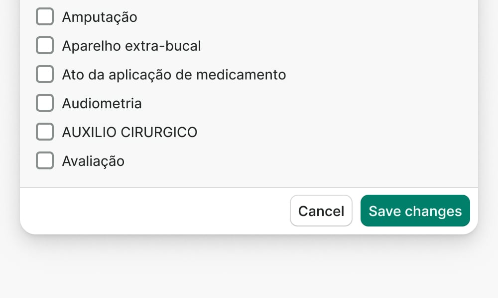
Always align the actions to the right side, with the primary action always at the far right.
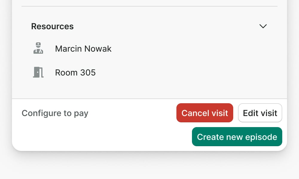
Don’t overcrowd the footer with too many actions. Include max of 2 actions to provide a clear hierarchy.
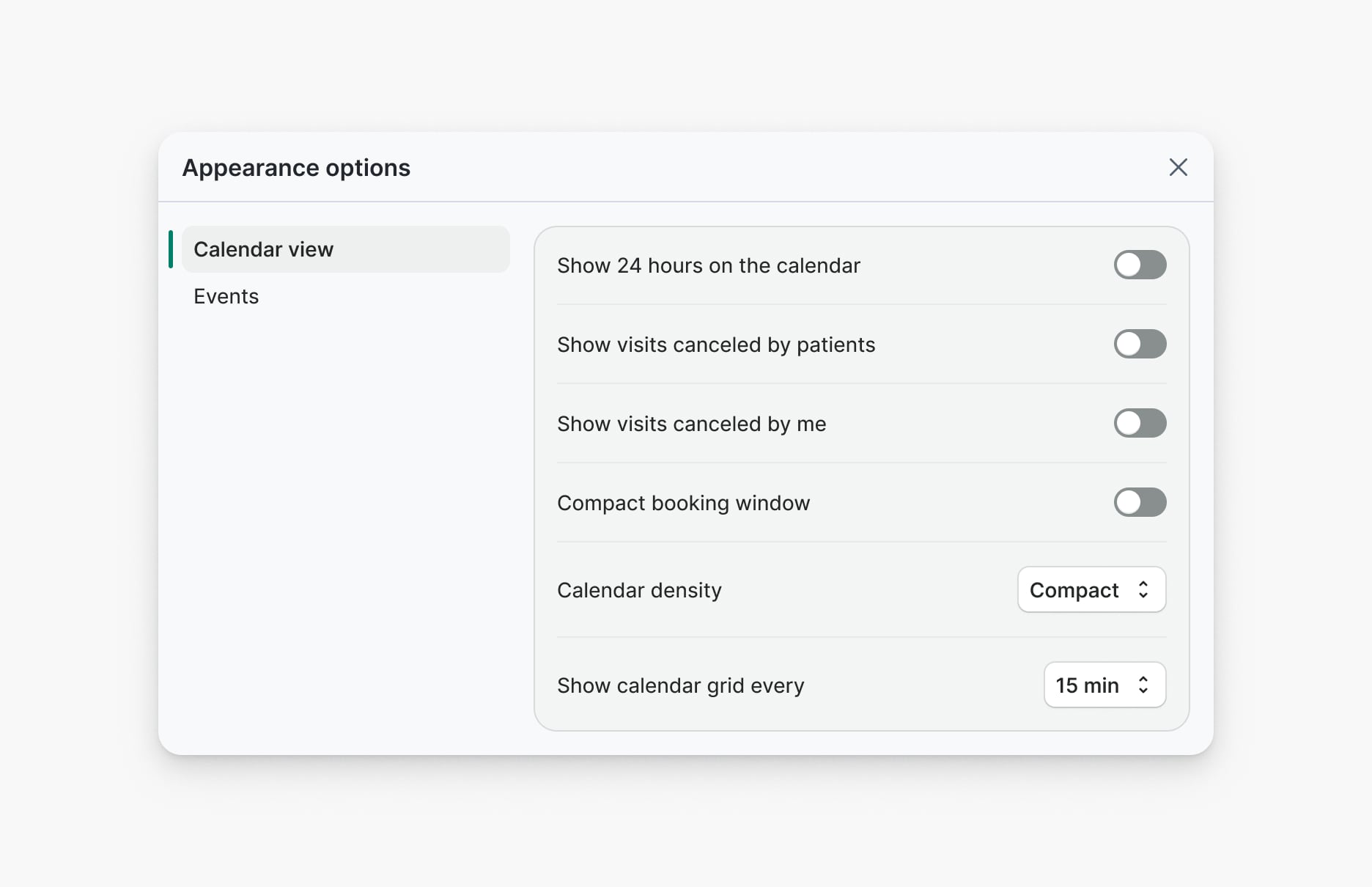
Sizes
Modal dialog offers two sizes: medium and large. Each size defines the width of the modal dialog.
Medium (default)
Medium is the default size for modal dialogs. It's ideal for seeking confirmation from the user and presenting simple forms or data.
Large
Choose large size when presenting complex forms or dense data. Do not use it for confirmation dialogs.
Positioning
Modal dialogs are always displayed in the center of the screen with a visible background that covers the content behind
them. Modal dialogs include safespace area between the modal and viewport equal to Space L.
Dismissing modal dialogs
Modal dialogs provide multiple ways to exit them:
- X button in top right corner
- Mouse click outside of the modal dialog
- Browser back button
- Escape key using keyboard
- Custom close button (Optional)
Consider providing a “Cancel” button for modal dialogs that require action from the user.

Don’t provide custom close button in the footer for passive modal dialogs.
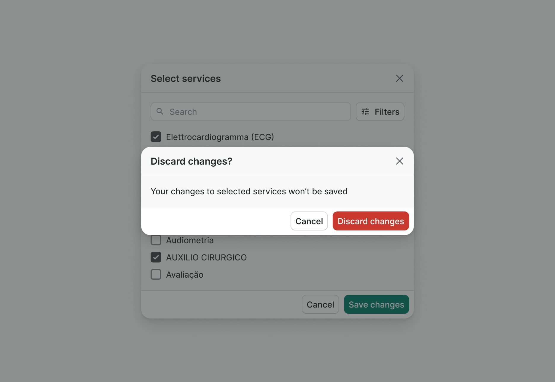
Seek confirmation from the user if dismissing the modal dialog means losing progress.
Examples
Live Preview
Props
| Name | Description | Type | Default | Values |
|---|---|---|---|---|
close-on-click-outside | Decides if the modal can be closed by clicking outside of it. | boolean | ||
disable-teleport | Toggles teleporting of the modal to the target element | boolean | ||
v-model model-value v2, wc show v1 | State of the modal | boolean | ||
size | Size of the modal dialog | string | medium | medium | large | xlarge |
target | Type string or an actual DOM node where you want render component | string|object | body | |
title Required | Title of the modal dialog displayed in the header | string | ||
translations | Provide values as translated strings. | object | {
closeBtnAriaLabel: 'Close'
} | Object with the following key: closeBtnAriaLabel |
prevent-close | When true, prevents the user from closing the modal through UI interactions (close button, ESC key, clicking outside, browser back button). Modal can only be closed programmatically through v-model. | boolean | ||
fade-content | When true, shows a fade effect at the bottom of the modal body when content is scrollable | boolean |
Slots
| Name | Description |
|---|---|
body | Slot for body content |
footer | Optional slot for footer content |
Events
| Name | Description | Type |
|---|---|---|
v-model update:modelValue v2, wc toggle v1 | Emitted on modal close | { "names": [ "Boolean" ] } |