Usage
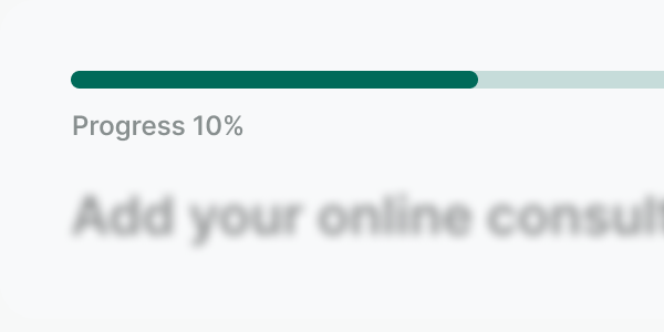
A progress bar shows the completion status of an ongoing task. Updated continuously as the task progresses, it shows an approximation of how much has left to load.
Best practices

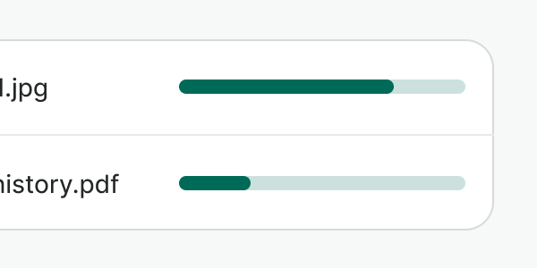
Use it when the process can be described with quantitative information, such as a percentage. For instance, uploading a file.

Don't use it to represent stepped progress that is determined by user actions. Use a step indicator instead.

You can provide additional content when necessary and always use an aria-label when using the progress bar. Check extended practices on accessibility below.

Don’t use it in small spaces or when you need to display an indeterminate state. Use the spinner instead.

Don't use it for data visualization or progress that requires user actions. For now, use a custom component instead.
Accessibility
Labeling the progress bar
The progress bar needs an ARIA-label so that a screen reader announces the state properly. Each piece of text that becomes the label needs to be available in the same language as the page. The default label is “Loading.” Make the label more personalized when the context matters. Since the actions can be relatively long, you can consider using other schemes like “Uploading + {what is uploading},” for example, “Uploading a file.”
General considerations
Some of the considerations to make a progress bar accessible require adding ARIA properties to the regions being affected:
- Set
aria-livetoassertiveso updates to the region have the highest priority and should be presented to the user immediately. - Set
aria-atomictotrueif you want the entire changed region as a whole to be presented. - Use
aria-busyto indicate that an element is being modified and that assistive technologies may want to wait until the changes are complete before informing the user about the update.
Examples
Live Preview
Props
| Name | Description | Type | Default | Values |
|---|---|---|---|---|
aria-label | Provides an accessible label to the progress bar. | string | Loading | |
max | Defines the maximum value of the progress bar. It must be a number greater than 0. | number | 100 | |
value | The current value of the progress bar. It must be a value between 0 and max, or 0 and 100 if max is not provided. | number | 0 |