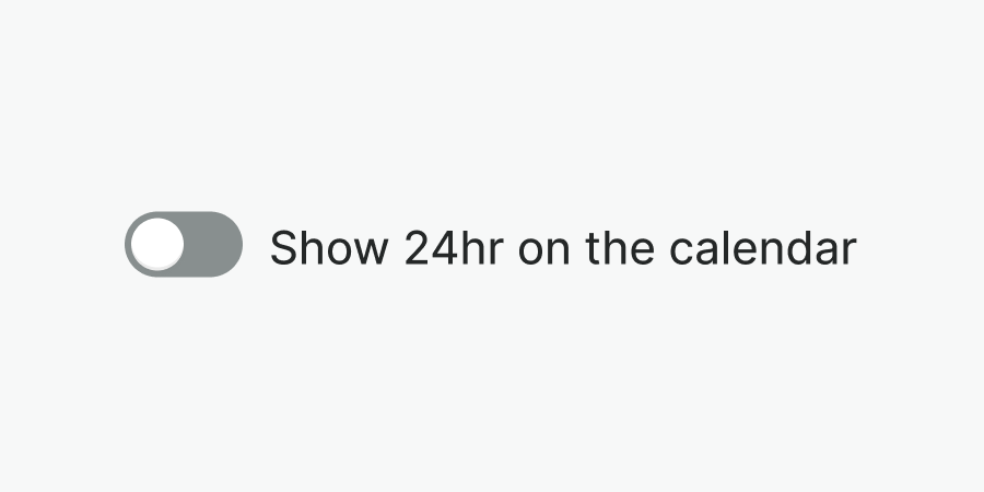
Usage
The toggle component allows users to toggle a specific option on or off immediately.
Best practices
Do
Use the toggle to immediately activate or deactivate a setting.
Don't
Don't use the toggle to select options that require explicit save action. Use the checkbox instead.
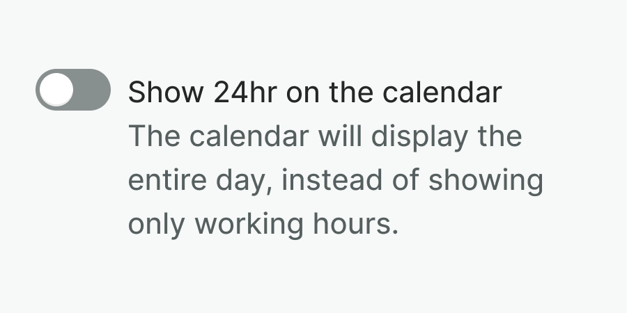
Do
Use hint to provide additional information about the toggle.

Don't
Don't hide additional information behind icons or tooltips.
Don't
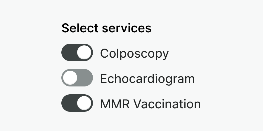
Don't use the toggle to select one option from predefined choices. Use radio buttons instead.
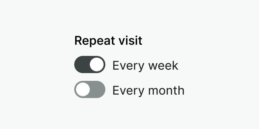
Examples
Live Preview
Props
| Name | Description | Type | Default | Values |
|---|---|---|---|---|
hint | Text displayed under the label with additional information | string | ||
label Required | Label of the input element | string | ||
required | Determines whether the input is required or not. | boolean | ||
v-model model-value v2, wc checked v1 | Controls whether the input is checked or not. | boolean | false | |
reverse | Controls whether the content is in reverse order. | boolean | false | |
disabled | Sets the component as disabled. | Boolean | false |
Events
| Name | Description | Type |
|---|---|---|
v-model update:modelValue v2, wc change v1 | Emits if input is checked or not | { "names": [ "Boolean" ] } |
Slots
| Name | Description |
|---|---|
hint | Use it to provide rich content for input hint. Takes precedence over hint property. |