Usage
Buttons are used to trigger an action on a page or complete tasks in other components, such as forms and modals.
Best practices
The different types of variants help us to employ the right button for the right purpose.
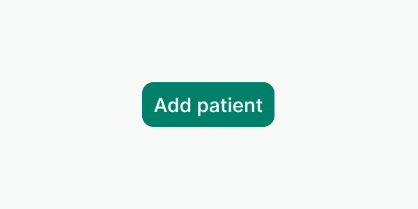
Write clear and action-driven labels using sentence-case, such as “Add patient” or “Delete appointment”. Use {verb} + {noun} whenever is possible.
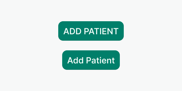
Don’t use all-caps or other text formats.
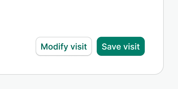
Use primary and secondary variants when grouping actions.
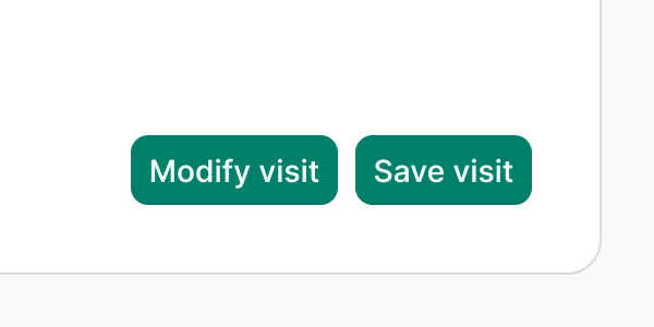
Don’t use multiple instances of the primary variant when grouping actions.
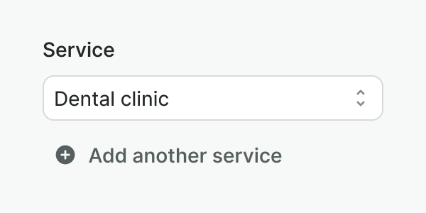
Use the plain variant for less important or less common actions on the screen.
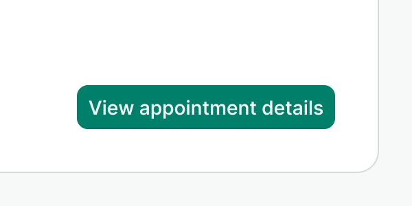
Do not use buttons to link to other pages. Use the link component instead.
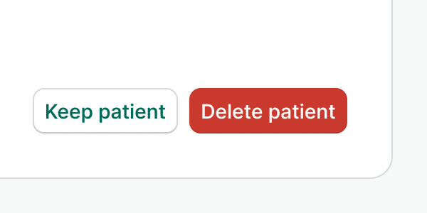
Use the danger variant for every destructive action you need to portray.
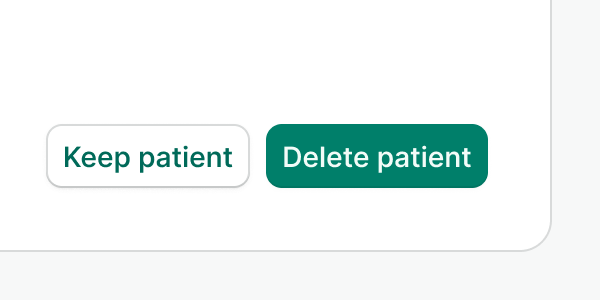
Don’t use any other button variant for destructive actions even if they are the primary action on the screen.
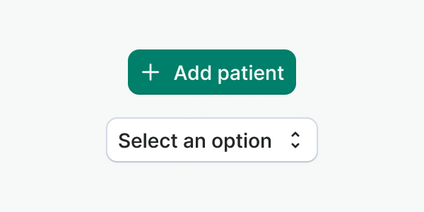
Use icons for affordance clarity or to highlight the action that will be performed.
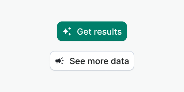
Don’t use icons for decorative purposes, or that don’t portray the buttons’ action. In those cases might be better to use only a label.
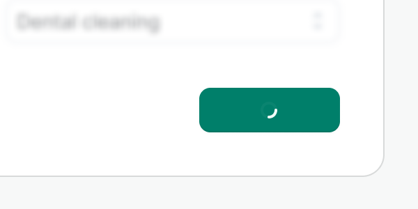
Keep the same button width in both loading and not loading mode. The length of the label and its icons will define it.
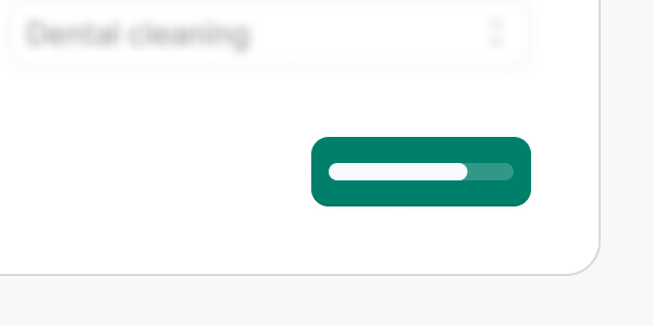
Do not use any other loading method, such as the progress bar, as the available space is quite diminished.
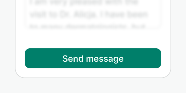
Use the full-width button in narrow sections where the rest of the content also fills the container.
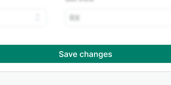
Do not use a full-width button in a wide or fluid container, especially if the rest of the content does not fill the width, or it is aligned to one of the sides.
Use counters in buttons to provide meaningful feedback. For instance, showing the number of items that will be affected by the action.
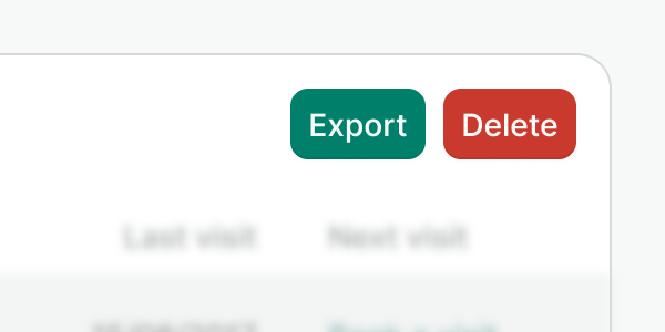
Do not use counters in multiple buttons in the same context. This can overwhelm users and reduce the effectiveness of the feedback.
Accessibility
Buttons vs links
The types of actions performed by buttons are distinctly different from the function of a link (generally links go somewhere and buttons do something). It is important that both the appearance and role of a button, match the function it provides. That’s why we aim for a differentiated visual design that streamlines the component's function and its ARIA role. We are aware of the exception we are introducing with the plain button variant. Check the best practices above for more details on how to use them.
Loading Button
Some of the considerations to make a loading button accessible require adding ARIA properties to the regions being affected:
- Set
aria-livetoassertiveso updates to the region have the highest priority and should be presented to the user immediately. - Set
aria-atomictotrueif you want the entire changed region as a whole to be presented.
Where's the disabled button?
We have made the conscious decision to not provide a disabled button for now. We firmly believe that most of the solutions that use a disabled button can be solved in many other simpler ways, for instance, by using validation, progressive disclosure, or lowering the actions per page to reduce the cognitive load. We enforce this for a few reasons:
- Using disabled buttons makes us wonder why the button is not available and how to enable it. This requires explicit explanation and therefore increases the complexity of the screen (we cannot just forbid the action and not explain what is happening).
- Showing disabled buttons when they cannot be enabled in any way is frustrating. It clutters the interface and confuses us since a solution is not possible.
- Accessibility. It’s also a silent agreement that a disabled button has a very poor contrast. Disabled buttons could additionally be confused with secondary or plain buttons and just make the whole experience only accessible to the ones that can see the difference.
Examples
Live Preview
Props
| Name | Description | Type | Default | Values |
|---|---|---|---|---|
aria-controls | Identifies the element (or elements) whose contents or presence are controlled by this component. | string | ||
counter | Controls the display of a badge with a numeric or percentage counter. | number|string | ||
counter-type | Allows you to choose the badge type. | string | neutral | accent, accent-inverted, neutral, info, success, warning, danger, neutral-inverted, info-inverted, success-inverted, warning-inverted, danger-inverted |
href | When provided, renders the button as an anchor tag <a>, with its href attribute set to the given value. | string | ||
to Vue only | Use if linking to a Vue route with Router | string|object | ||
label Required | Defines text of the button | string | ||
leading-icon | Displays an icon to the left of the label. | string | icon name (i.e. "alarm-clock") | |
leading-icon-color | Sets the color of the leading icon. Only works when variant is "plain". | string | primary, secondary, muted, inverted, accent, success, warning, danger, accent-inverted, success-inverted, info, info-inverted, danger-inverted, or hexadecimal color (#176d00) | |
trailing-icon | Displays an icon to the right of the label. | string | icon name (i.e. "alarm-clock") | |
type | Specifies the type of button. | string | button | button, submit, reset |
variant | Defines the purpose of the button. | string | default | default, primary, secondary, danger, plain |
loading | Controls if the button is in a loading state or not. | boolean | false | false, true |
full-width | Controls if the button extends to fill the container. | boolean | false | false, true |
align-label | Controls the alignment of the label. | string | center | center, start, end |
Events
Button component supports all native events of the HTML <button> element. It means that it emits the click event
for mouse click and enter or space key pressed while the button is in focus state.