Usage
Links are used to navigate users between pages or to an external resource. They can be used as a standalone element or within any text. They should not be used to trigger actions.
Best practices
Do
Use links to navigate between pages or to an external page.

Don't
Don't use links to trigger actions like save, add, or edit. Use the Button instead.
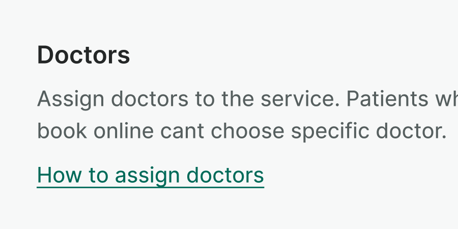
Do
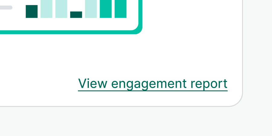
Be descriptive with the links. Links should be understandable on their own.
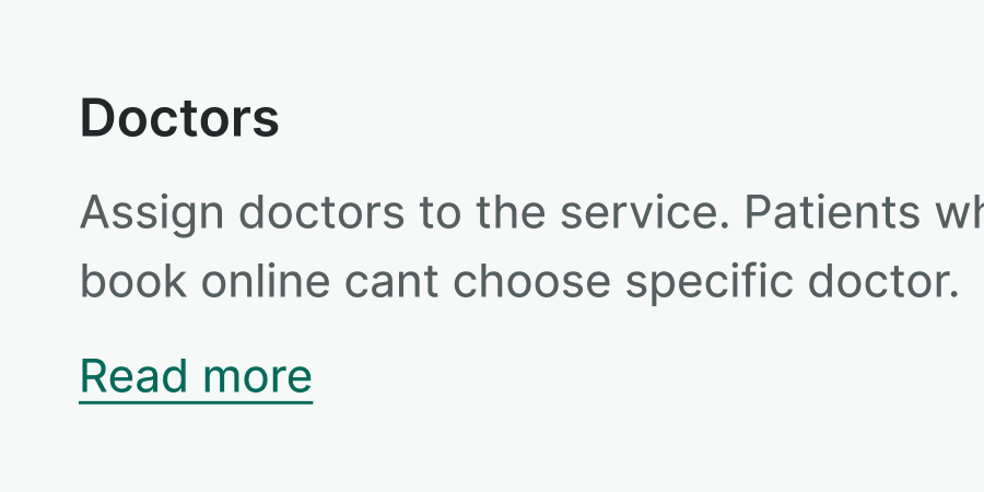
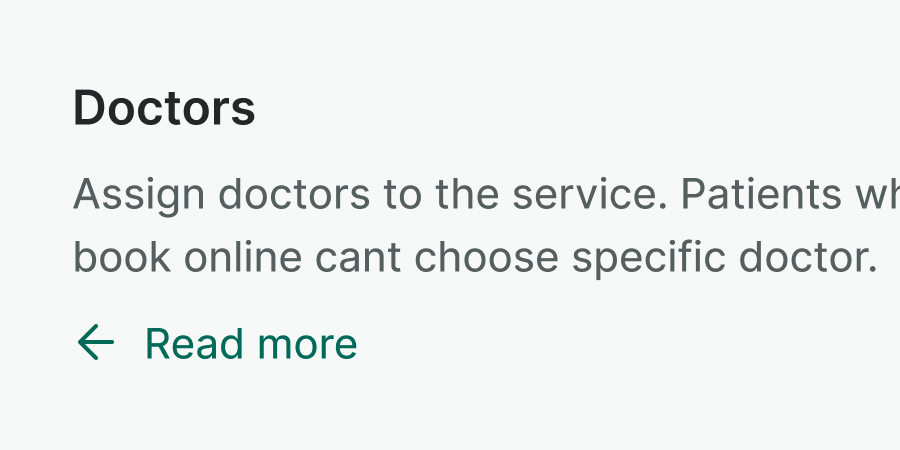
Don't
Don't use generic wording such as "read more" or "click here", as they can't be understood without context.
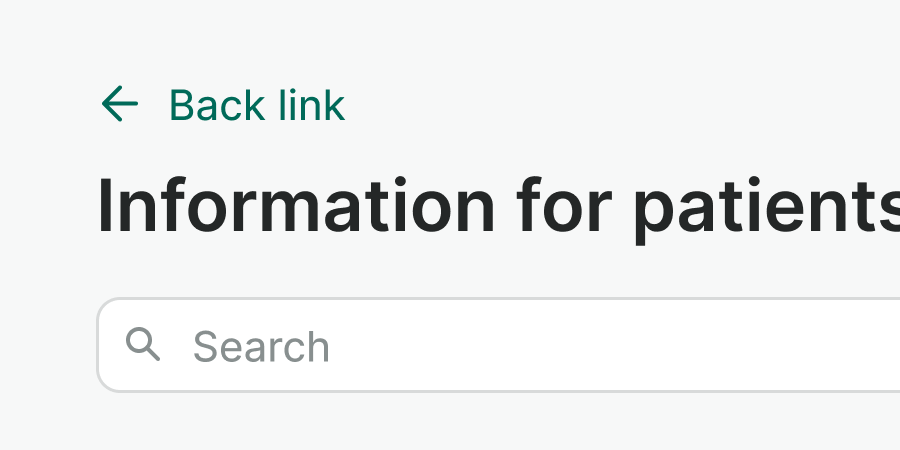
Do
Use icons to reinforce navigation cues i.e. showing the direction they user will follow, or indicating that link opens in a new tab.
Don't
Do not use icons for purely decorative purpose.

Do
Inherit a color from the surrounding text to subdue the link, or to ensure a proper color contrast.
Examples
Live Preview
Attributes
Attribute inheritance is enabled for WLink component. It means that any non-property attribute will still be applied to the root of the component (i.e. target attribute).
Props
| Name | Description | Type | Default | Values |
|---|---|---|---|---|
color-inherit | Specifies whether the link should inherit `color` from the parent container | boolean | false, true | |
href | URL value | string | ||
to Vue only | Router link `to` property. If specified the component will become a router-link | string|object | ||
leading-icon | Displays an icon to the left of the label. | string | icon name (i.e. "alarm-clock") | |
trailing-icon | Displays an icon to the right of the label. | string | icon name (i.e. "alarm-clock") |
Slots
| Name | Description |
|---|---|
default | Default content slot |