Usage
The card is a wrapper that displays content and actions on a single topic. It helps us structure the information that an user needs to digest.
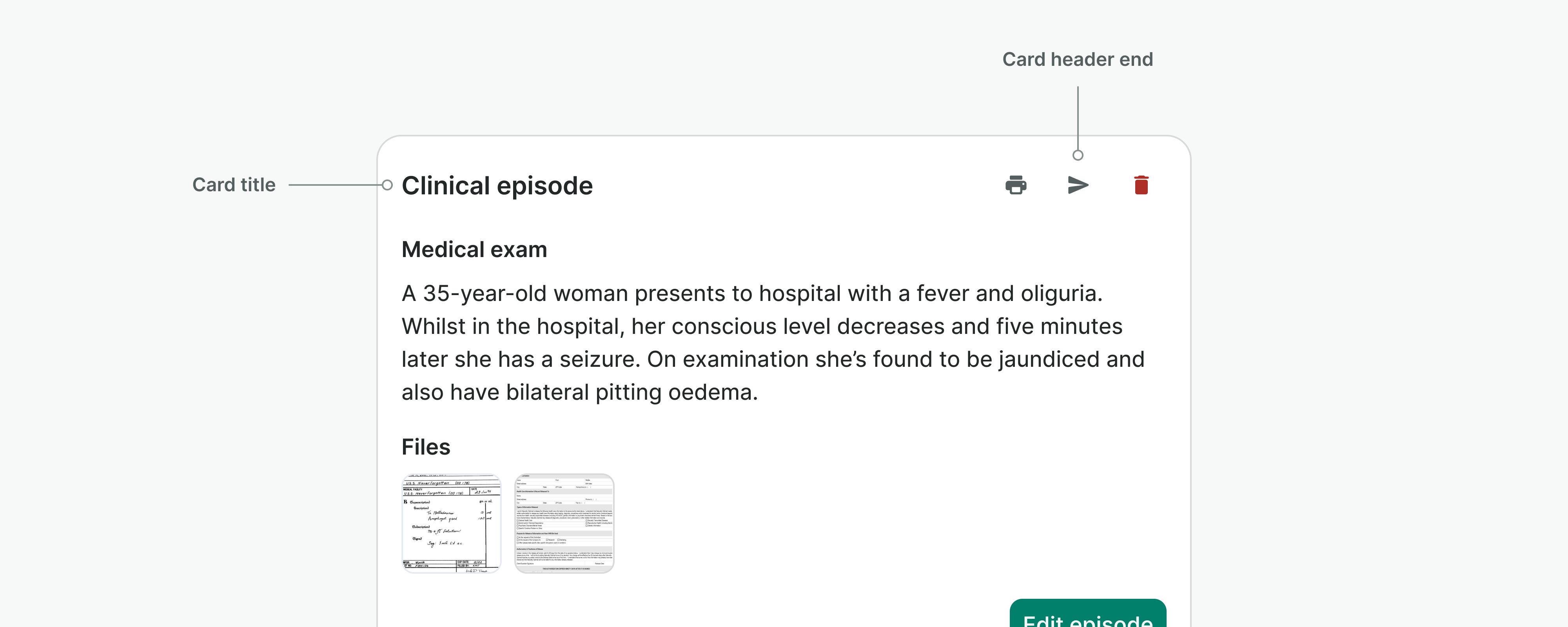
Card header
Placed on top of the card, the card header functions as a holder for introductory information and consists of a title and a slot for additional actions.
Do
Use titles that distinctly represent the intended purpose of the card.
Don't
Do not use the header end slot of the card header for persistent primary actions, use the bottom right of the card instead.
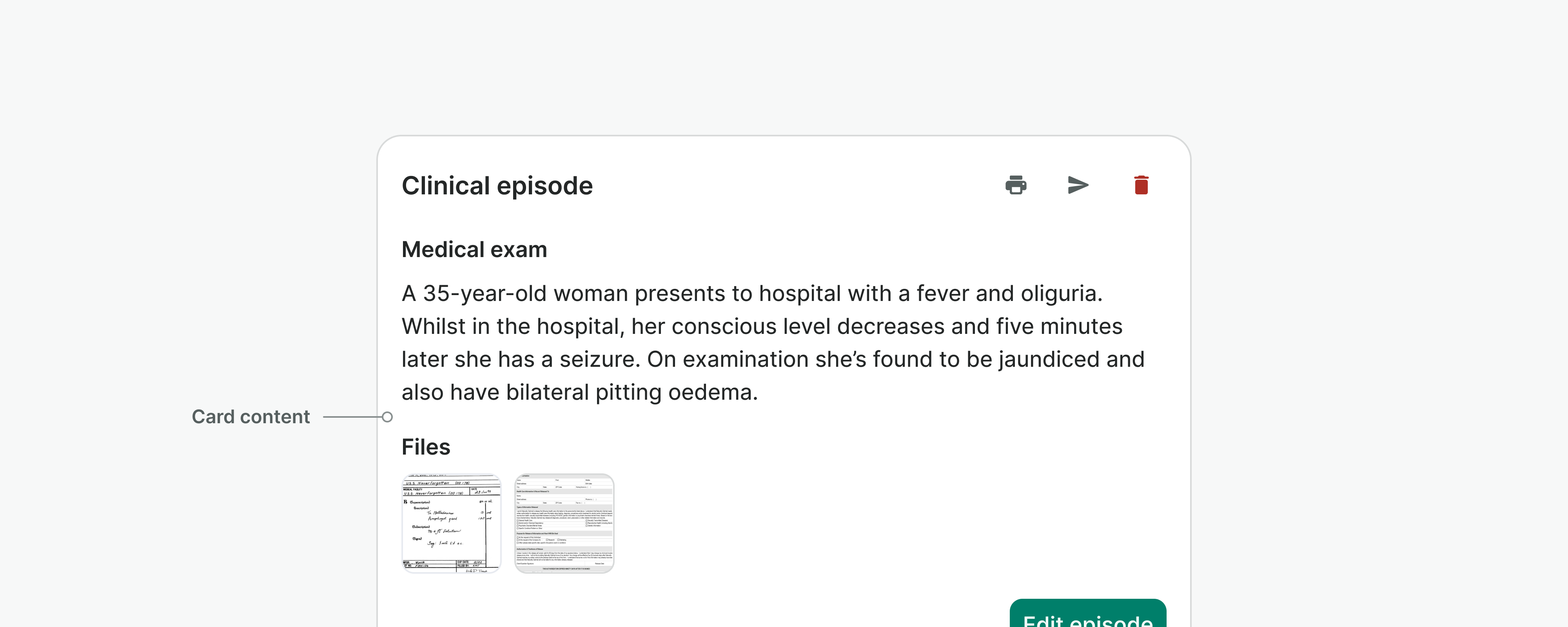
Card content
The card content refers to the information, data, images, or other elements that are displayed within a card body.
Do
Use the card content to display information on a single topic.
Don't
Do not have more than one primary button on a card. If you need a place to include more actions, use the header end section instead.
Examples
Live Preview
Props
| Name | Description | Type | Default | Values |
|---|---|---|---|---|
variant | Defines the card type and its purpose | string | raised | raised, inset |
padding | Controls the padding of the card | string | medium | none, medium, large |
title | Defines a title for the card. | string | null |
Slots
| Name | Description |
|---|---|
headerEnd | Optional slot that positions content at the end of the card header. Useful for actions or additional info. Title is mandatory to render this content. |
default | Default content slot |