Usage
A dropdown menu is used to display a list of actions. It must be triggered by another component, like a button or icon button.
Best practices
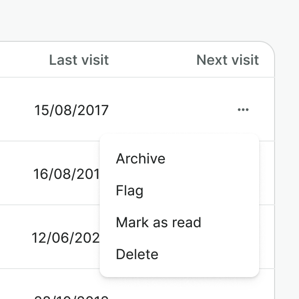
Use a dropdown menu when you have more than 5 actions to display or the space is limited. Otherwise, use button group.

Do not use a dropdown menu to hide primary actions. They must never be hidden behind a dropdown menu.
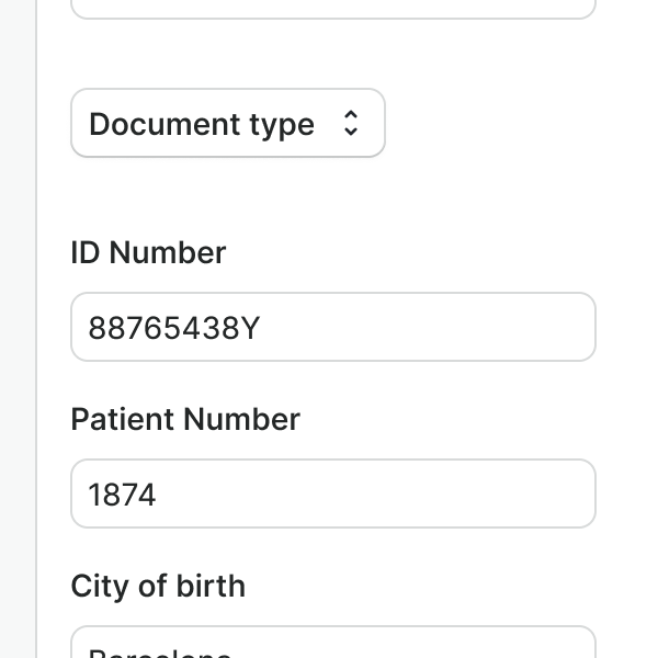
Do not use a dropdown menu as a form input. Use the select component instead.
Dropdown items and groups
Dropdown menus support section dividers and headers for grouping actions and adding clarity.
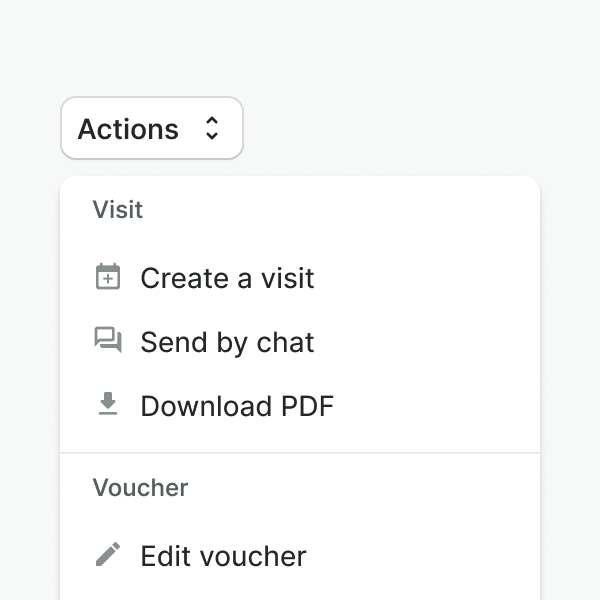
Group actions based on related categories to make them easier to scan.
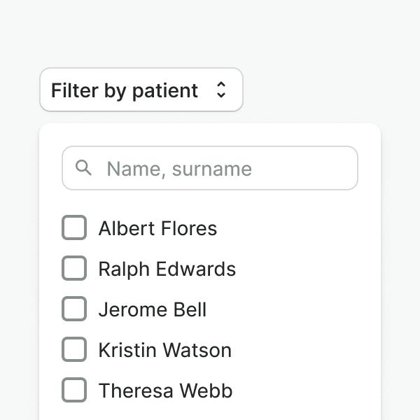
Do not use the dropdown menu for any filtering purposes, and do not include components other than dropdown items.

List items in a logical order, for instance, sorted by frequency of use.
Leading and trailing icons
Leading and trailing icons are placed at the start or end of the dropdown item and, as the icons that are placed in buttons, they should be used consciously.

Use icons for affordance clarity, to indicate status, or highlight the action that will be performed.

Don't use icons for decorative purposes or that don't portray the action. In those cases might be better to use text only.
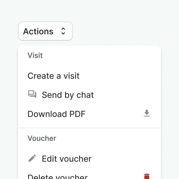
Don't mix trailing and leading icons inside the group. Be consistent to ensure scannability.
Examples
Live Preview
Props
| Name | Description | Type | Default | Values |
|---|---|---|---|---|
open | Controls whether the dropdown is open or not. | boolean | false | false, true |
position | Controls the position of the dropdown menu in relation to the trigger. `bottom-left` will align it to the bottom left of the trigger. `bottom-right` will align it to the bottom right of the trigger. `top-left`and 'top-right' will align it to the top left and right respectively. | string | bottom-left | bottom-left, bottom-right, top-left, top-right |
size | Controls the size of the dropdown popout. | string | medium | small, medium, large |
items | Controls the number of dropdown items and dropdown groups to display. | array | [{ heading: string, items: array [ { title: string, leadingVisual: string, trailingVisual: string, href: string, to: string, value } ], hideDivider: boolean }] | |
target | Type string or an actual DOM node where you want render component | string|object | body | |
use-teleport | When it is set to true, dropdown menu will teleport the content part into the body. | boolean | false | false, true |
Warning!
WDropdownItem's
to
property is not supported in web-component version of this component
Slots
| Name | Description |
|---|---|
default | Default content slot. Use it for adding the dropdown toggle. |
Events
| Name | Description | Type |
|---|---|---|
open | This event is emitted when the dropdown is open. | { "names": [ "Boolean" ] } |
close | This event is emitted when the dropdown is closed. | { "names": [ "Boolean" ] } |
item-click | This event is emitted when a dropdown item is clicked. | { "names": [ "String, any" ] } |
select | This event is emitted when a dropdown item is checked or unchecked. | { "names": [ "Array" ] } |