Usage
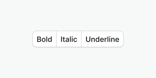
Button groups bring together button controls that belong to the same context. They help us save space when needed.
Best practices
Do
Use the default button variant and make sure you follow the best practices described in the button component.

Don't
Do not group buttons that don't have a relationship or similar purpose and just because they're close together.
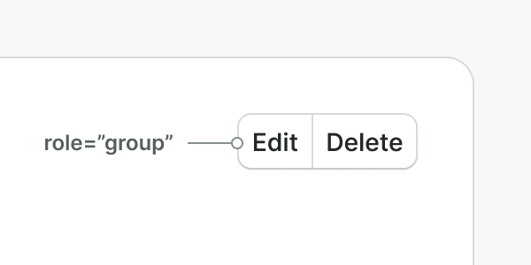
Do
To provide additional semantics and accessibility, apply the suitable
role attribute to the button group.
Don't
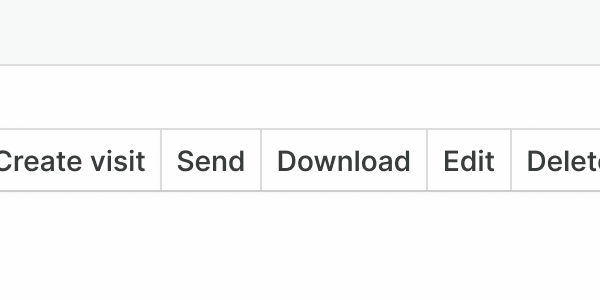
Do not group more than 5 buttons together. Be conscious of the number of options and the space available. If you need to display several actions, use a dropdown instead.

Don't
Do not use the button group as a replacement for navigation. Use tabs instead.
Examples
Live Preview
Props
| Name | Description | Type | Default | Values |
|---|---|---|---|---|
role | The role of the containing element. | string | group | valid ARIA role |
Slots
| Name | Description |
|---|---|
default | Default content slot |