Usage
Banner provides a distinguishable and non-disruptive way to communicate important information or conditions to users. Banners should be used sparingly and only for important messages.
Anatomy
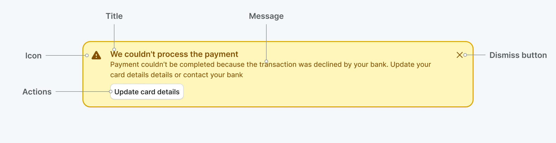
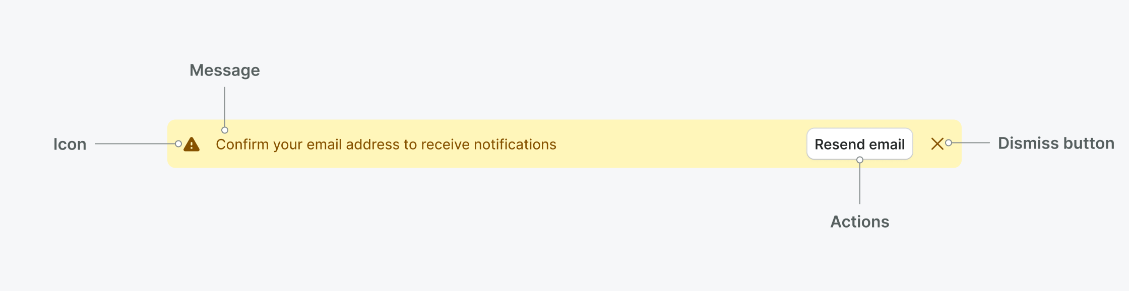
- Icon: Let the user quickly gauge what type of alert it is
- Title: (optional) Summarizes the banner in a short, clear statement to grab the user’s attention. (Not available for compact variant)
- Message: Provides detail and actionable steps for the user to take.
- Button or Link: (optional) CTA that allows users to address the alert or navigates them to a page with further details.
- Close button: (optional) Allows users to close the alert.
Best practices
- Use banners to communicate in a prominent way to the user.
- Provide an action to resolve the issue described by a banner if possible.
- Keep banner messages short and descriptive.
- Avoid displaying more banners than one at a time.
- Don’t use banners for promotional messages or to explain features in the user interface.
Placement
Banners should be placed on top of the section or page they apply to and fill available width of the container.
- Place a banner at the top of the page or section it applies to.
- Don’t make banners scroll with the user. Banners should be static.
- Don’t use banners for temporary messages. Use Toast instead.
Dismissing the banner
Banners should persist on the page until the user dismisses it or if the state that caused the banner is resolved.
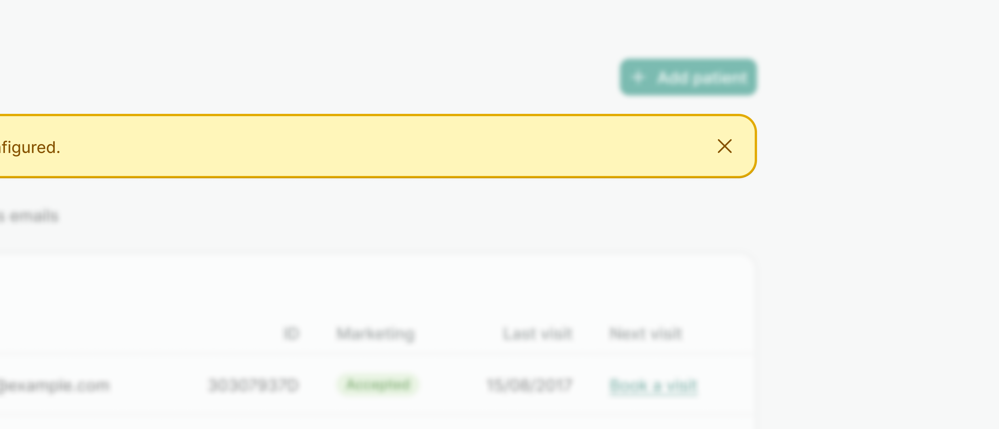
- Provide a close button, unless the banner is critical and has to be addressed by the user.
- Don’t automatically dismiss the banner with a timeout. If you need a temporary message use Toast instead.
Variants
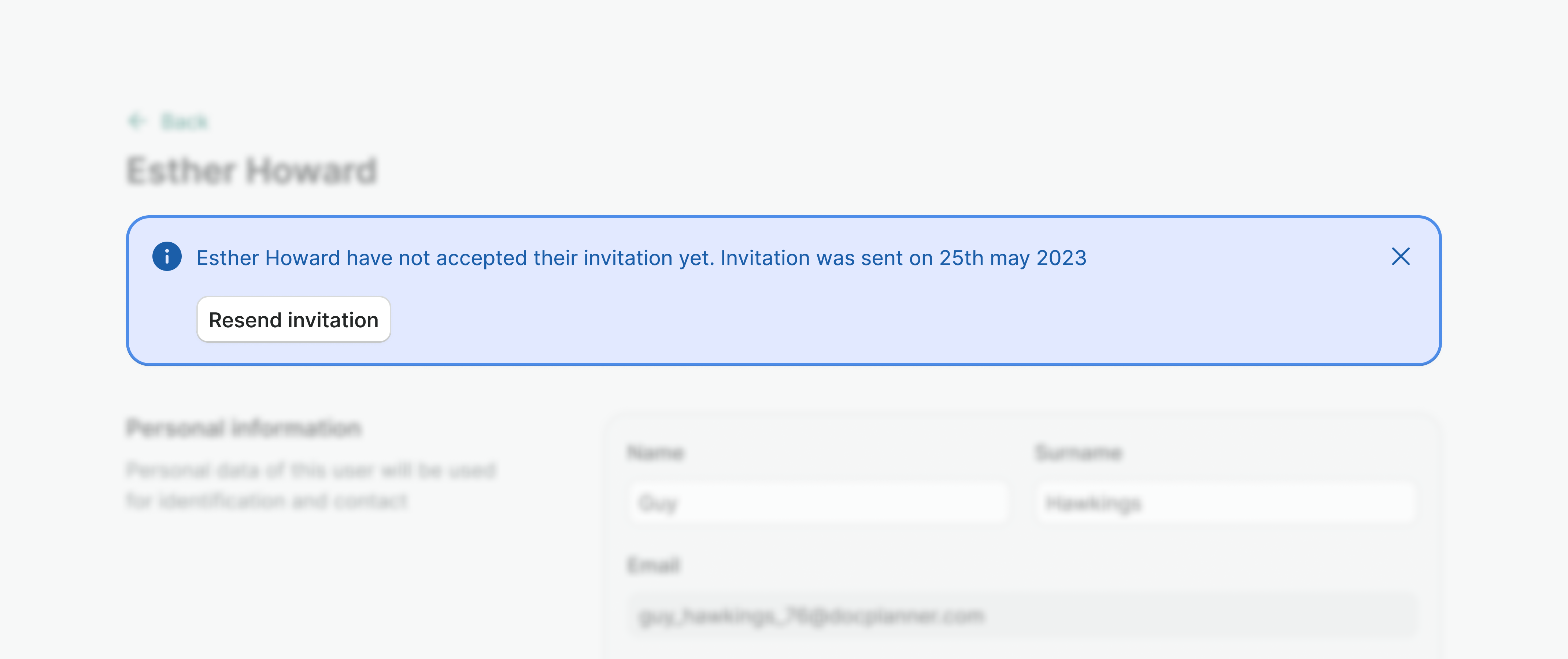
Info
Shows information connected to the current task, but does not require any action from the user.
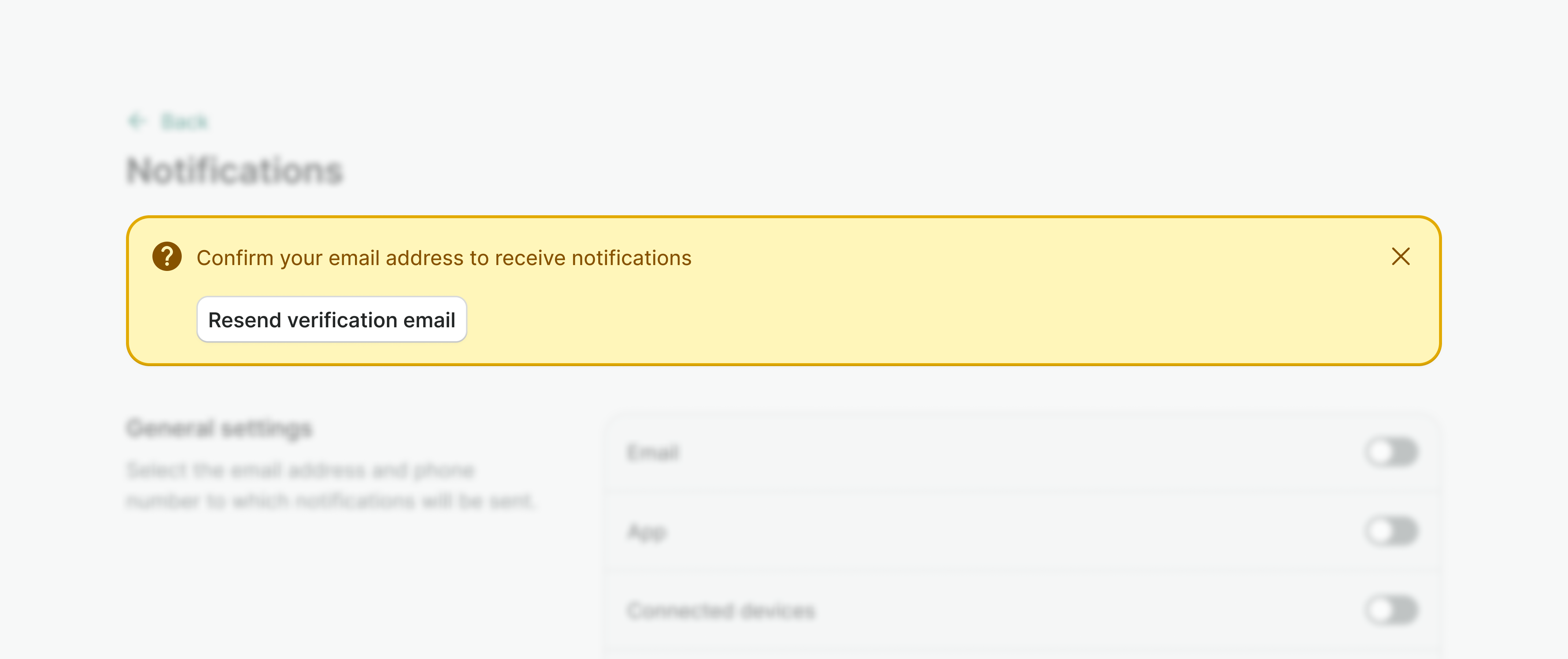
Warning
Informs the user about the unwanted state or the issue that is not critical and doesn’t block the user.
Error
Informs the user about a critical error that has to be addressed to proceed further.
Success
Confirms to the user that the action was completed as expected and might provide further actions helpful to the user.
Sizes
Default
Default banner should be used for messages that relate to the whole page or larger sections. Default banner uses larger padding and displays actions below it's content. It may include a title, if necessary.
Compact
Compact banner should be used for messages that relate and are contained in smaller sections (i.e. a single card). Compact banner doesn't include optional header. It uses smaller padding and displays actions next to the content. If available width is too small, actions will wrap under the content.
Examples
Live Preview
Props
| Name | Description | Type | Default | Values |
|---|---|---|---|---|
variant | Defines the style variant of the banner. | string | info | info | error | success | warning |
dismissible | Defines whether banner can be dismissed. | boolean | true | true | false |
compact | Defines whether banner is displayed in compact mode. | boolean | false | true | false |
translations | Provide values as translated strings. | object | {
closeBtnAriaLabel: 'Close'
} | Object with the following key: closeBtnAriaLabel |
Slots
| Name | Description |
|---|---|
header | Header slot |
default | Default content slot |
actions | Actions for CTA |
Events
| Name | Description | Type |
|---|---|---|
dismiss | Emits the event after the click | { "names": [ "Boolean" ] } |