Usage
Empty states are used to fill blank spaces when no content is present or when the feature is temporarily empty. They are meant to propose a path forward.
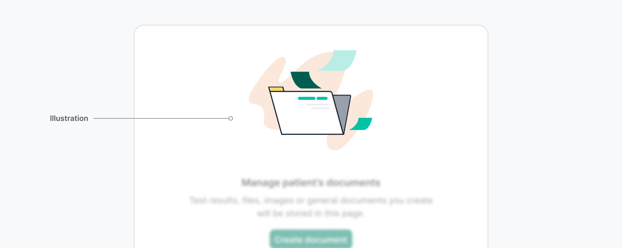
Illustration

Do
- Use the illustration options provided in the component as they are thoughtfully crafted, and follow our illustration guidelines.
Don't
- Do not use system icons, images, or any other type of graphic to illustrate an empty state.
Content
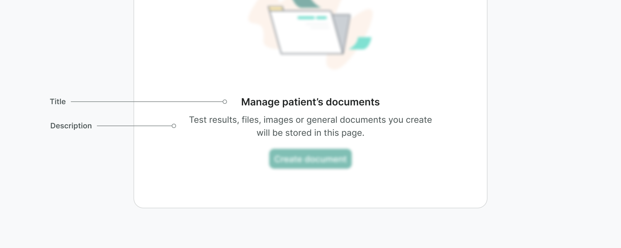
As we said above, empty states are meant to explain the feature or the situation that causes this void. Use the title and description to help you with that.

Do
- Use the title to provide a short definition of the feature or the current state.
- Use the description to guide the users by clearly stating the benefit and utility of the feature or offering solutions.
Don't
- Do not blame the user for the empty state. Consider their emotional condition and context and try to help them.
Actions
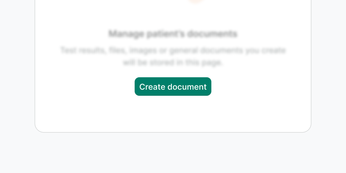
The actions present the user with a way out of the current situation. We recommend you to always place a primary button that solves the empty state and make use of the secondary button or link scarcely.


Do
Use actions to clarify to the user what they can do next.

Don't
Do not use more than one primary button.

Do
If you need to explain the feature further and that requires navigation, place a link below the button/s.

Don't
Do not display any parts of the interface that are dependent on the content (e.g. filters, or sorting).
Examples
Live Preview
Props
| Name | Description | Type | Default | Values |
|---|---|---|---|---|
image-src | Provides a link to the image. | string | null | |
description Required | Provides a description of the empty state. | string | null | |
title Required | Specifies title text for the empty state. | string | null |
Slots
| Name | Description |
|---|---|
actions | Actions for CTAs |