Spacing
Spacing is a fundamental aspect of design that ensures clarity and organization within an interface. Proper spacing enhances readability, guides user flow, and creates a visually appealing layout by defining the relationships between elements.
Every part of the interfaces that we build should be intentional, including the empty space among elements. The way we manage space in our designs defines the access our users have to the content provided, therefore, keep always in mind that a correct use of space helps the user understand the stucture of the product, the hierarchy of the page and the affordances of every element present in your designs.
Scale
The base unit size is 8px. Semantic tokens represent the choices the design system team made in regards to when to use each spacing value.
| Sample | Description | Token |
|---|---|---|
The quick brown fox jumps over the lazy dog calc(8 / var(--w-base-rem) * 1rem) | Space SUse it to space out small components in the UI | --w-space-s |
The quick brown fox jumps over the lazy dog calc(16 / var(--w-base-rem) * 1rem) | Space MUse it to space out small components in the UI | --w-space-m |
The quick brown fox jumps over the lazy dog calc(32 / var(--w-base-rem) * 1rem) | Space LUse it to separate articles and sections in every view. | --w-space-l |
The quick brown fox jumps over the lazy dog calc(64 / var(--w-base-rem) * 1rem) | Space XLUse it to separate articles and sections in every view. | --w-space-xl |
Usage
By using consistent values and organized interface structures in specific environments we help designers and developers manage the relationships and proportions between elements.
Small and Medium
The semantic space tokens S (8px) and M (16px) are potentially more used to space components (e.g. space among buttons and icons or the space between an icon and its label).

E,g. Different grouped actions with a Button + Icon separation. Large and ExtraLarge
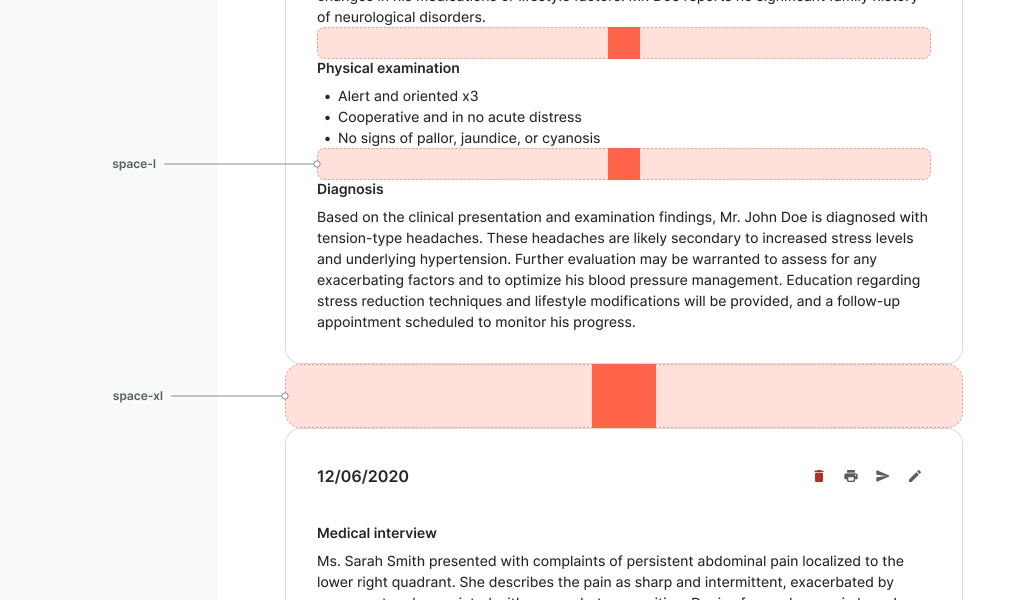
While L (32px) and XL (64px) are more likely to space elements in our layouts (e.g. divide sections, build space in forms, headings or cards).

E,g. Vertical alignment within a Card component
Design resources
By using spacing tokens as variables in Figma, you can revolutionize your design process. Auto-layout frames are now able to use our tokens, and you can change the size and direction of them in the blink of an eye.