Usage
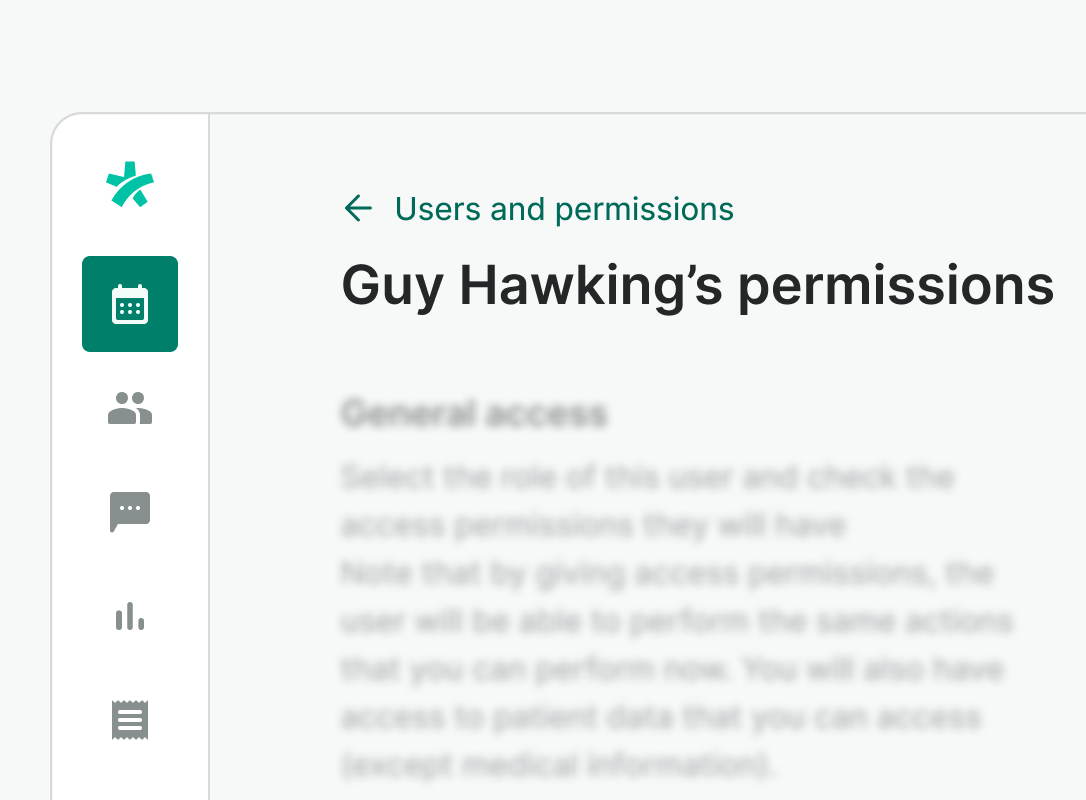
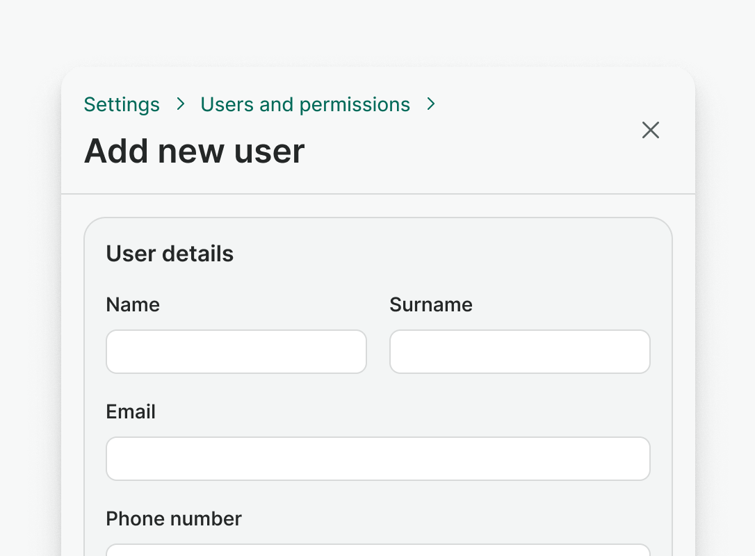
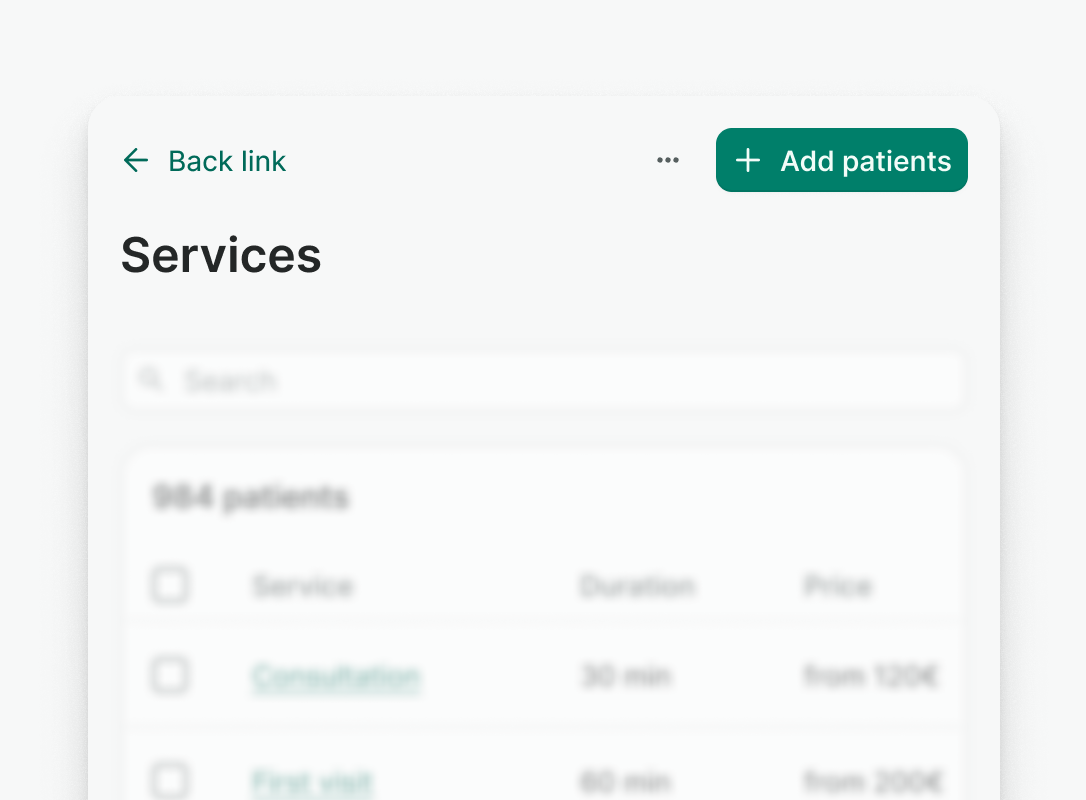
The Page Header shows the current page's title, main actions, and optional description. It includes back navigation for nested pages, helping users understand their location in the app and move back easily.
Best practices
Do
Use Page Header only at the top of the page.
Don't
- Don't use multiple Page Headers on one page
- Don't use Page Header in a modal dialog
Do
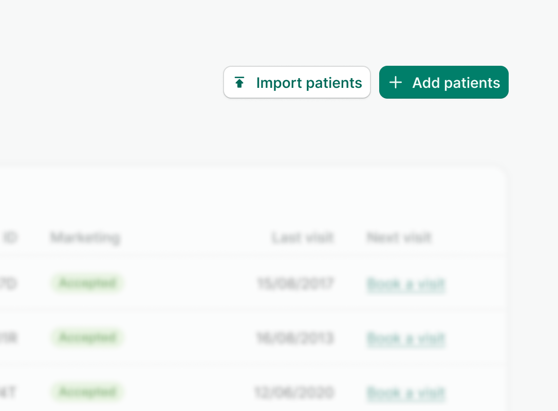
Use header to hold primary actions of the page.
Don't
Avoid overcrowding the header with too many actions. If you need more actions or are designing for mobile, prioritize them. Place less important actions in a dropdown menu.
Examples
Live Preview
Props
| Name | Description | Type | Default | Values |
|---|---|---|---|---|
parent-navigation | Array of objects representing the list of parent pages. For one parent page, it renders a Link. For more than one, it renders Breadcrumbs. | array | [ { label: String, href: String, to: String, isActive: Boolean } ] | |
title | Title of the page. | string | ||
title-tag-type | Specifies the HTML tag for the title. Useful for changing the semantic meaning of the title. | string | h1 | p, h1, h2, h3, h4, span, div |
badge | Displays a trailing badge to support the page title. | string | ||
badge-type | Specifies the type of the badge. | string | neutral | accent, accent-inverted, neutral, info, success, warning, danger, neutral-inverted, info-inverted, success-inverted, warning-inverted, danger-inverted |
description | Displays an additional text below the title. | string |
Slots
| Name | Description |
|---|---|
actions | Used to render header actions |