Usage
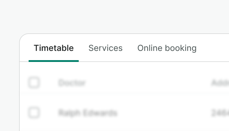
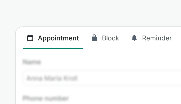
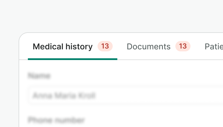
Tabs are used to organize and navigate between related views at the same hierarchy level. Tabs can include icons to reinforce labels and counters to inform about the tab's content.
Do
Use short and scannable labels, with as few words as possible.

Don't
Don't use long names as a label.
Do
Be consistent with the use of icons, and use them to reinforce the label.

Don't
- Don't use icons for decorative purposes only, or if they don't have a clear connection to the label.
- Don't use icons only for some selected tabs.

Do
Use counters in tabs to provide meaningful feedback, for instance, notifications about specific sections.
Don't
Use counters sparingly as you can overwhelm users and reduce the effectiveness of the feedback. Instead, balance the need for each section and display the strictly necessary.

Don't
Don't add interactive elements, such as buttons and links, inside the tab item.
Examples
Live Preview
Props
Tabs
| Name | Description | Type | Default | Values |
|---|---|---|---|---|
items | Array of objects that represents the list of TabItems for the tab component. The properties accepted are `label`, 'value', 'isActive' and 'iconName'. | array | [] | [ { label: String, value: String, isActive: Boolean, iconName: String, data-*: String } ] |
aria-label | Defines a string value that labels the tab component. | string | tabs |
TabsItem
| Name | Description | Type | Default | Values |
|---|---|---|---|---|
value Required | Value required for accessibility compatibility to connect a tab item with a tab panel. Remember that the value provided to the tab item should be unique and the same as the value provided for the TabPanel component. Under the hood, we are adding support connecting the aria control property with the id of the tabpanel. | string | ||
active | Set the tab as active | boolean | false | |
counter | Controls the display of a badge with a numeric counter. | number | ||
counter-type | Allows you to choose the badge type. | string | neutral | accent, accent-inverted, neutral, info, success, warning, danger, neutral-inverted, info-inverted, success-inverted, warning-inverted, danger-inverted |
icon-name | Set the tab icon name to display on the left. | string | null |
TabPanel
| Name | Description | Type | Default | Values |
|---|---|---|---|---|
value Required | Value required for accessibility compatibility to connect a tab panel with its tab . Remember that the value provided to the tab panel should be unique and the same as the value provided for the TabItem component. Under the hood, we are adding support connecting the id of the tabpanel with the aria control property of the tab. | string | ||
active | Set the tabpanel as active. By default, the tabpanel is enabled so this is the property to be used depending on the current active tab. | boolean | false |
Slots
Tabs
| Name | Description |
|---|---|
default | Default content slot |
TabsItem
| Name | Description |
|---|---|
default | Default content slot |
TabPanel
| Name | Description |
|---|---|
default | Default content slot |
Events
Tabs
| Name | Description | Type |
|---|---|---|
change | This event is emitted when active tab change. | { "names": [ "String" ] } |
TabsItem
| Name | Description | Type |
|---|---|---|
item-click | This event is emitted when the current tab is clicked. | { "names": [ "String" ] } |