Usage
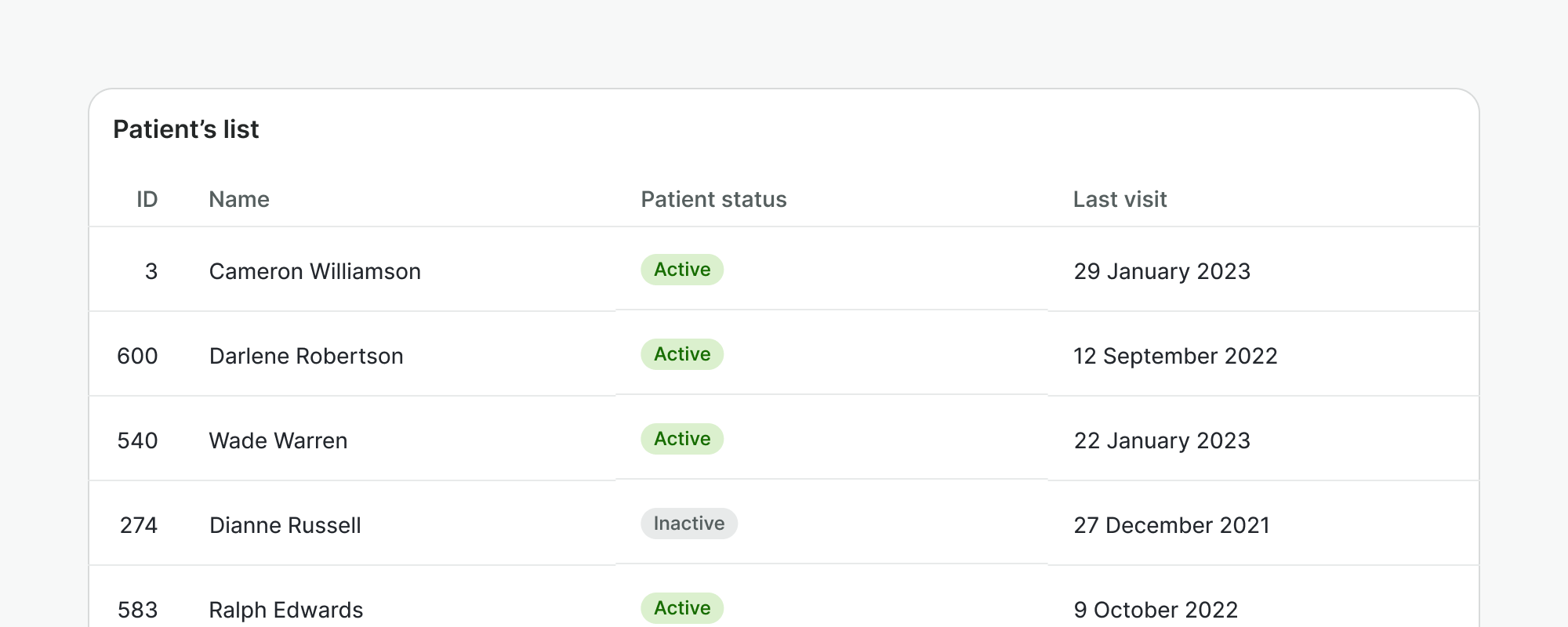
A table is a component used to display and organize information from a data set. Provides styles and features like row selection or sortable columns.
Best practices
Do
- Use a table when you need to navigate through a lot of information and compare data among rows and columns.
- Place a table within a card component and use the card header if needed to provide context.
Don't
- Do not use a table when you need to display simple or non-comparative values. Consider a non-tabular format instead, like a list.
- Do not use a table when there are columns where the cells are usually empty. Consider listing the items instead.
- Do not display a table without content.
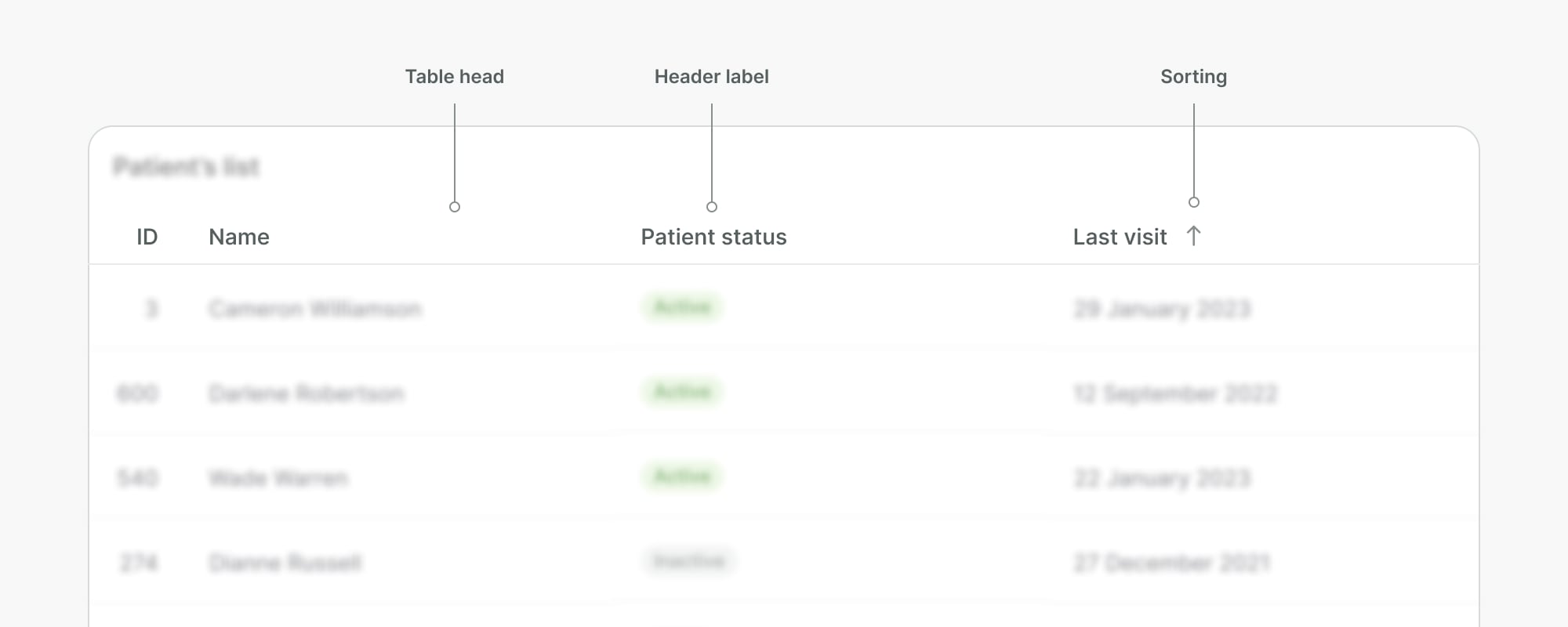
Table head
Table heads are built with short header labels that describe the data in their respective columns. These headers are additionally used to sort rows by the column data in ascending or descending order.
Do
- Keep headers clear and concise.
- Display header labels in one line to avoid wrapping. Wrapping will misalign the header labels and make them harder to scan.
Don't
- Do not misalign headers with their respective content in the column.
- Do not sort values randomly. Sort data in an intuitive order, for instance, showing the most recently created items first. Rows will be re-ordered when the user updates the sorting parameters.
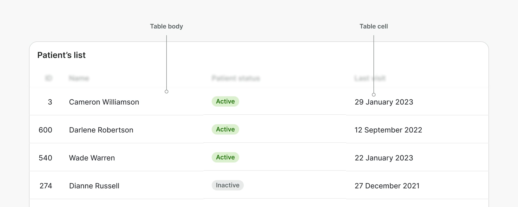
Table body
The table body refers to the sum of the rows and the content displayed within the table cells, such as text, numbers, or any other data type.
Do
- Include a textual indicator for empty cells, so they cannot be mistaken for data missing or failing to load.
- Use the right alignment of the content to better scan and compare numbers, or at the last column of the table if there are actions in the row.
Don't
- Do not fill cells with long-form content like paragraphs or long lists.
- Do not use symbols such as "x", "ø" for empty cells as they might disrupt the experience for assistive technologies like screen readers.
- Do not mix data in a column cell that isn't described by the column header.
- Do not use a primary button in every table row.
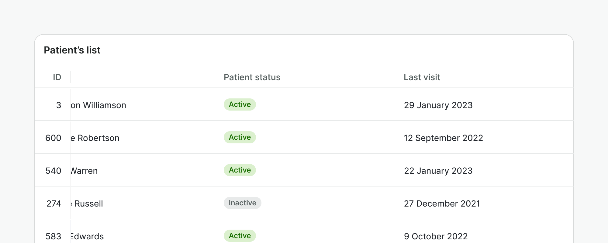
Sticky columns
Sticky columns allow to highlight first or last column when table data overflows the container and requires horizontal scrolling.
Do
Use sticky column to highlight prominent data for the user and allow for better scannability when scrolling. e.g. ID column.
Don't
Don't use it for secondary information that is not crucial for user to see at all time.
Examples
Live Preview
Props
Table
| Name | Description | Type | Default | Values |
|---|---|---|---|---|
rows | Maps the rows on the table. This is an array of objects with each object having keys that correspond with the property of each column. | array | [] | [ { selected: boolean}, (...) ] |
columns | Maps the columns on the table. This is an array of objects with each object having keys that correspond with the property specified in the object of each row. | array | [] | [ { title: string, key: string, align: string, sortable: string, width: string, minWidth: string, sortDirection: string }, (...) ] |
selectable | Defines whether the rows at the table can be selected in bulk. | boolean | false | false, true |
loading | Specifies loading state of the table | string | skeleton, spinner | |
skeleton-rows-number | Specifies the number of rows to be displayed in the skeleton state when there is no data. If the table contains data, this prop will be ignored and all rows will be replaced with skeleton rows. | number | 5 | |
translations | Provide values as translated strings | object | { selectRowLabel: 'Select row', selectAllRowsLabel: 'Select all rows' } | |
sticky-column | Defines the column that will be sticky. The value can be 'first' or 'last'. | string | none | 'none, first, last, both |
Table Head Cell
| Name | Description | Type | Default | Values |
|---|---|---|---|---|
align | Defines the alignment of the head cell. | string | left | left, right |
sortable | Defines if the head cell can be sortable. | boolean | false | false, true |
sort-direction | If the head cell is sortable, it shows the proper icon depending on the sort direction specified. | string | null | asc, desc |
Table Body Row
| Name | Description | Type | Default | Values |
|---|---|---|---|---|
selected | Defines if the body row is selected or not. To be enabled, the table should set to selectable. | boolean | false | false, true |
Table Body Cell
| Name | Description | Type | Default | Values |
|---|---|---|---|---|
align | Defines the alignment of the body cell. | string | left | left, right |
colspan-td | Defines the colspan of the body cell. | number | 1 |
Slots
Table
| Name | Description |
|---|---|
row | |
`${column.key}-loading` | |
column.key |
Table Head
| Name | Description |
|---|---|
default | Default content slot for table head |
Table Head Cell
| Name | Description |
|---|---|
default | Default content slot for table head cell content. It is usually used for the column title. |
Table Body
| Name | Description |
|---|---|
default | Default content slot for table body |
Table Body Row
| Name | Description |
|---|---|
default | Default content slot for table body row content |
Table Body Cell
| Name | Description |
|---|---|
default | Default content slot for table body cell |
Events
Table
| Name | Description | Type |
|---|---|---|
select-row | Emits the event when we select row | { "names": [ "Object" ] } |
select-all-rows | Emits when we select all rows from checkbox header | { "names": [ "Object" ] } |
sort-column | Emits the event when we sort by column | { "names": [ "Object" ] } |
Table Head Cell
| Name | Description | Type |
|---|---|---|
click | Emits the event when we click on the head cell of the table. | { "names": [ "Event" ] } |