A Segmented Control is a linear set of connected controls that lets users select one or more related options, instantly updating the content or view within the same screen.
Anatomy
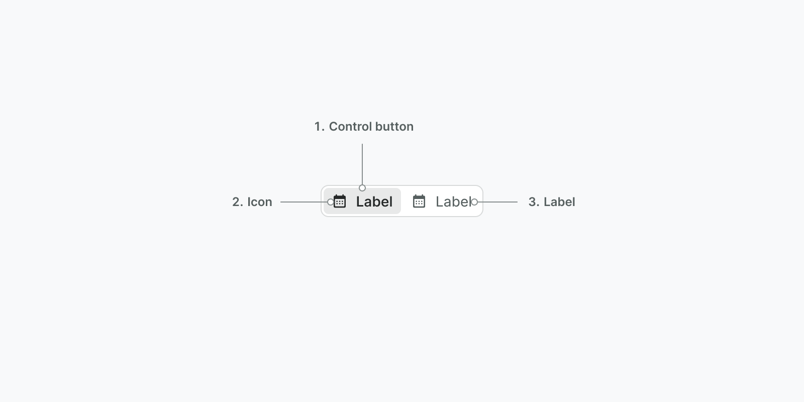
- Control Button: A button that allows the user to select or unselect an option
- Icon: (Optional) A descriptive visual that will communicate what will happen if the control is selected
- Label: (optional) A descriptive text that will communicate what will happen if the control is selected
Usage
When to use
- Use for filtering content within the current view. Selecting an option instantly refines what the user sees in the current context.
- Use for switching between distinct views or categories on the same screen.
- Use when it is desirable to have all options are visible at the same time, as opposed to hidden in a dropdown.
When not to use
- Avoid using a segmented control to offer actions, such as adding, removing, or editing content because they're meant for filtering or switching views. Use a button for immediate actions instead.
- Avoid using a segmented control for navigating to entirely separate screens as they imply staying within the current context. Use tabs or navigation instead.
Examples
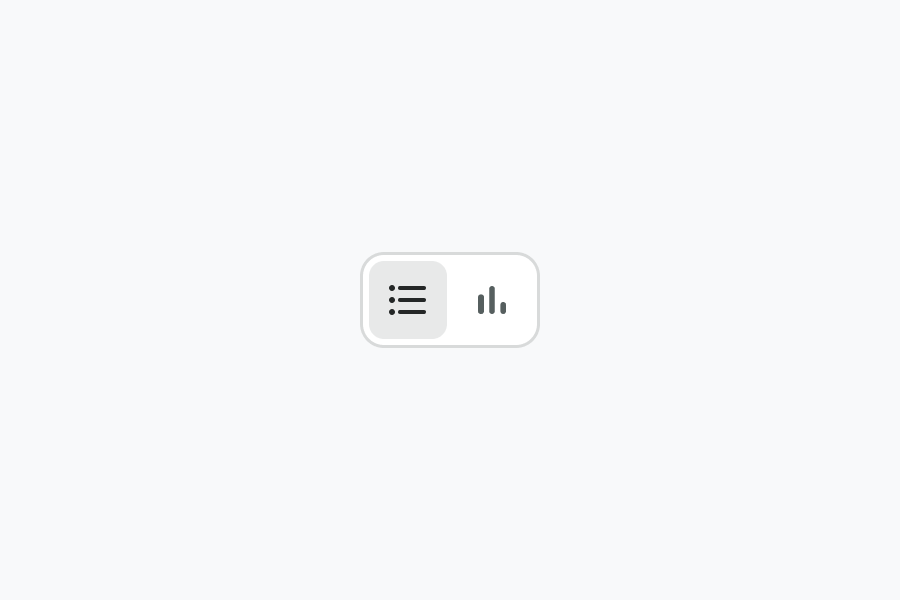
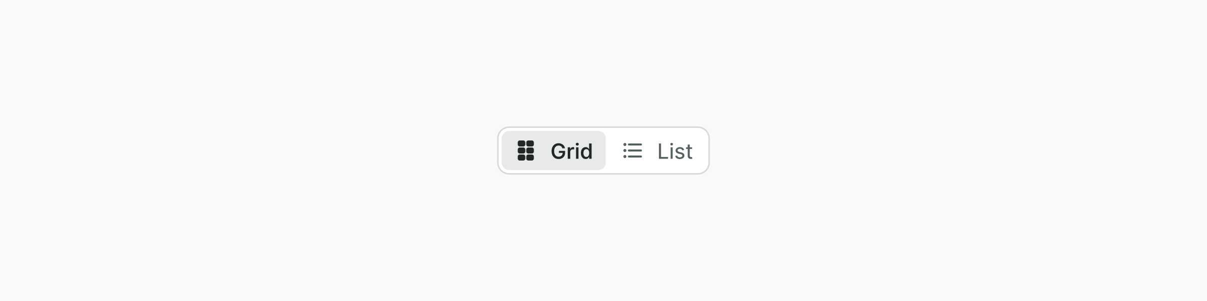
Switch between views
Allow users to switch between a list view and graph view
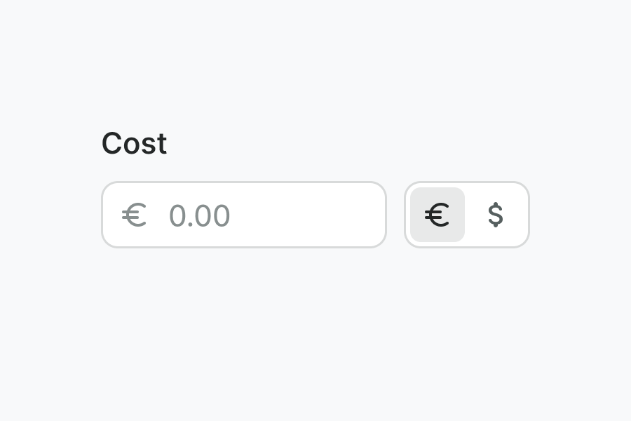
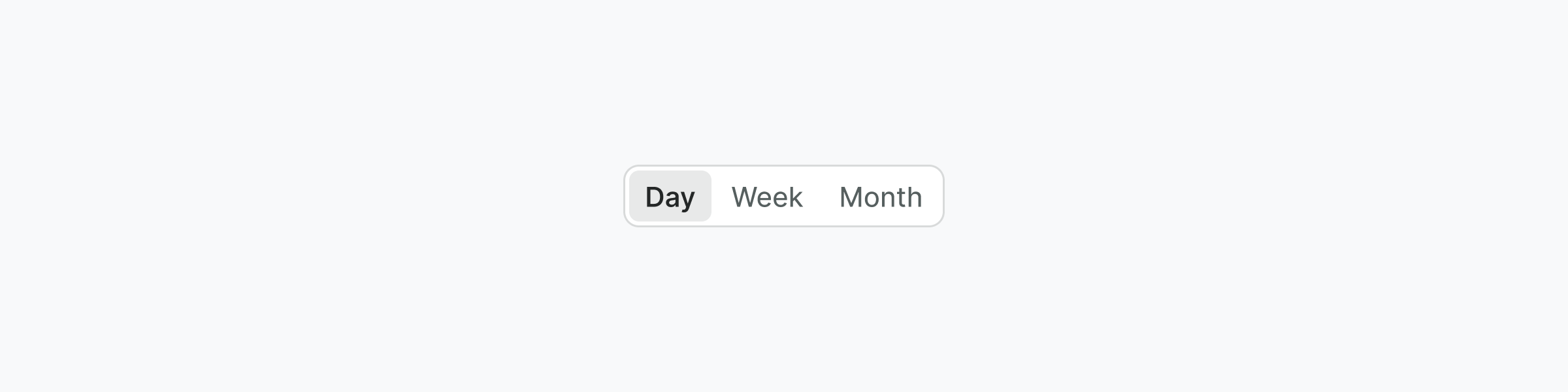
Change a Value
Allow users to change the data format in an input field
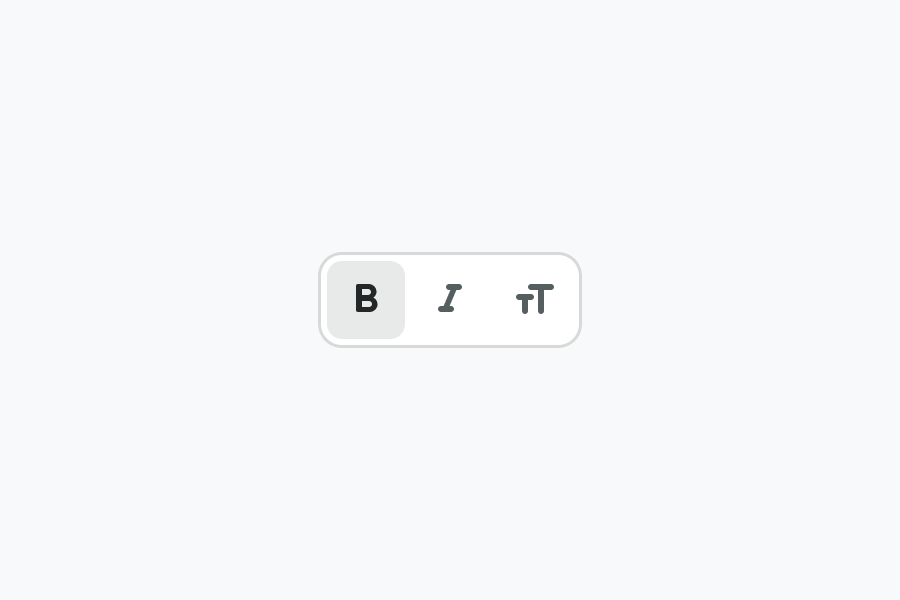
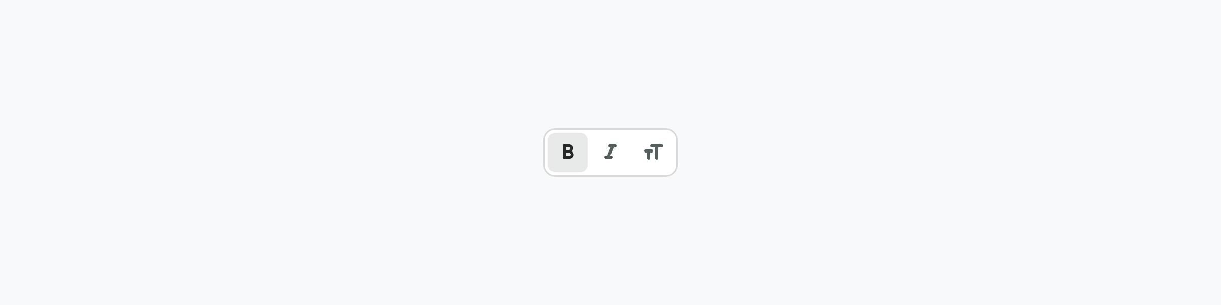
Selecting One or More Option
Allow a user to select one or more styling choices for text
Best practices
Do
- Use radio buttons to choose one option from the list.
- Think about whether your Segmented Control needs text and an icon, text only, or an icon only.
- Use short and concise text for the labels (if applicable).
- Place the Segmented Control in close proximity (ideally just above) to the area it controls.
Don't
- Don't group items that aren't clearly related.
- Don't use an icon-only toggle if the actions aren't clearly understood.
- Avoid wrapping the Segmented Control onto more than a single row.
- Do not mix different types together in one segmented control.
Behavior
General
- A segmented control does not require a "Save" button to apply the selection
- When a choice is selected, the selection immediately affects an object, state, or view
- Only one segment can be active at a time, representing a mutually exclusive choice.
- Single Select type must always have a selected option
- The button label text fills the space available, while retaining the left and right padding
- If the text does not fit it gets truncated
Responsive
In mobile the segmented control fills the full viewport
Types
Text and Icon
Text
Icon
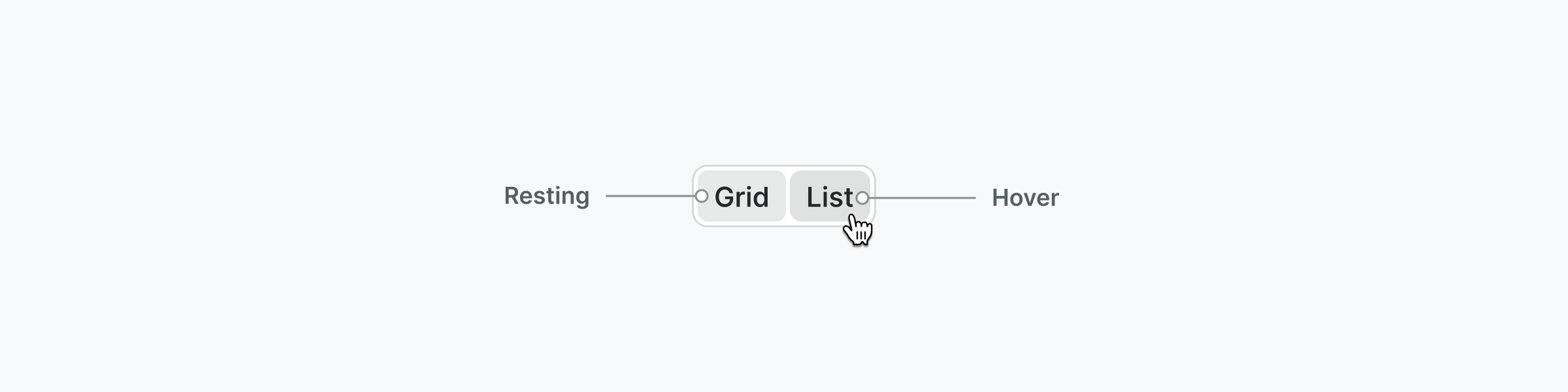
States
Unselected
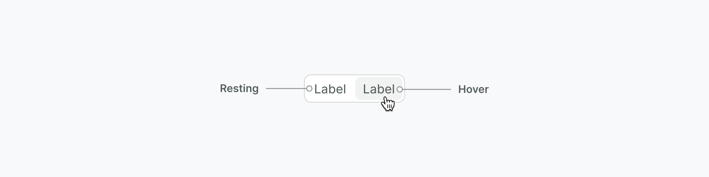
Selected
Variants
Segmented Control has two types — single and multiple.
Single-select (Radio Functionality)
- Selections are mutually exclusive
- Once a selection has been made, it can only be deselected by making a new selection
- One option is always selected
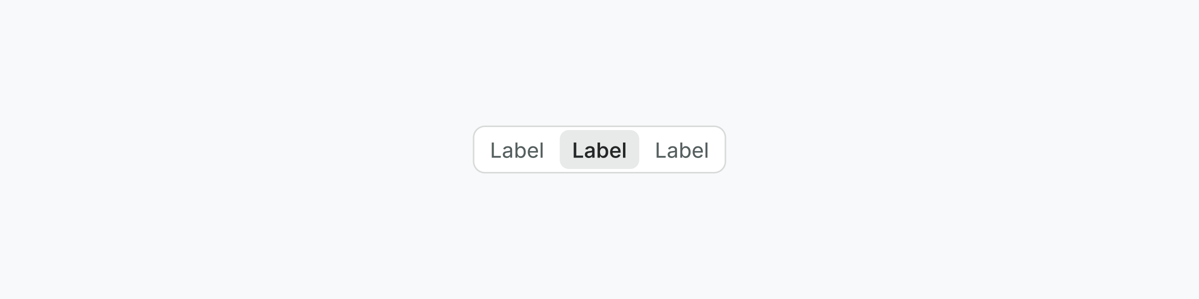
Multi-select (Checkbox Functionality)
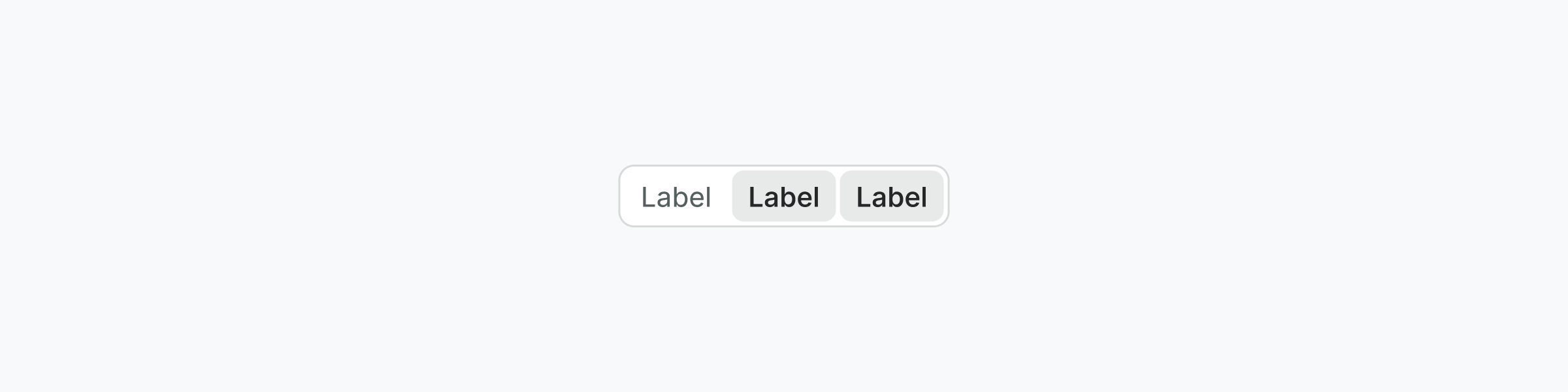
- Selections are not mutually exclusive. One or more option to be chosen at the same time
- Selecting a different option will keep the previous options selected
- No options or all options could be selected
Content guidelines
- Segmented control button labels should be nouns or noun phrases that succinctly describe the choice
- Labels may not wrap to multiple lines
- Start labels with a capital letter
- Don’t use commas or any punctuation at the end of each label
- Avoid using more than two words per label
Examples
Live Preview
Props
| Name | Description | Type | Default | Values |
|---|---|---|---|---|
items Required | Array of items to display in the segmented control | array | ||
mode | Selection mode - single allows one selection, multiple allows multiple | string | | |
model-value Required | Current selected value(s) - v-model support | string|array | ||
full-width | Whether buttons should expand to fill container width | boolean | ||
aria-label | Accessible label for the segmented control group | string |
Events
| Name | Description | Type |
|---|---|---|
update:modelValue | { "names": [ "undefined" ] } |
Slots
No available slots