Usage
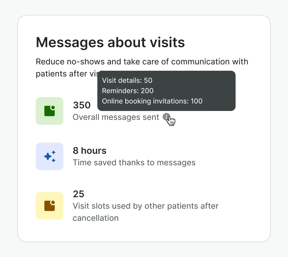
Tooltip is a small pop-up box that appears when a user hovers over an element. Tooltip can be used to provide additional information or context about that element. They should only contain supplementary, non-essential information and be used sparingly.
Best practices
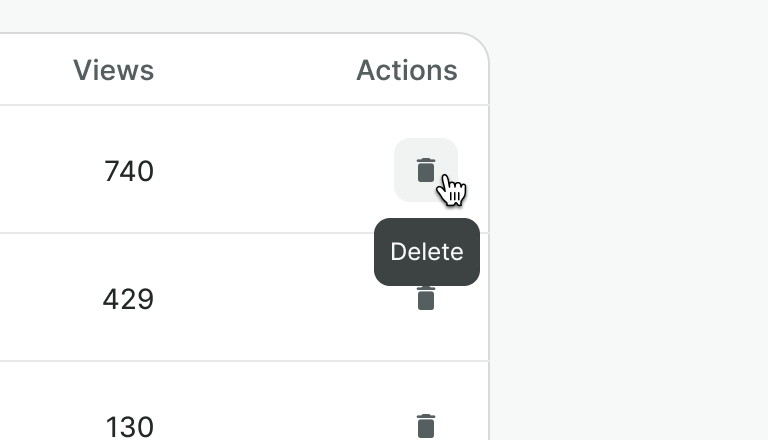
Use tooltip only with interactive elements e.g. providing text label for the Icon button.

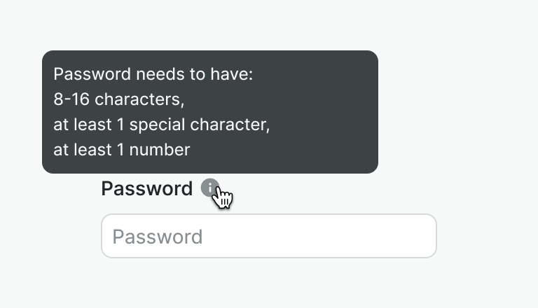
Don’t use tooltips on non-interactive elements e.g. text, icons, containers.


Alternatives
Although tooltips may seem like a good solution for providing additional content to users, they are rarely appropriate.
- They are hidden by default, making them easy to miss.
- If they are not used on focusable elements, they cannot be accessed via keyboard, creating accessibility issues.
We recommend finding an alternative approach and considering tooltips as a last resort.
Show content directly on the page
If the content is necessary to finish the task, or vastly benefits the user try to show it directly on the page.

Use a different component
Consider different components, e.g. a modal. They give you more flexibility to put necessary content and provide better accessibility.

Use progressive disclosure
Instead of hiding information in the tooltip, provide a clear action to show and hide the content.
If you need help deciding what alternative to use, you can reach out to the Design System Team for assistance.
Examples
Live Preview
Props
| Name | Description | Type | Default | Values |
|---|---|---|---|---|
content Required | Text inside the tooltip | string | ||
position | Defines which side will tooltip be displayed on | string | auto | auto | top | right | bottom | left |
aria-label | Text used to describe tooltip for screen readers | string | ||
target | Type string or an actual DOM node where you want render component | undefined | body |
Slots
| Name | Description |
|---|---|
default | Default content slot. It will be the tooltip target (for the events and position) |