Usage
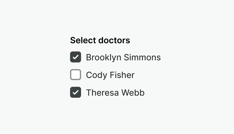
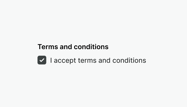
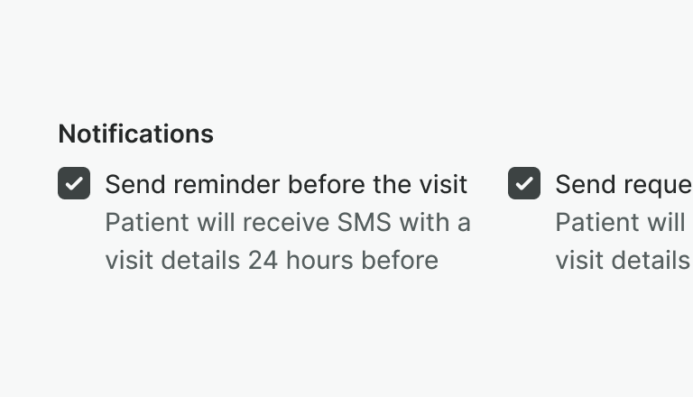
The Fieldset component is used for grouping sets of related checkboxes or radio buttons.
Best practices
Use the fieldset component to group a set of related inputs i.e. checkboxes or radio button.
Don't use the fieldset with just one input.
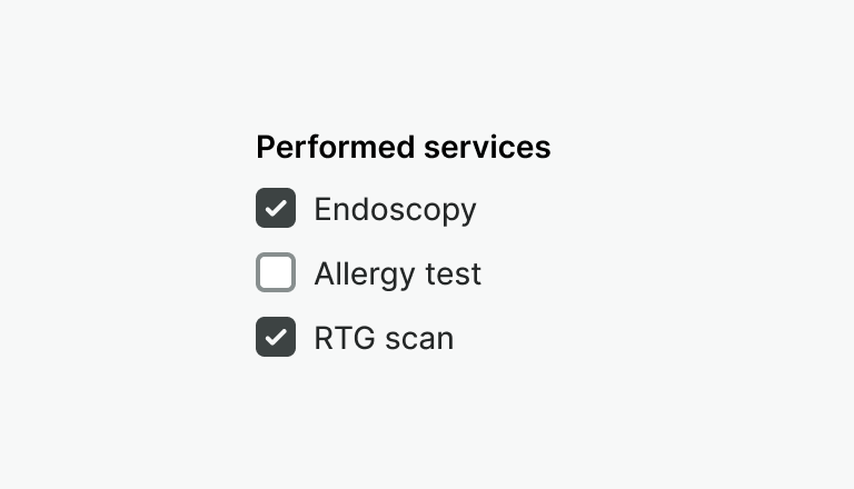
Provide a clear label to explain available choices to the user.
Don't omit the label. Omitting the label makes context hard to understand.
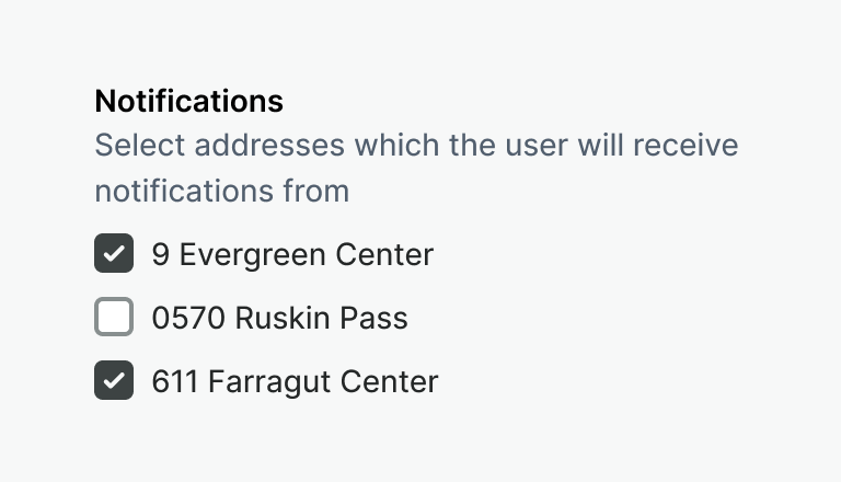
Use hint to provide additional information about the fieldset.
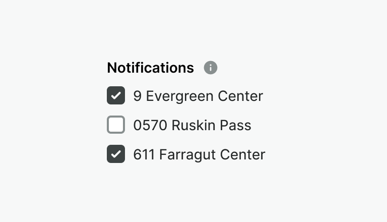
Don't hide additional information behind icons or tooltips.
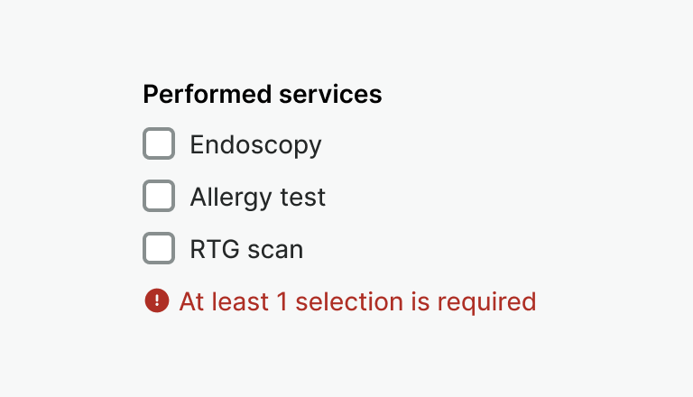
Use error to show validation message for a fieldset.
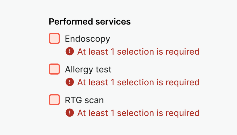
Don't show a validation message for each input.
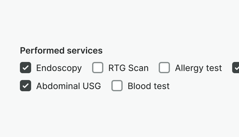
Consider using inline alignment when vertical space is limited and labels are short and clear.
Don't use inline alignment when items include long labels and hints. This will make content harder to scan.
Examples
Live Preview
Props
| Name | Description | Type | Default | Values |
|---|---|---|---|---|
error | Displays an error description below the fieldset | string | ||
hint | Text displayed under the label with additional information | string | ||
inline | If true items are displayed inline | boolean | ||
label | Label of the fieldset | string |
Slots
| Name | Description |
|---|---|
hint | Use it to provide rich content for input hint. Takes precedence over hint property. |
default | Default content slot |
error | Use it to provide rich content for error messages. Takes precedence over error property. |