Usage
Textarea enables users to enter multi-line text data.
Best practices

Use textarea fields where the expected data is long.

Don't use textarea when the expected data is shorter. Use the input instead.
Labels
Labels indicate what type of data the field needs. Having labels present gives us two major advantages:
- They are programmatically associated with the field, which means assistive technologies will read them when the user focuses on them.
- When the user click/tap on the label, the browser passes the focus to the field, which makes it easier for touch screens, and users with motor disabilities.
Important note
Labels should always be present, unless for those cases where the context and elements that surround the textarea make it clear what data is needed (e.g. a field in a chat). In those cases, make sure an aria-label is used.

Use labels to specify the data required in the textarea.

Do not avoid labels as they are essential to the textarea completion and later understanding.

Keep the label short and concise. Always use sentence case.

Avoid using long sentences or colons.
Placeholders
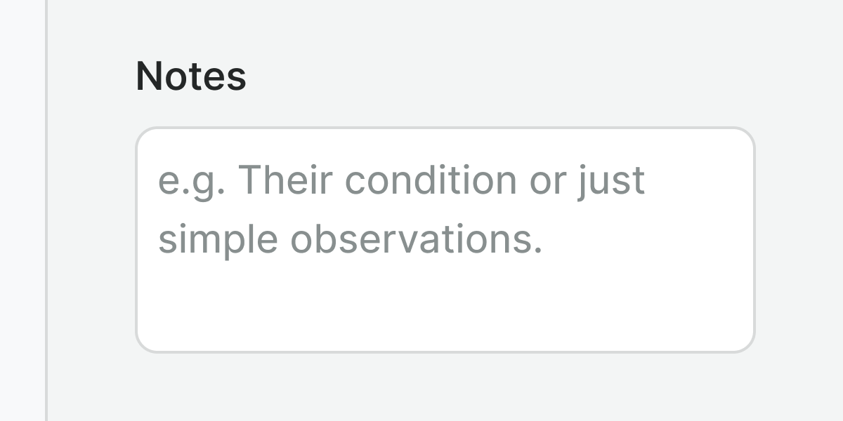
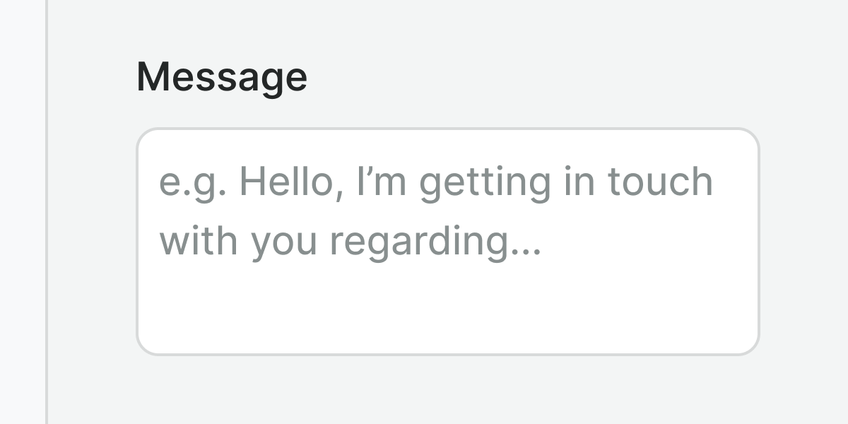
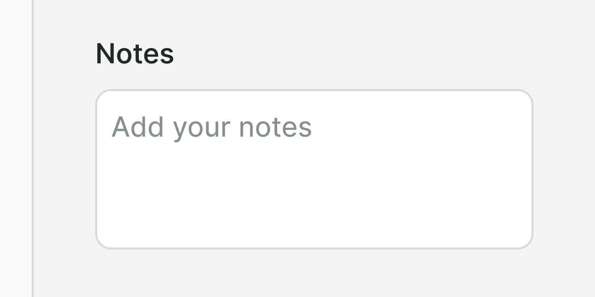
Use the placeholders to help users understand the format needed. They can never be a substitute for the label or hint because:
- They disappear as soon as the user interacts with the field.
- They usually do not meet a strong contrast ratio (+3:1 in our case).
- Screen readers do not read placeholders as they do labels.

When using placeholders, write direct examples using sentence-case.

Do not use placeholders as labels or as hints or to provide important information.
Hint & errors
Hints and error messages provide additional directions to support the label meaning in an accessible manner.

Use hints to provide useful information about the required data.

Do not duplicate information, if an error message is repeating the hint, hide the hint.
Examples
Live Preview
Props
| Name | Description | Type | Default | Values |
|---|---|---|---|---|
aria-multiline | Informs assistive technologies that the textarea supports multi-line content, expecting that enter or return will create a line break rather than submit the form. | boolean | true | true, false |
aria-label | Identifies the field when a visual label is not present (e.g. a chat field) | string | null | |
error | Optional error message to be shown under the textarea field. | string|boolean | false, true, "" | |
hint | Optional text about the expected input. | string | ||
label | The label for the textarea | string | null | |
v-model model-value v2, wc value v1 | The value of the textarea | string | ||
placeholder | Placeholder text to display within the field | string | ||
readonly | Set the textarea to a readonly state. The input remains focusable and will be submitted in forms, but cannot be edited. | boolean | false, true | |
resize | Controls if the textarea field is resizable by the user and how | string | vertical | none, vertical |
rows | Specifies the visible height of a textarea in lines | number | true | |
required | Determines whether the field is required or not. | boolean | false | true, false |
Events
| Name | Description | Type |
|---|---|---|
v-model update:modelValue v2, wc input v1 | Emits typed text | { "names": [ "String" ] } |
Slots
| Name | Description |
|---|---|
hint | Use it to provide rich content for input hint. Takes precedence over hint property. |