Usage
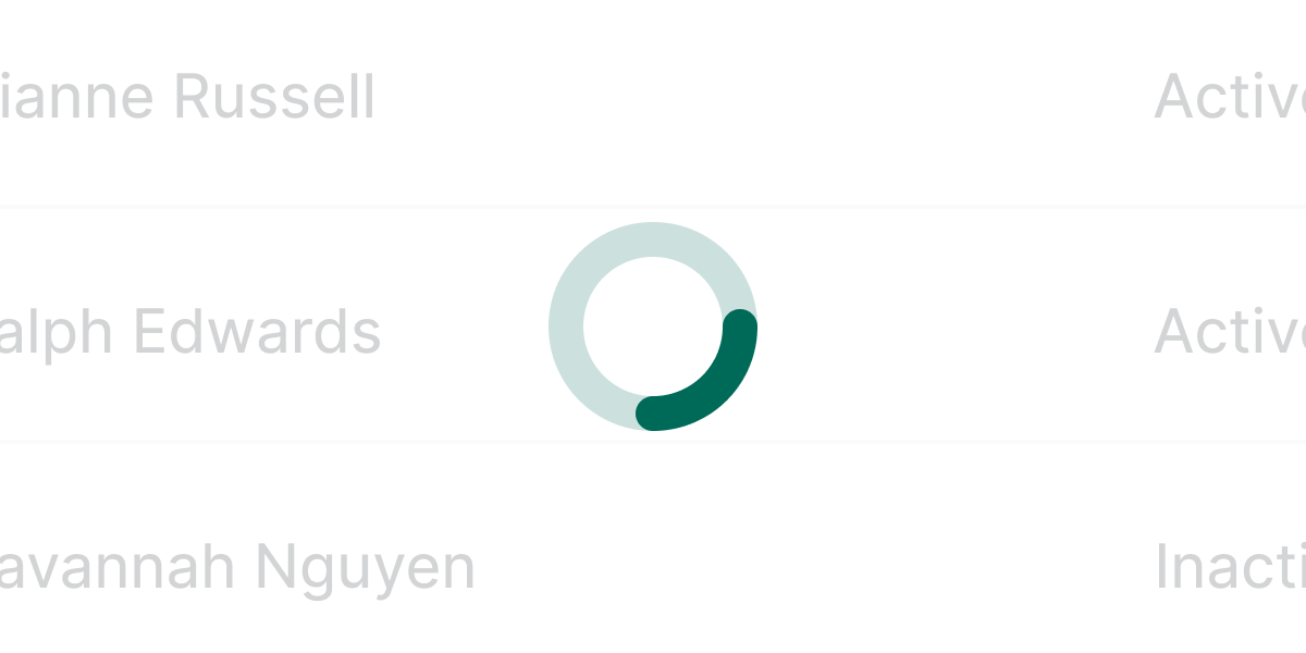
A spinner is a visual indicator that confirms a process is happening in the background but the component or view is not yet ready for interaction.
Best practices
Use the spinner for actions that last from 1 to 10 seconds. If the action is shorter than 1 second, you don’t need a spinner. For actions longer than 10 seconds, use a progress bar.


Accessibility
Labeling the spinner
The spinner needs a label so that a screen reader announces the state properly. Each piece of text that becomes the label needs to be available in the same language as the page. The default label is “Loading.” Make the label more personalized when the context matters. Use the scheme “Loading + {what is loading},” for example, “Loading a graph.” In some cases, you can follow a more generic pattern using a different verb, for example, “Submitting a form.”
General considerations
Some of the considerations to make a spinner loading state accessible require adding ARIA properties to the regions being affected:
- Set
aria-livetoassertiveso updates to the region have the highest priority and should be presented to the user immediately. - Set
aria-atomictotrueif you want the entire changed region as a whole to be presented. - Use
aria-busyto indicate that an element is being modified and that assistive technologies may want to wait until the changes are complete before informing the user about the update.
Examples
Live Preview
Props
| Name | Description | Type | Default | Values |
|---|---|---|---|---|
aria-label | Defines a string value that labels an element. | string | ||
size | Defines the size of the spinner | string | large | small, large |