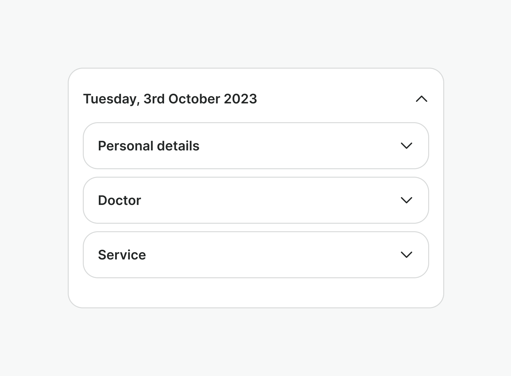
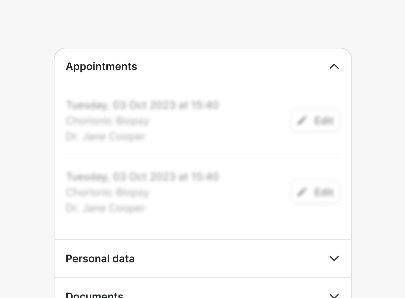
Usage
A collapse is a content area commonly used to organize related information that can be collapsed and expanded. It can be triggered by just a heading or a more complex content snippet.
Best practices

Do
Use it to make pages shorter, and reduce scroll if the content is not crucial for the interaction.
Don't
Do not nest them. Having several components that hide information nested can resolve into a very tedious experience.

Do
Use it when the users need to see more than one section at a time
Don't
Do not use them if the user needs to switch quickly between sections as the other sections might be pushed down. Use tabs instead.
Examples
Live Preview
Props
| Name | Description | Type | Default | Values |
|---|---|---|---|---|
divider | Shows a divider at the bottom of the collapse component. | boolean | false | false, true |
indent | Indents the collapse content. | boolean | false | false, true |
model-value | Controls whether the collapse is open or not. | boolean | false | false, true |
padding | Controls the padding of the collapse component. | string | medium | none, small, medium |
Slots
| Name | Description |
|---|---|
header | The header slot can contain a heading or a more complex content snippet. |
panel | The panel that holds the collapsed content. |
Events
| Name | Description | Type |
|---|---|---|
update:modelValue | Emitted when the collapse is toggled. | { "names": [ "Boolean" ] } |