Usage
A date picker is an input control that allows the user to select a single date or a range of dates by either typing or selecting from a calendar.
Best practices

Use a date picker when asking the user for a specific date or range of dates, such as an appointment date or the valid period of a voucher.
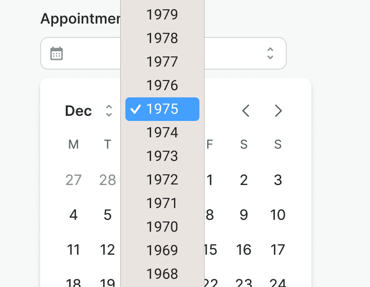
Do not use a date picker for entering a birth date or if the date goes ±10 years to the future or past. Use an input component instead.
Labels
Even though the date picker has an icon prefix as a visual hint of the data needed, labels must be used to better indicate what type of data is required. See more on label importance here.

Use labels to specify the data required in the input field.
Do not avoid labels as they are essential to the input completion and later understanding.
Formatting
Date formatting allows you to present the appropriate format for specific situations. Use it thoughtfully and customize it according to your specific use cases.

Use numeric dates when the space is limited. Different countries have different conventions and they can be confusing for international users.

Use the descriptive format when you have enough space and it is important to present more details about the date.
Hints & errors
Hints and error messages provide additional directions to support the label meaning in an accessible manner.

Use hints to provide useful information about the required input.

Do not duplicate information, if an error message is repeating the hint, hide the hint.
Examples
Live Preview
Props
| Name | Description | Type | Default | Values |
|---|---|---|---|---|
v-model model-value | The selected date(s) of the date picker. | Array | Array<Date> | |
formatter | The formatter function which accepts a Date and returns a string. By default it uses the ISO-8601 format. | Function | date => new Intl.DateTimeFormat('default').format(date) | |
parser | The parser function which accepts a string and returns a Date. By default it uses the ISO-8601 format. | Function | ||
error | Optional error message to be shown under the date picker field. | string,boolean | ||
hint | Optional text about the expected date picker. | string | ||
label | The label for the date picker field. If we are in multi calendar, we pass an object and it should have the following structure: { from: string, to: string, } | string, object | ||
placeholder | Placeholder text to display within the date picker field. | string | ||
required | Determines whether the date picker is required or not. | boolean | false, true | |
target | Type string or an actual DOM node where you want render component | string|object | body | |
use-teleport | When it is set to true, date picker menu will teleport the content part into the target. | boolean | false | false, true |
open | Controls whether the dropdown is open or not. | boolean | false | false, true |
position | Controls the position of the date picker popouot. `bottom-left` will align it to the bottom left of the trigger. `bottom-right` will align it to the bottom right of the trigger. `top-left`and 'top-right' will align it to the top left and right respectively. | string | bottom-left | bottom-left, bottom-right, top-left, top-right |
first-day-of-week | Sets the first day of the week for different countries. 0 is Sunday and 1 is Monday. | Number | 0, 1, 2, 3, 4, 5, 6 | |
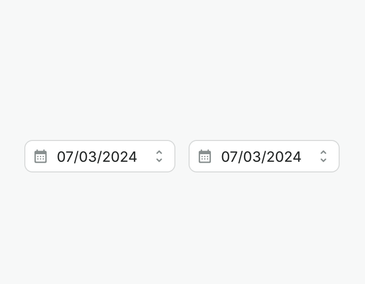
variant | Controls whether the date picker is multi month or not. | String | single | single, range |
dates-disabled | Controls which dates are blocked from being selected. | Object | {} | { before: Date, after: Date, dates: Array<Date>, ranges: Array<{ from: Date, to: Date }> } |
dates-highlighted | Controls which dates are highlighted. | Object | {} | { before: Date, after: Date, dates: Array<Date>, ranges: Array<{ from: Date, to: Date }> } |
highlight-current-week | Highlights the current week based on the current date. | Boolean | false | false, true |
locale | The locale to use for the date picker. | String | 'default' | default, de-DE, en-GB, en-US, es-CO, es-MX, es-ES, es-US, it-IT, pl-PL, pt-BR, pt-PT, tr-TR |
translations | Object with all necessary translations. | object | { triggerIconCalendar: 'Date picker', triggerIconToggle: 'Toggle', month: 'Month', year: 'Year', previousMonth: 'Previous month', nextMonth: 'Next month',} | { triggerIconCalendar: string, triggerIconToggle: string, month: string, year: string, previousMonth: string, nextMonth: string} |
readonly | Set the datepicker input to a readonly state. It remains focusable and will be submitted in forms, but cannot be edited. | boolean | false, true |
Events
| Name | Description | Type |
|---|---|---|
select | Emits the selected date(s). If the datepicker is single, it will emit an array with one date. If the datepicker is in range, it will emit an array with two dates. | { "names": [ "Array<Date>" ] } |
v-model update:modelValue | Emits the selected date(s). If the datepicker is single, it will emit an array with one date. If the datepicker is in range, it will emit an array with two dates. | { "names": [ "Array<Date>" ] } |
Slots
| Name | Description |
|---|---|
hint | Use it to provide rich content for input hint. Takes precedence over hint property. |