Usage
The layout is the top-most structural component in any view and acts as the main wrapper for smaller items within it.
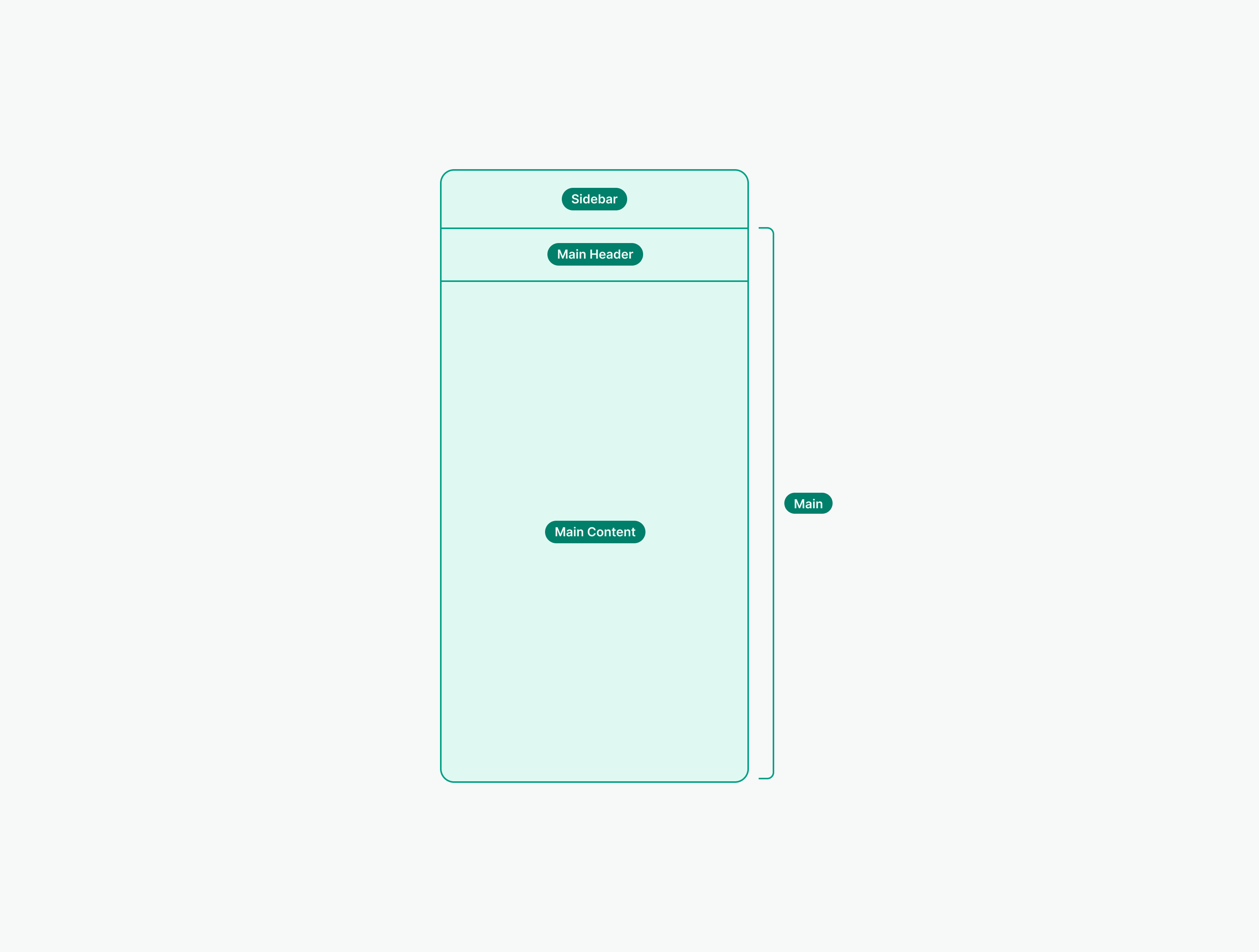
The Layout component defines the main layout structure of a page by providing standard sizing and spacing for the different content areas.
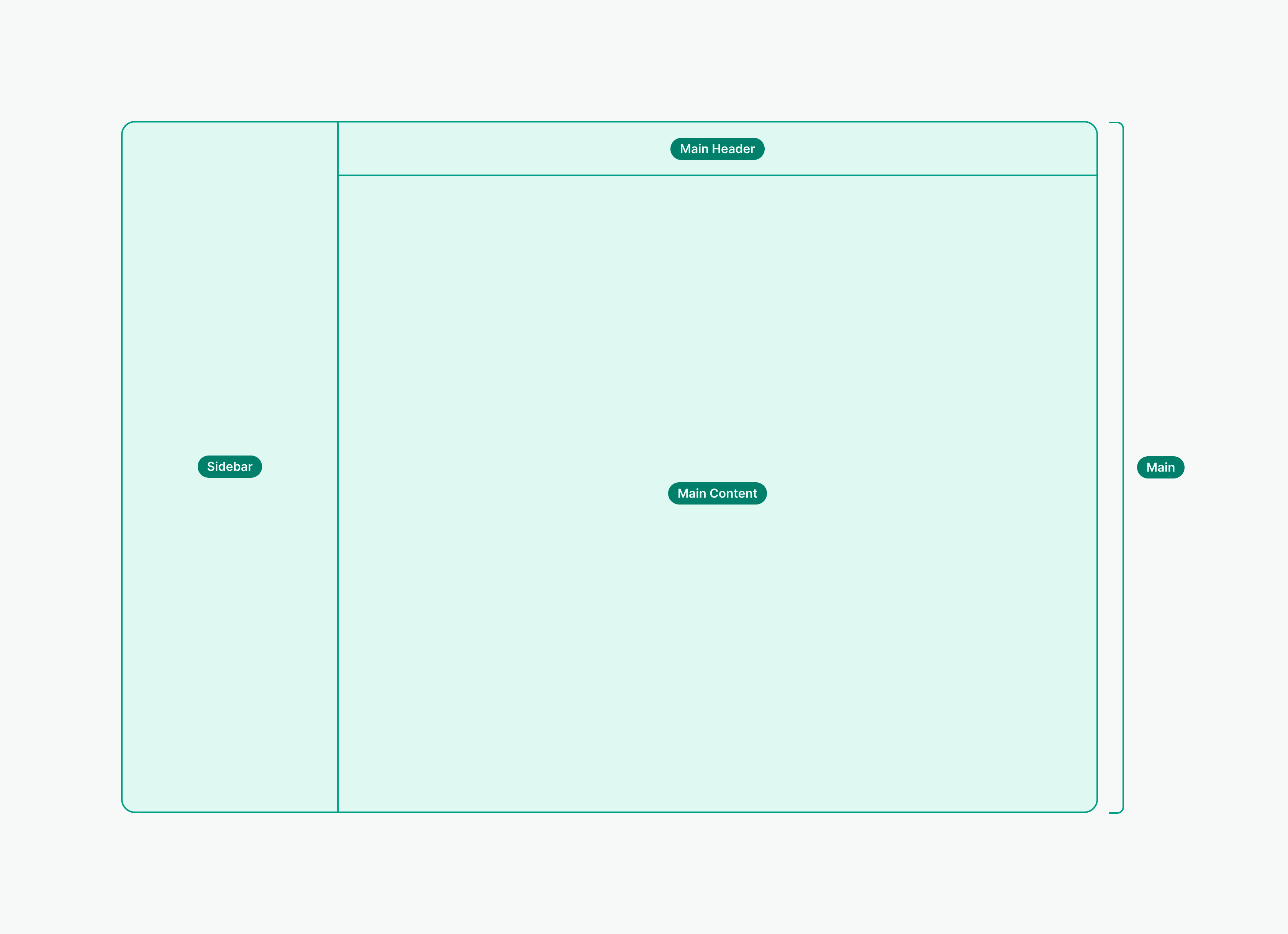
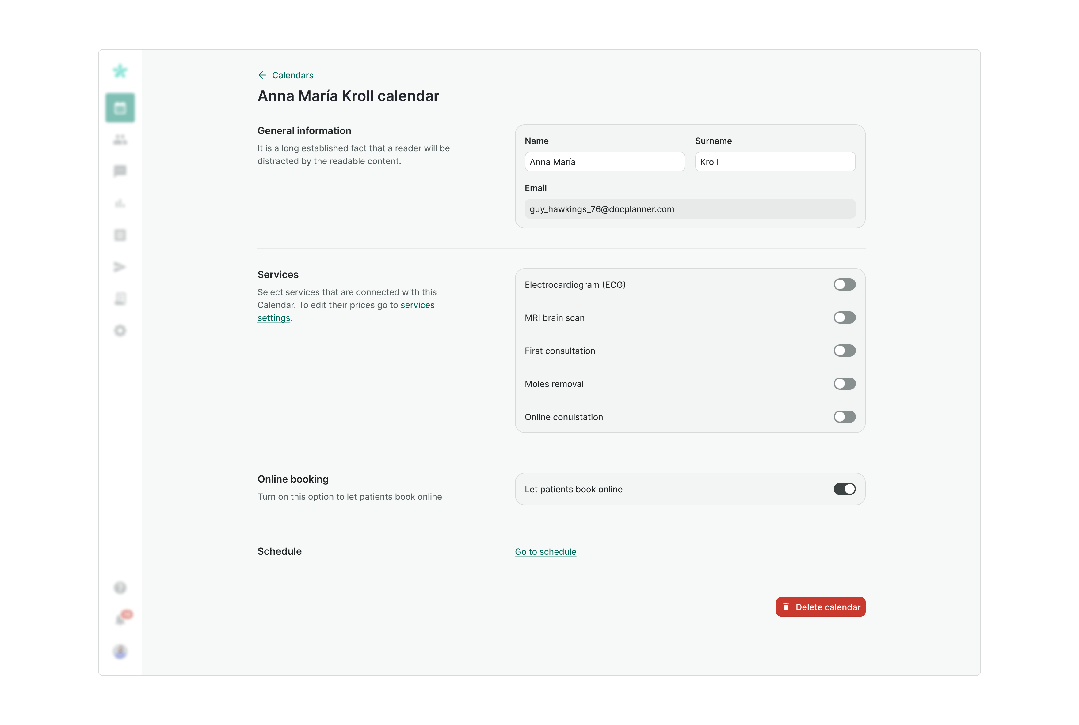
Main Header
Main Header is positioned above the main content area. It provides space for a Display Heading that is used for a page title and for the main actions that can be performed on the screen.

- Include page title to let users know where they are
- Add a back button if the page has a parent
- Provide the main action of the page in the Header
- Don't overcrowd the Header with too many actions
Sidebar
Sidebar provides space for navigation inside the current screen. Use it to allow users move between different content based on the use case or type of information
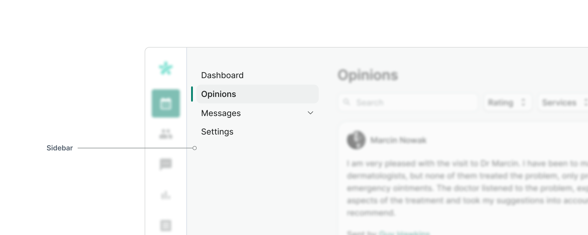

- Use the Sidebar to provide secondary navigation if needed
- Don't include main actions in the sidebar
- Don't include the page title in the sidebar
- Don't put inside the sidebar actions or information that are necessary to operate on the page
Main Content
Main content is used to place content that represents dominant functionality of the page. It can stretch full width of a container area or have a fixed width.
Main content usually contains lists of items or tables. For complex information or long forms, we recommend using the Grid component to distribute the elements.
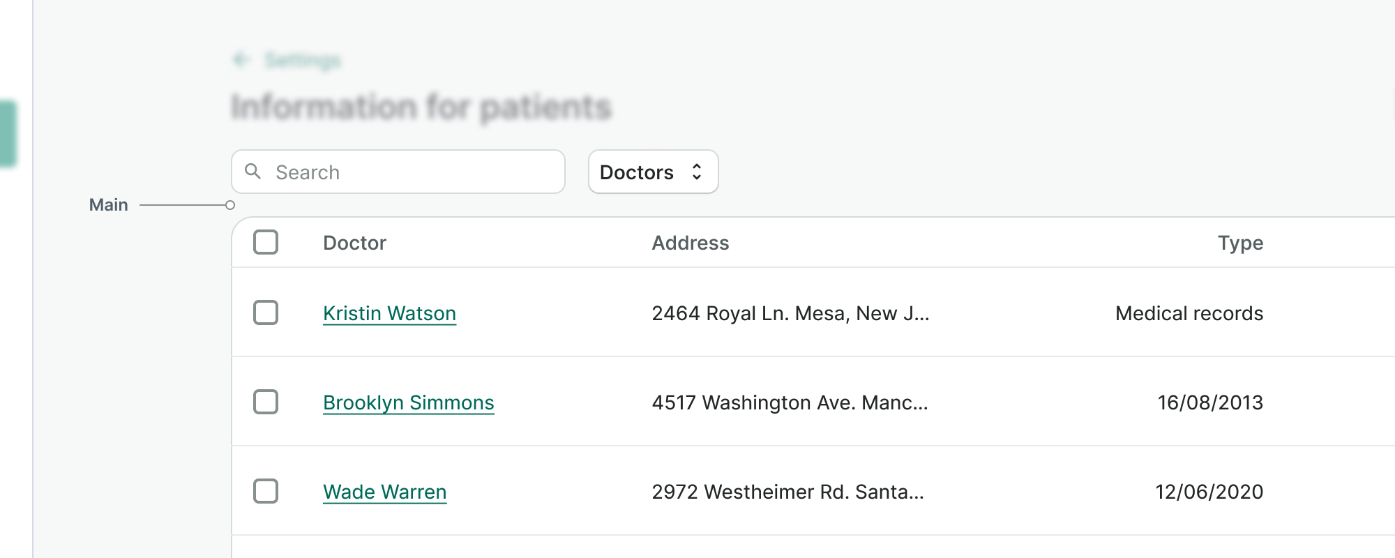

- Use full width layout, when working with multi-column tables or/and high density information pages
- Don't use full-width layout for simple, low-density pages that won't benefit from wider container
Responsiveness
The Layout component adapts to different screen sizes to ensure optimal viewing on various devices.
Mobile layout
On mobile device viewports, the layout shifts from a two-column structure to a single-column format, stacking the sidebar above the content by default.
Sidebar content
On desktop, the Sidebar is typically used for local navigation. On mobile, due to limited space, Sidebar content needs to be handled carefully.
Handling Sidebar Navigation on Mobile
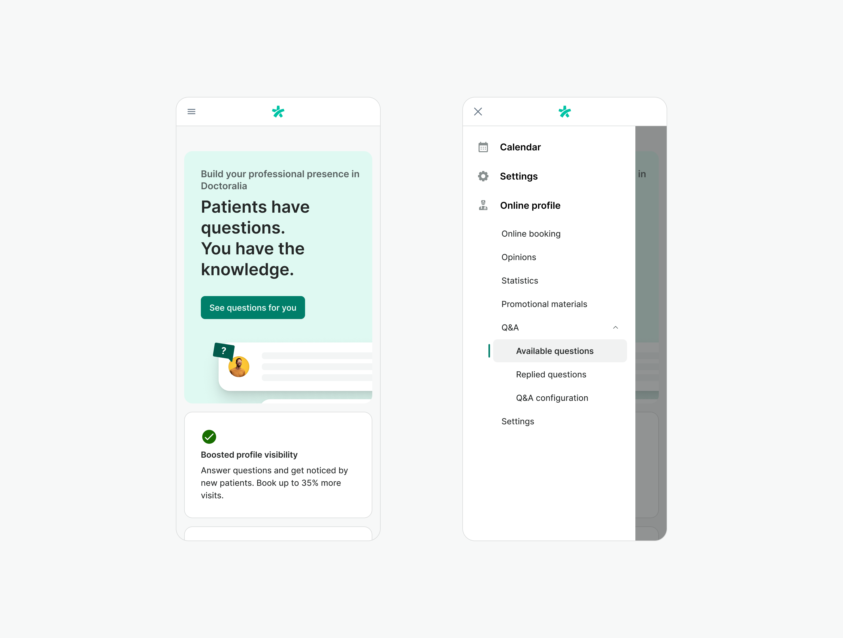
Given the limited screen size of mobile devices, we recommend relocating the sidebar navigation to the global navigation in your product.
This approach creates a more consistent and user-friendly experience on mobile for your product. Smaller mobile screens work better with simple navigation patterns that are easy to recognize. Having separate sidebar and global navigation on mobile can be confusing and waste valuable screen space.
If you are uncertain on how to proceed or need support feel free to contact design system team.
Handling Non-Navigation content on Mobile
If your Sidebar includes content beyond navigation (e.g., user options, supplementary information, filter), consider one of the options to handle them:
Omit if Non-Essential
If certain non-navigation elements in the Sidebar are truly supplementary and not critical for mobile users' primary tasks, consider removing them entirely on mobile to simplify the interface.
Create New Modality
For complex content that requires user focus or is can be presented in isolation, consider creating a new modality. This could include presenting the content in a modal or popover, accessed from within the Sidebar or Main Content area.
Collapsible Section
If some non-navigation Sidebar content is valuable but secondary, and doesn't warrant a new modality, consider placing it in a accordion. Users can choose to expand this section if they need the additional information.
Examples
Live Preview
Props
LayoutMain
| Name | Description | Type | Default | Values |
|---|---|---|---|---|
full-width | Main content stretches to the edges and have full width | boolean | false | false, true |
Slots
Layout
| Name | Description |
|---|---|
default | Default content slot |
LayoutSidebar
| Name | Description |
|---|---|
default | Default content slot for layout sidebar section |
LayoutMain
| Name | Description |
|---|---|
default | Default content slot for layout main section |
LayoutMainHeader
| Name | Description |
|---|---|
default | Header inner content |
LayoutMainContent
| Name | Description |
|---|---|
default | Default content slot for "layout main content" section |